Portfolio
A Selection of my Latest Projects
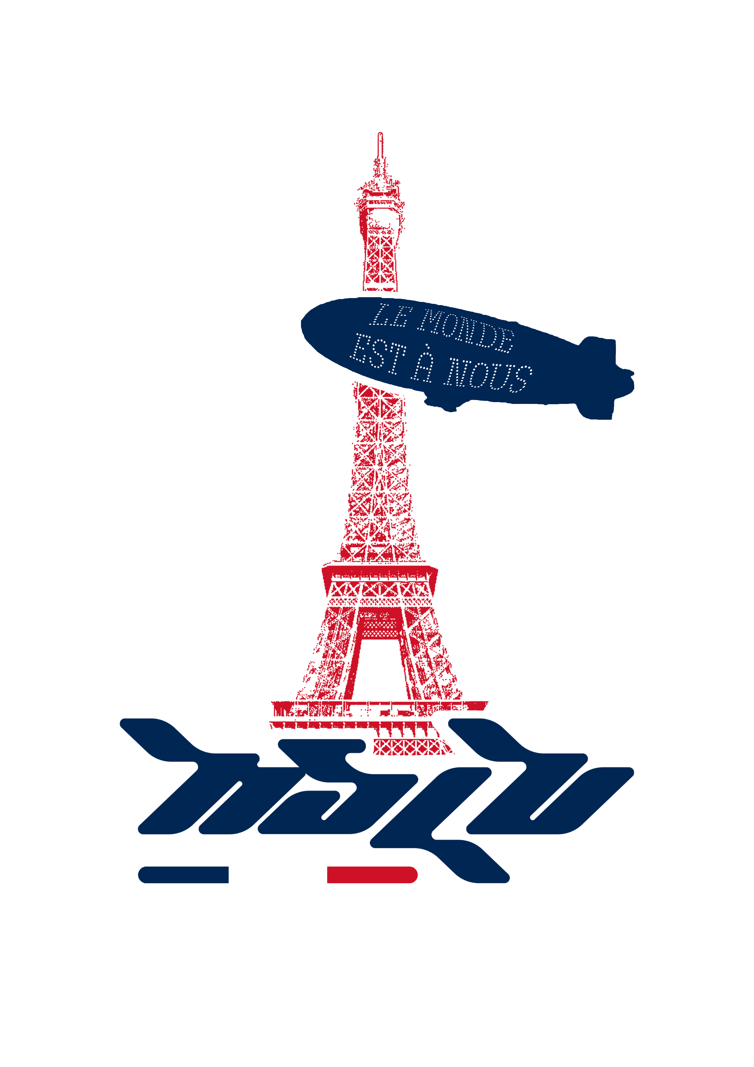
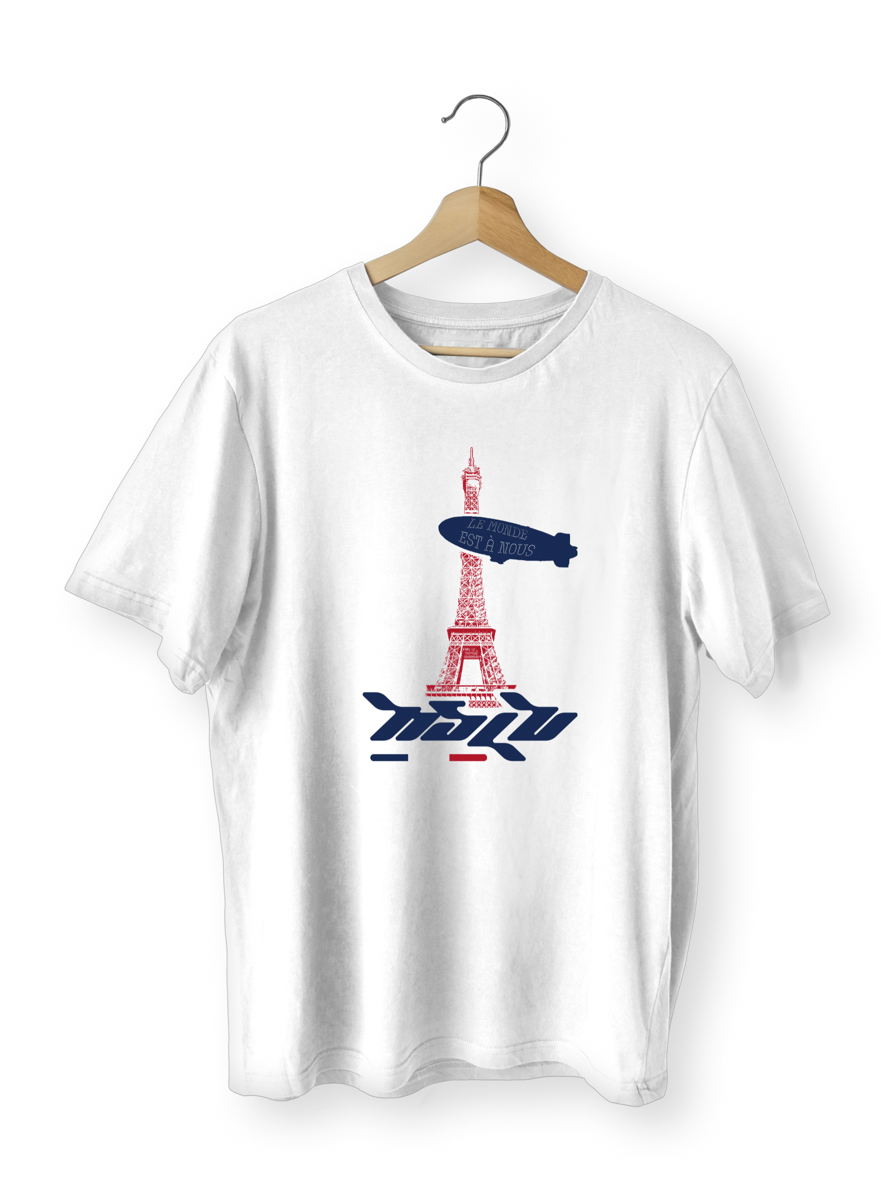
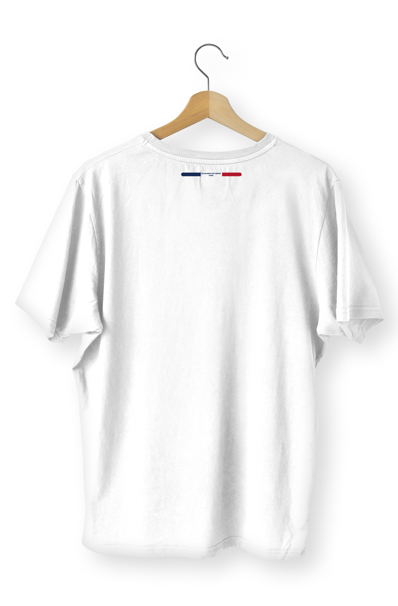
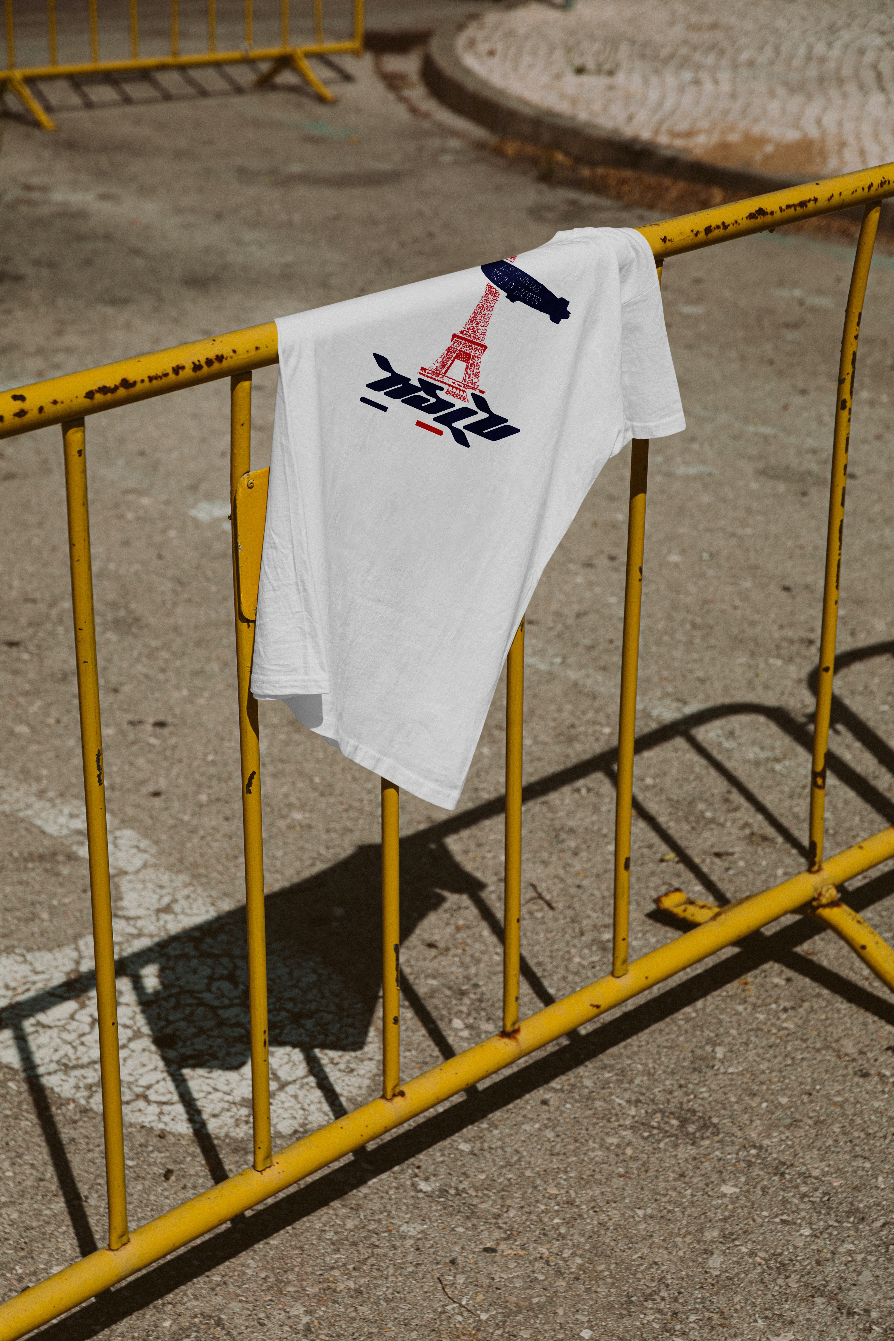
NSLB - Open Brief
An open brand for the fitness and lifestyle brand, NSLB (No Soldiers Left Behind). With their influences coming from what's popular in media as well as current streetwear trends, I wanted to go for a bold graphic for their Paris themed collection, taking inspiration from The film "La Haine", a film ingrained in youth culture as well as streetwear culture, I took the phrase "Le Monde Est A Nous" a standout phrase form the film, directly translating to "The World is Ours", I wanted a way to incorporate this in with the Eiffel tower, directly referencing the film "Scarface", another film ingrained in street streetwear culture, combining the two, with the blimp out of Scarface displaying the phrase from La Haine, tied together with their secondary logo, as well as the Eiffel tower, with the colours of the french flag unifying all of the elements.


Break me Down to Dust - Photobook
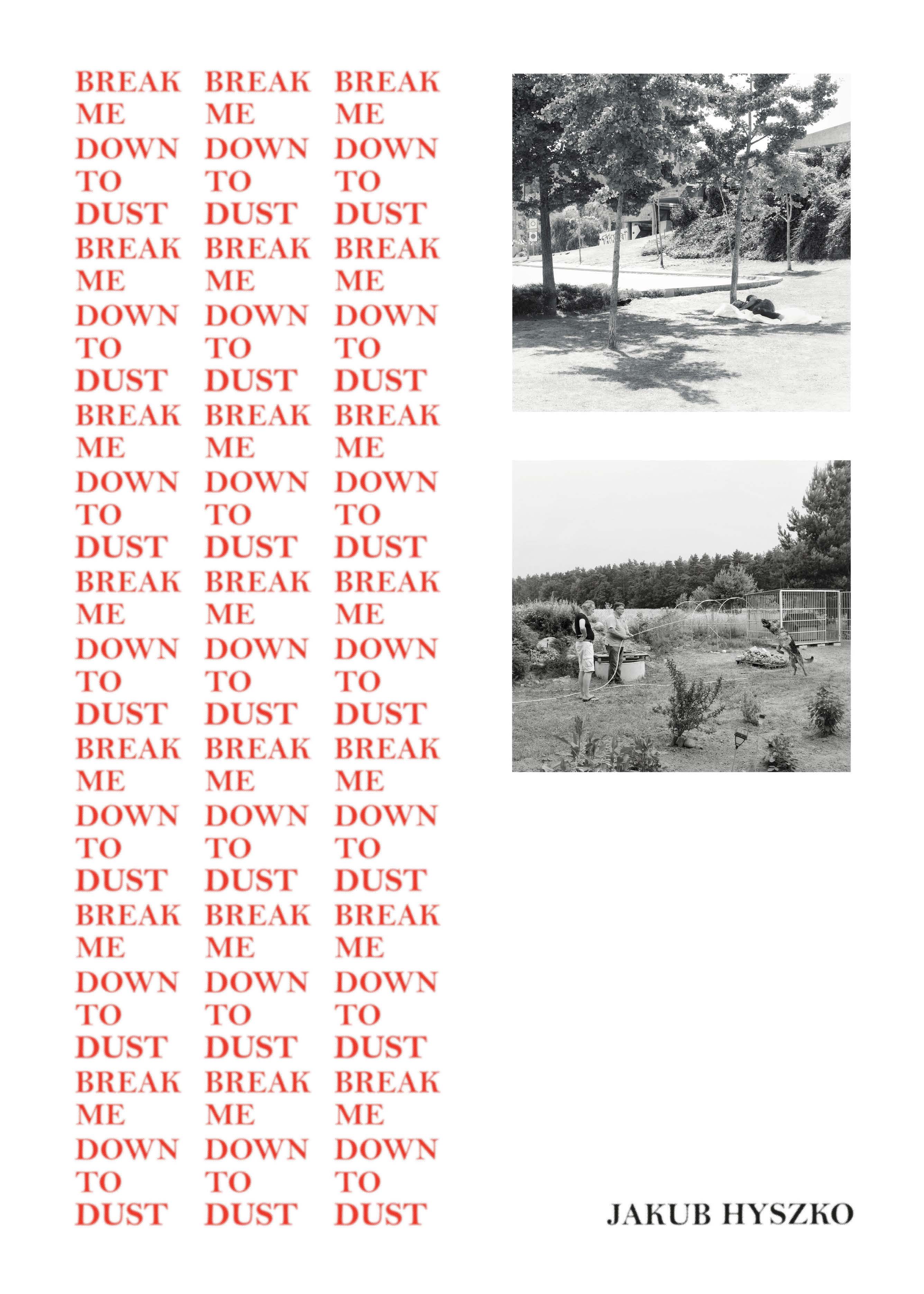
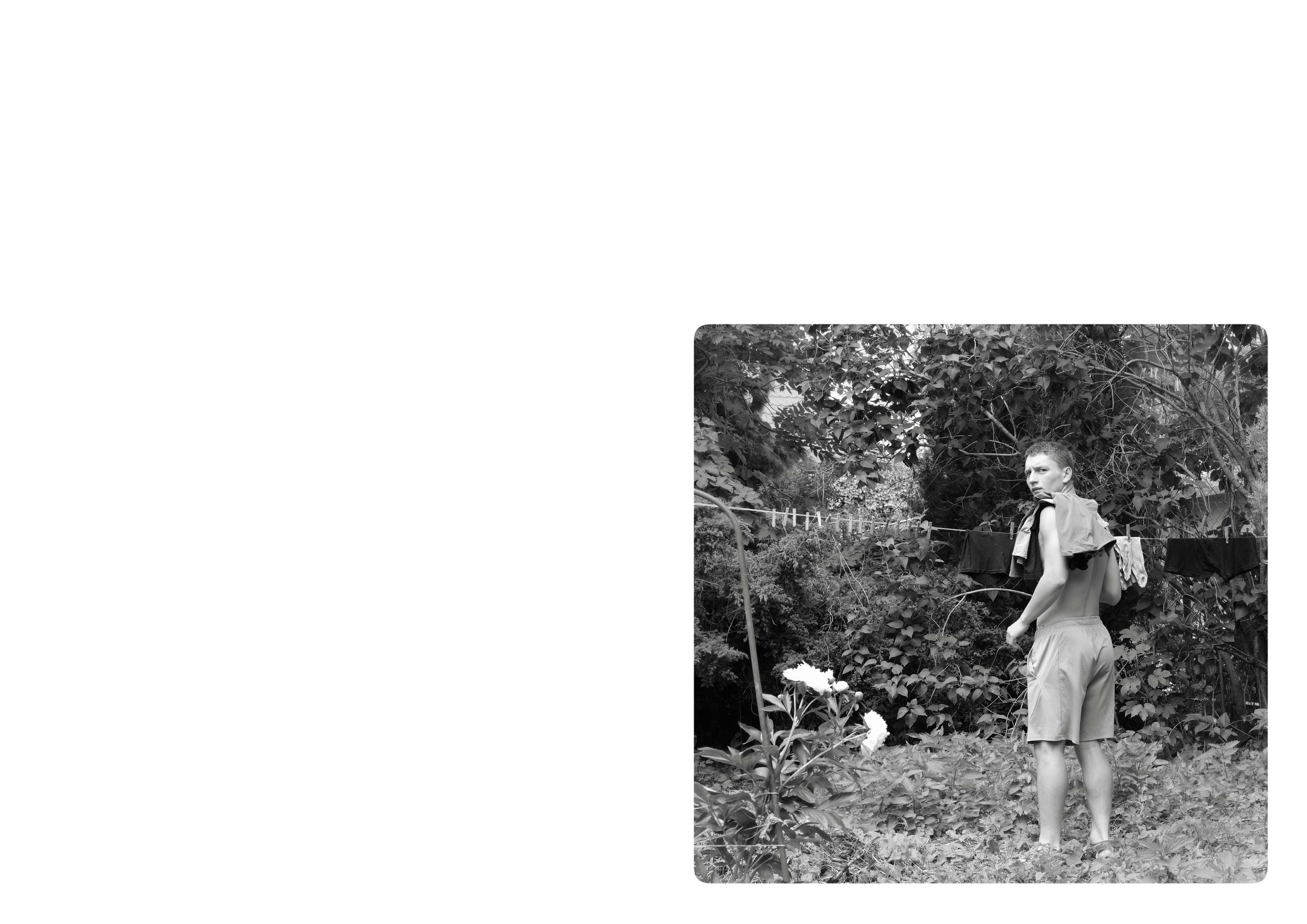
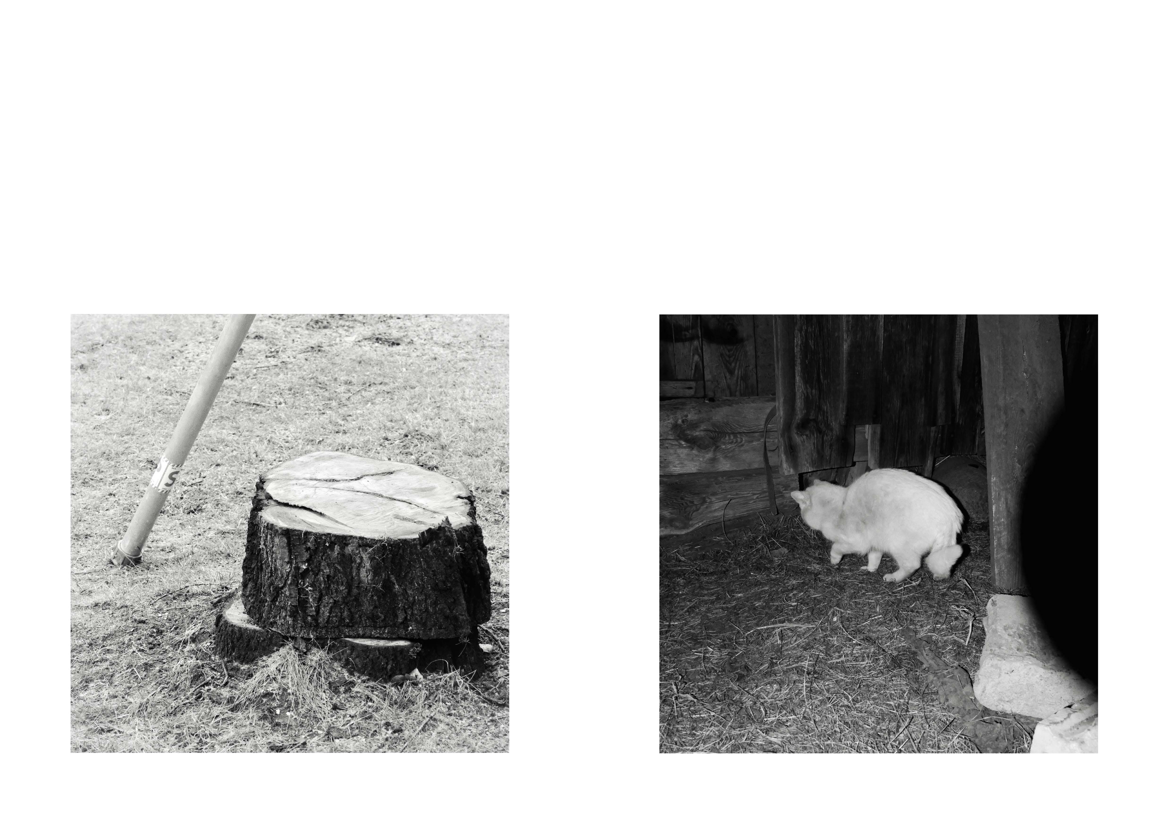
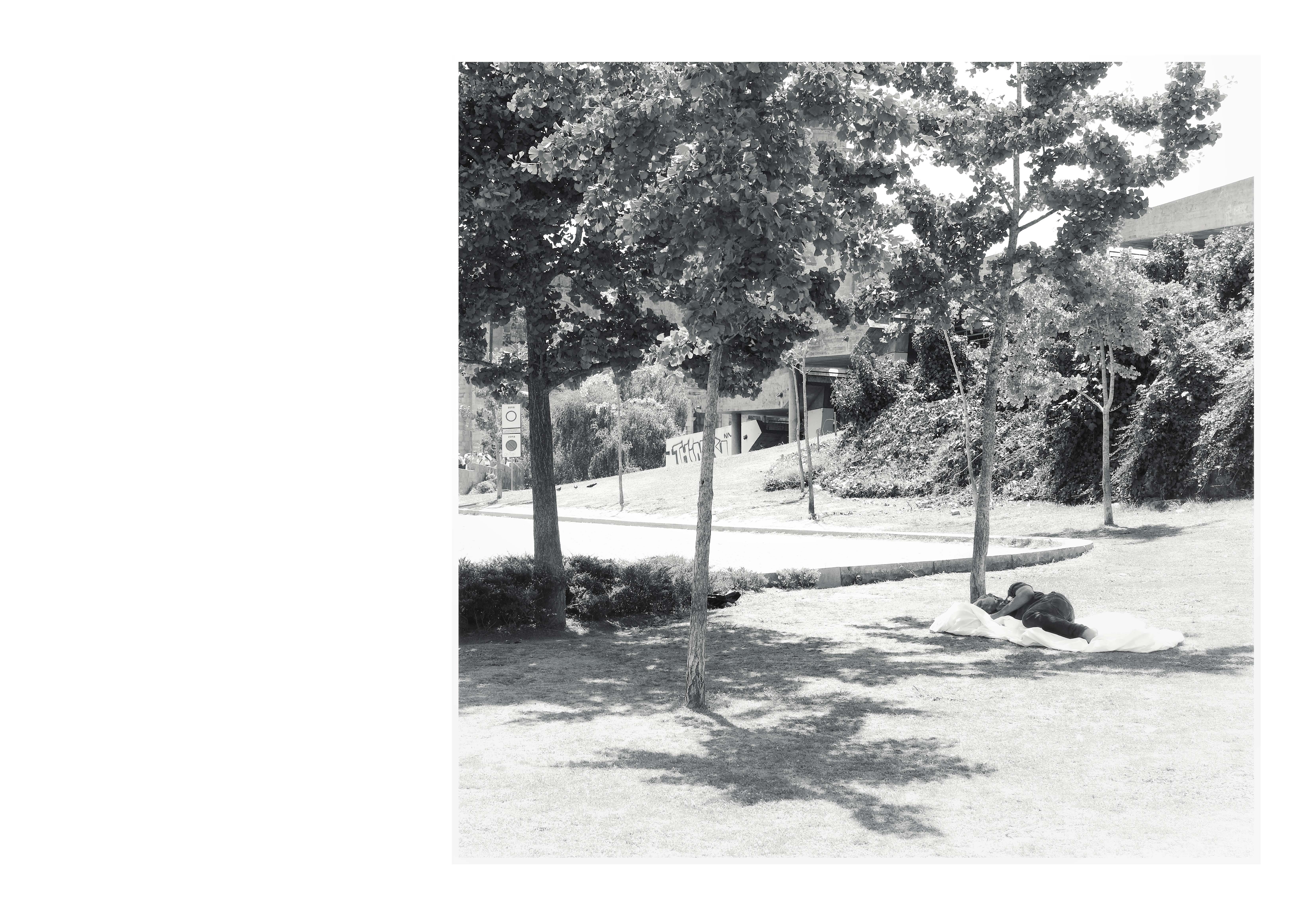
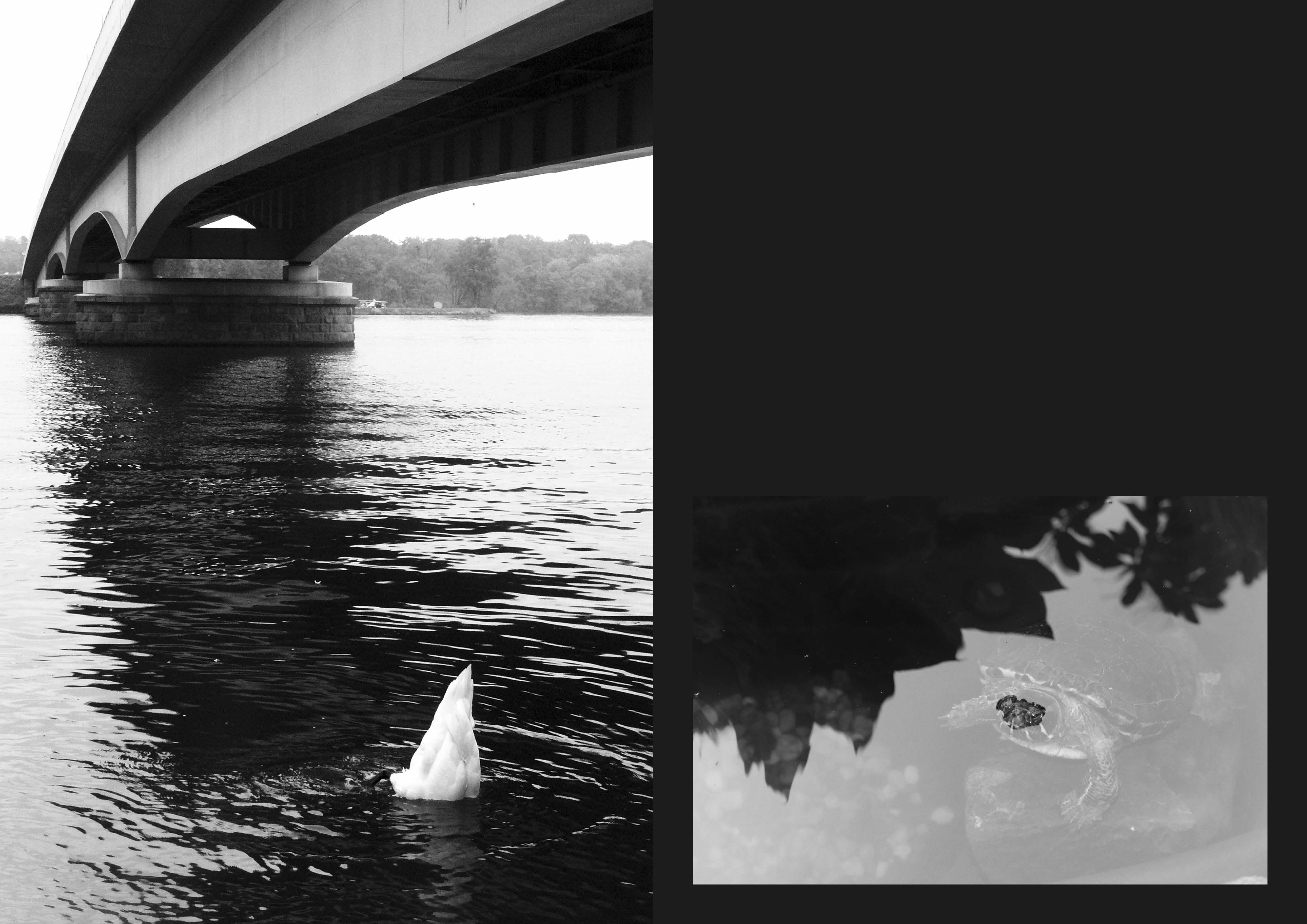
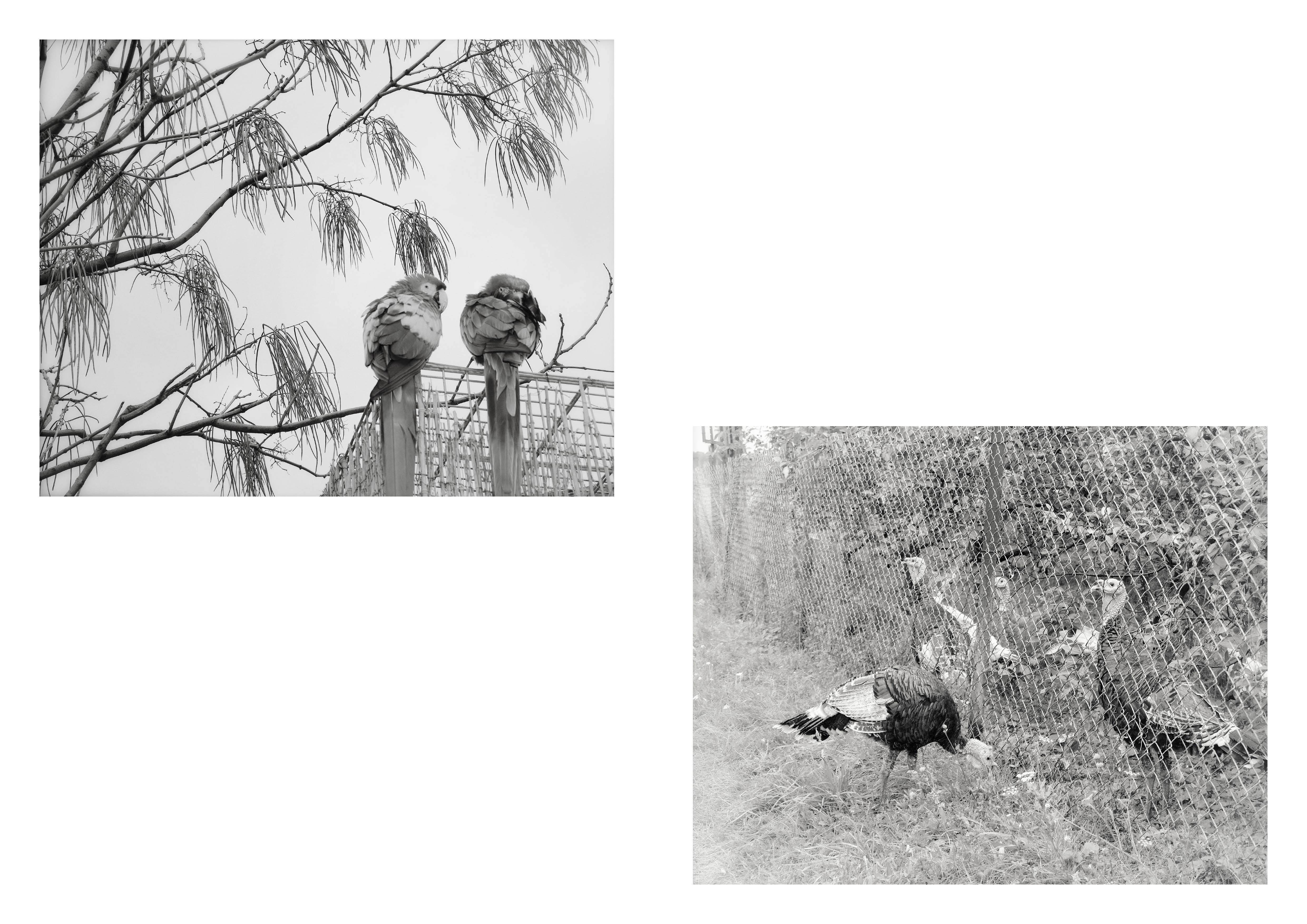
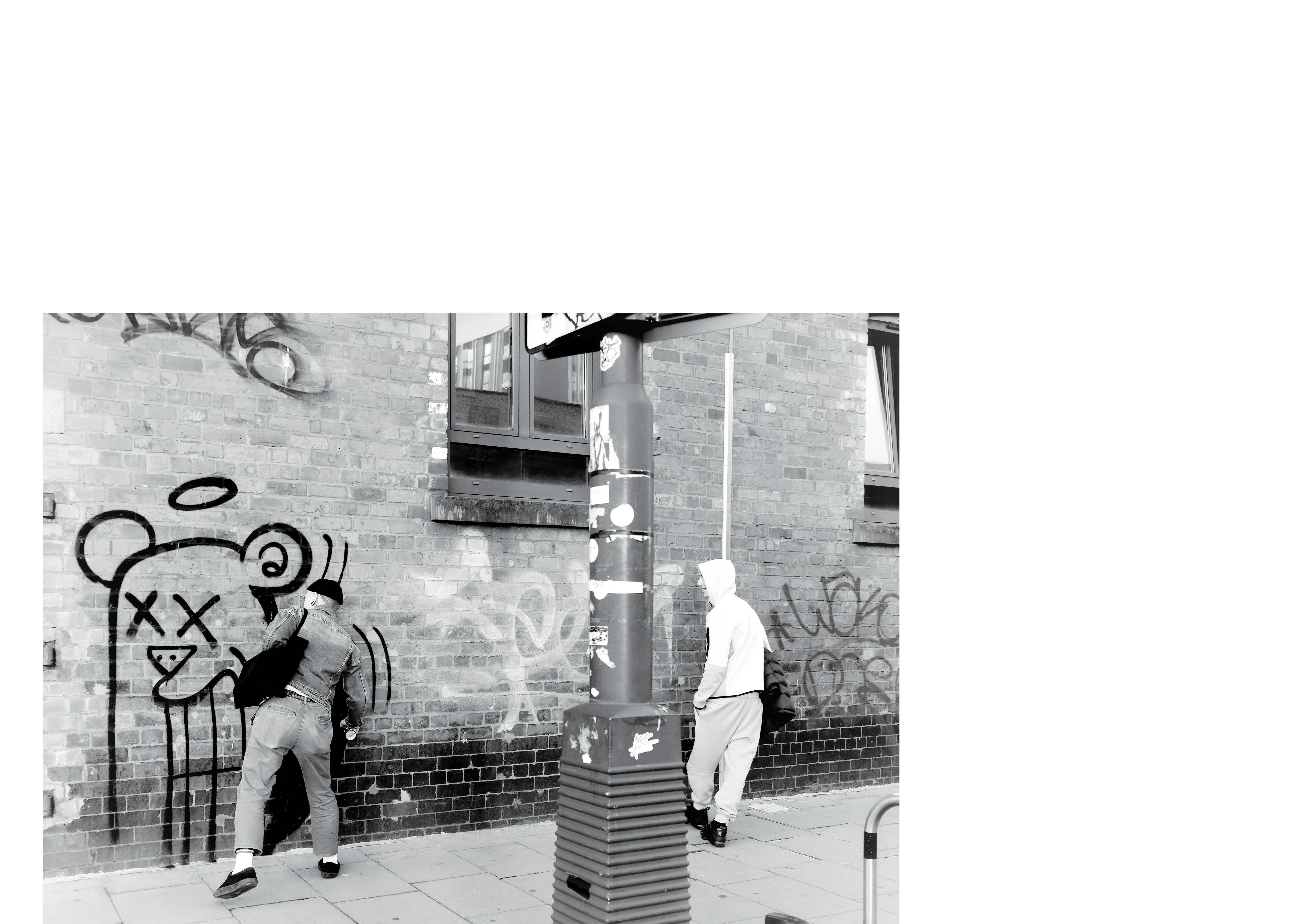
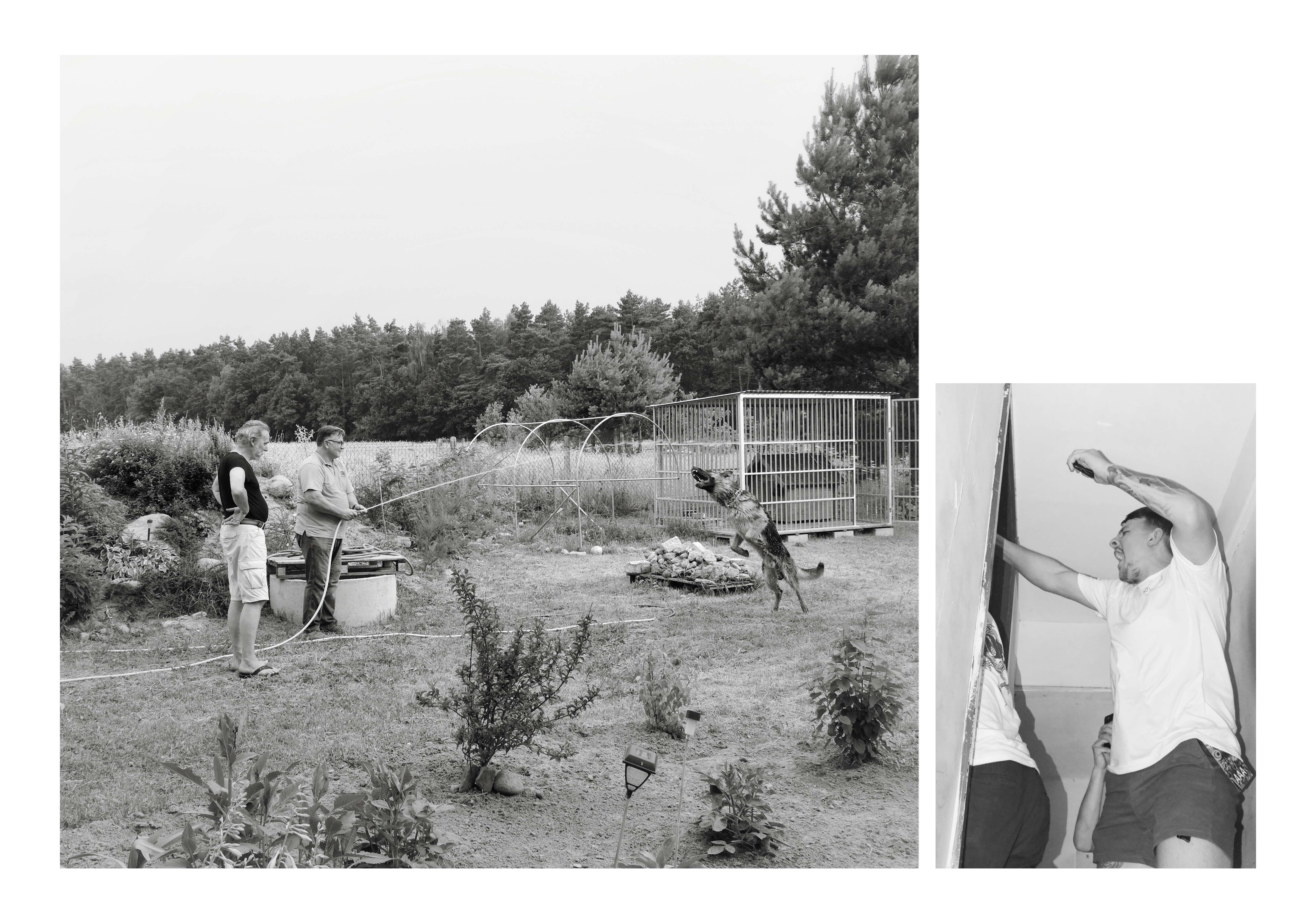
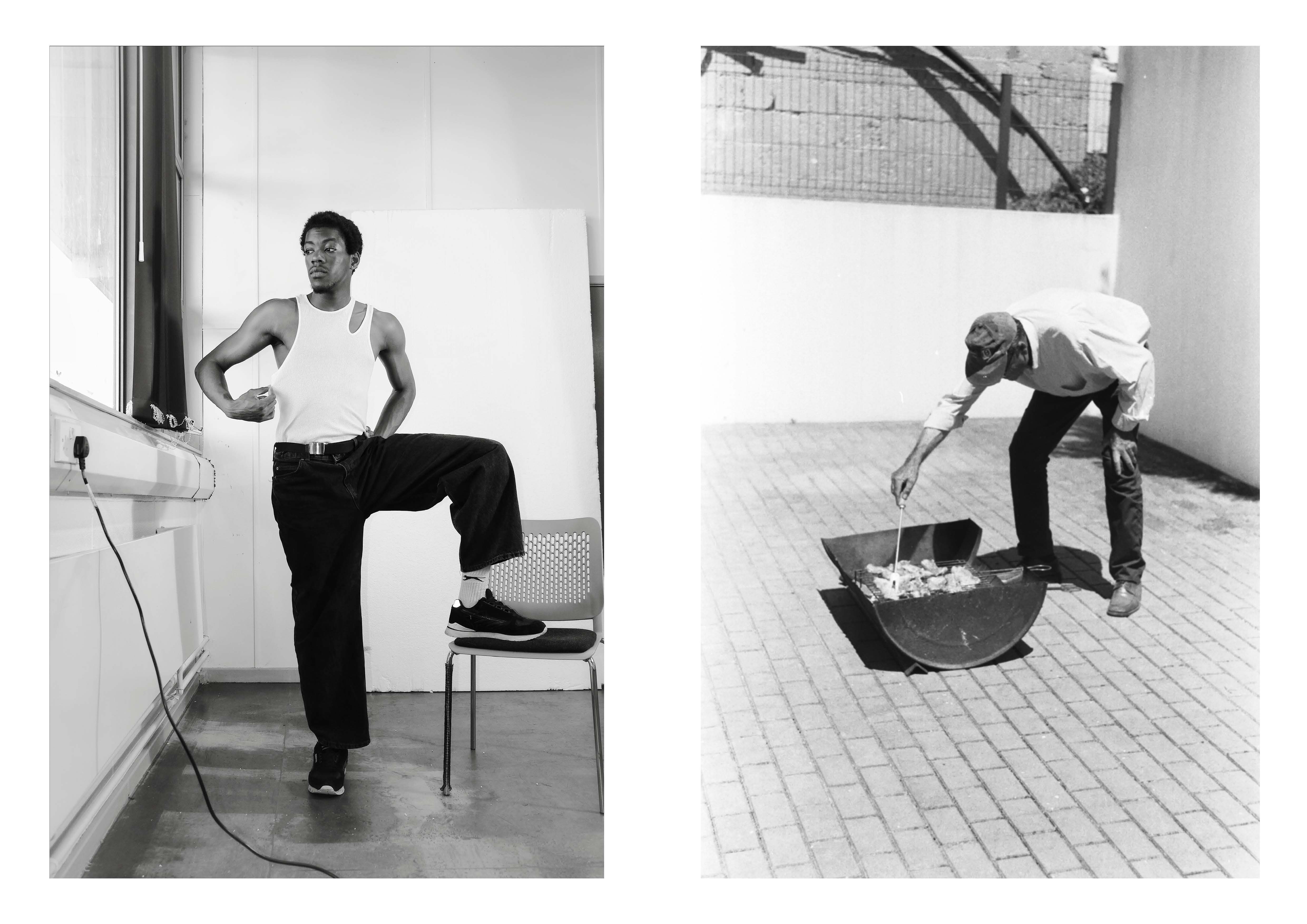
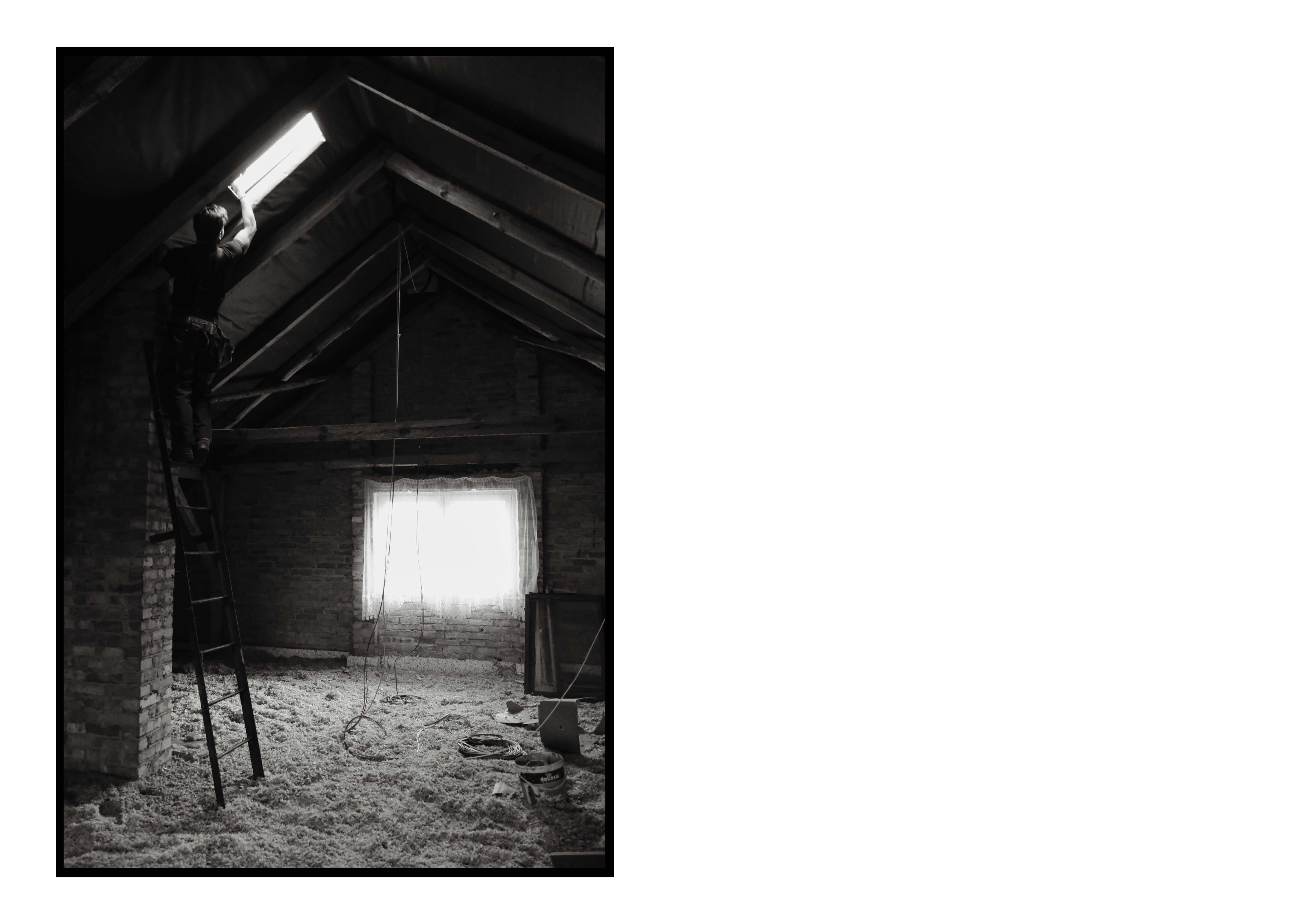
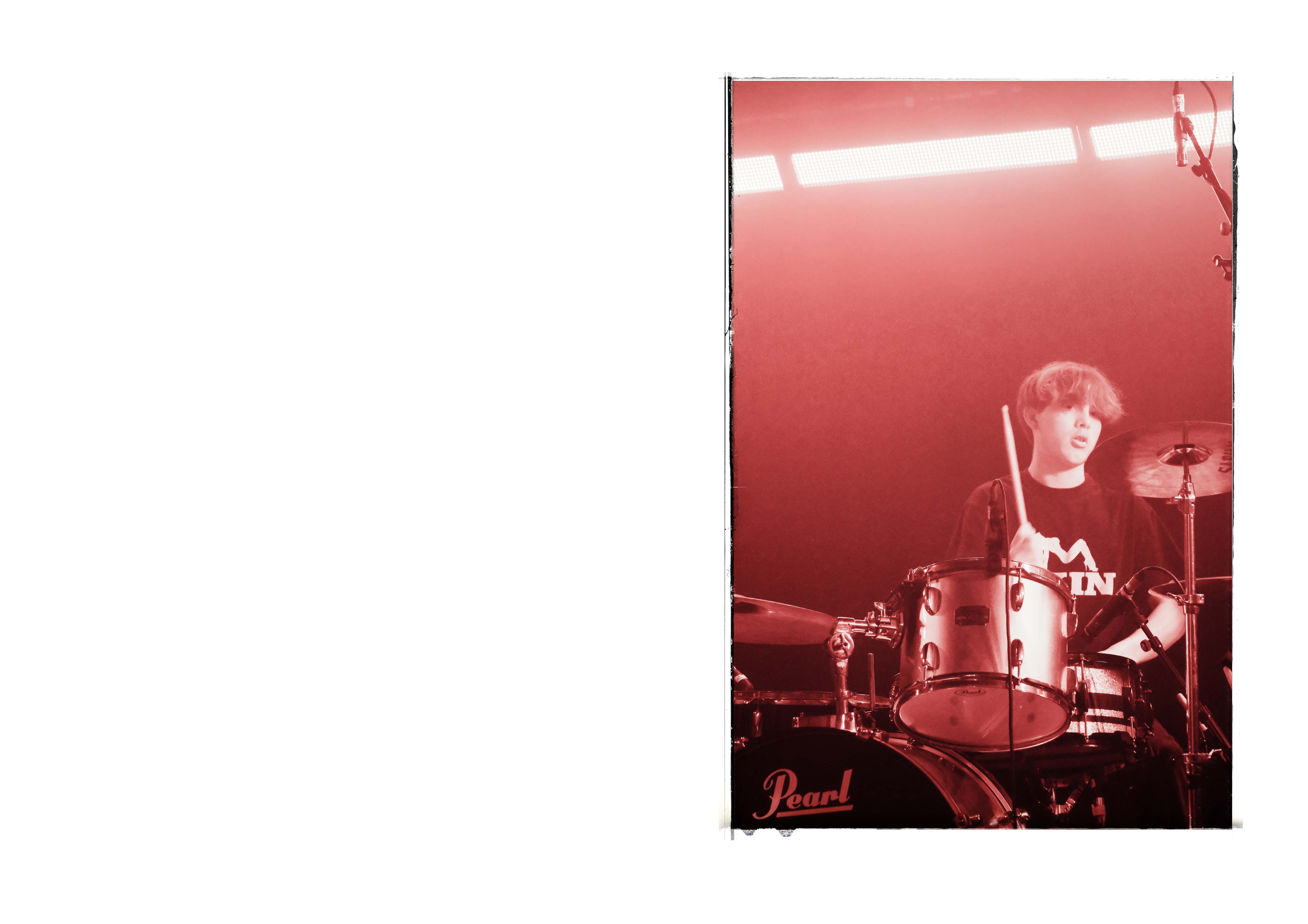
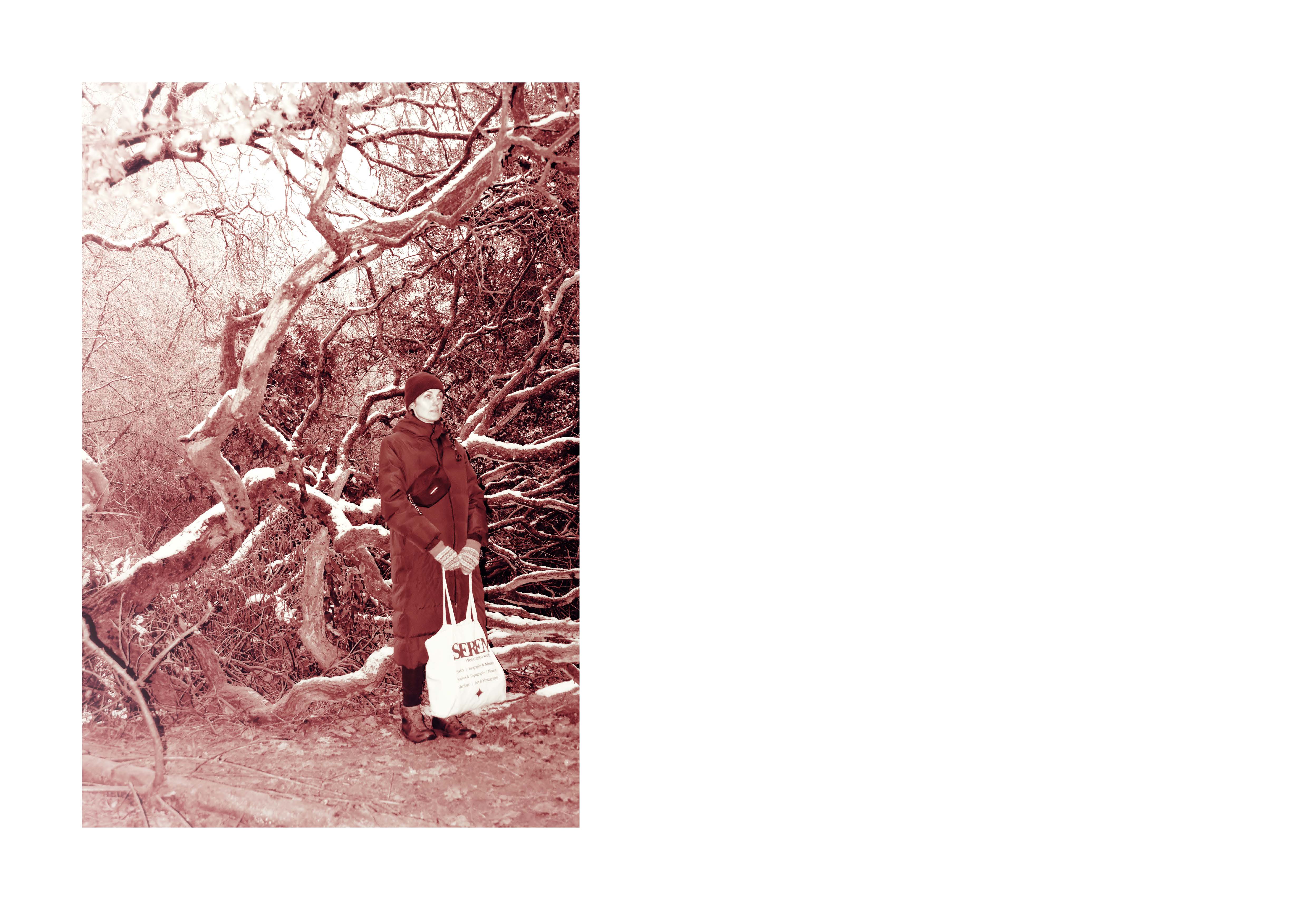
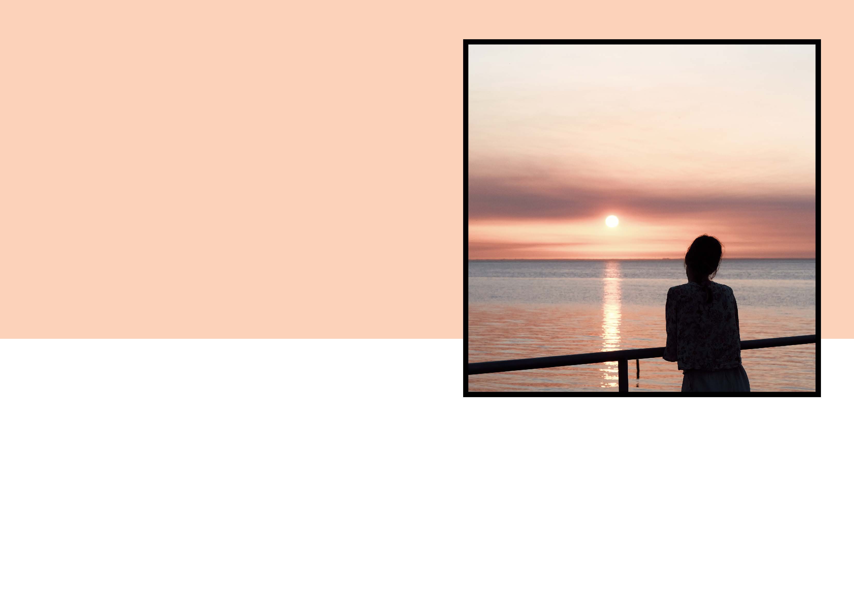
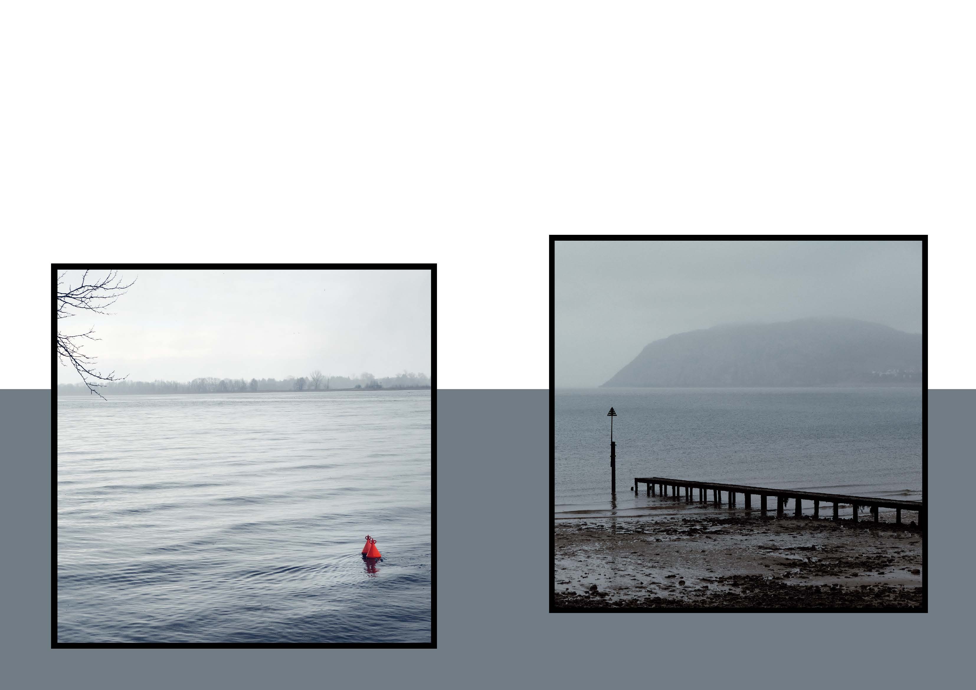
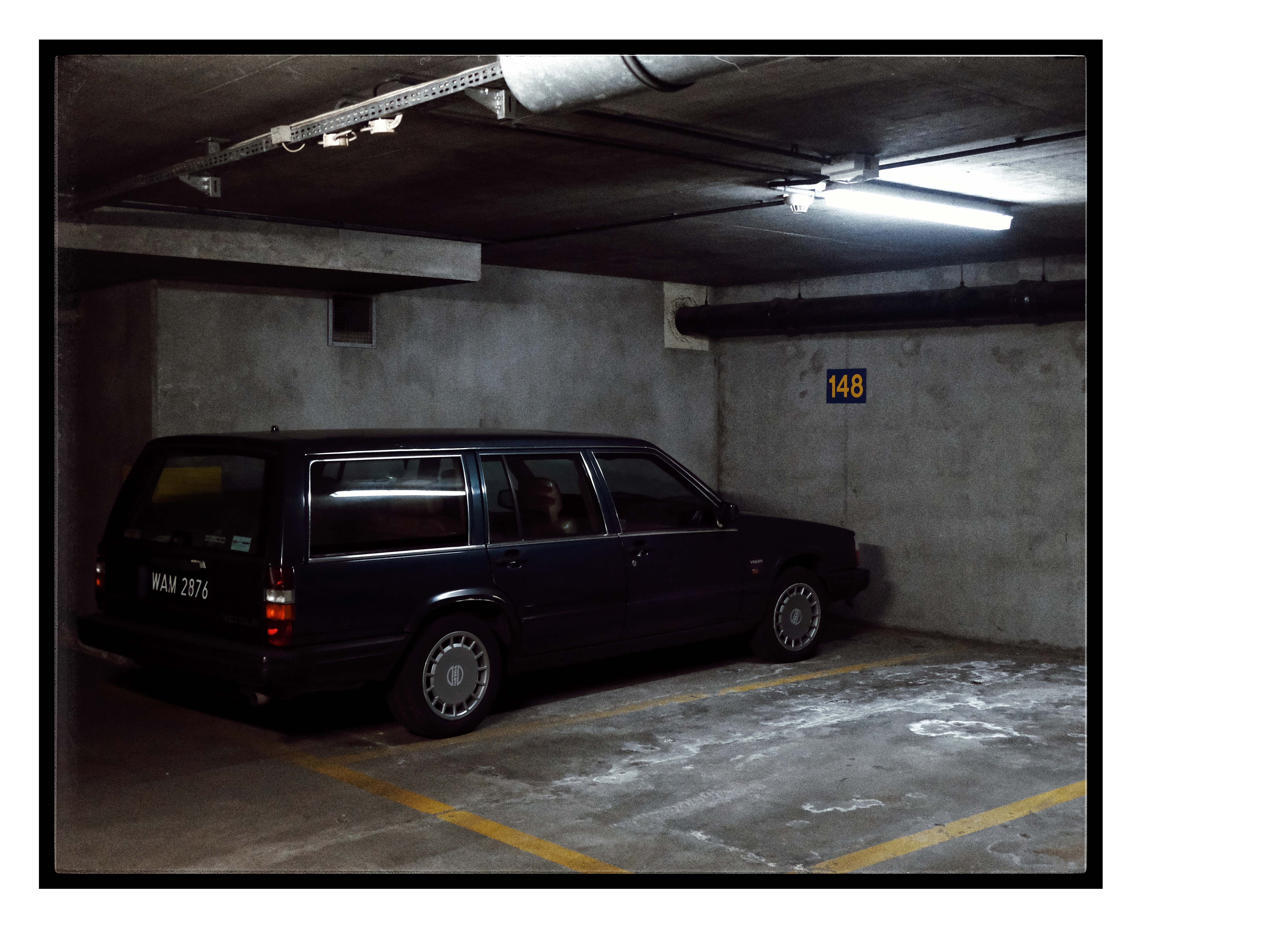
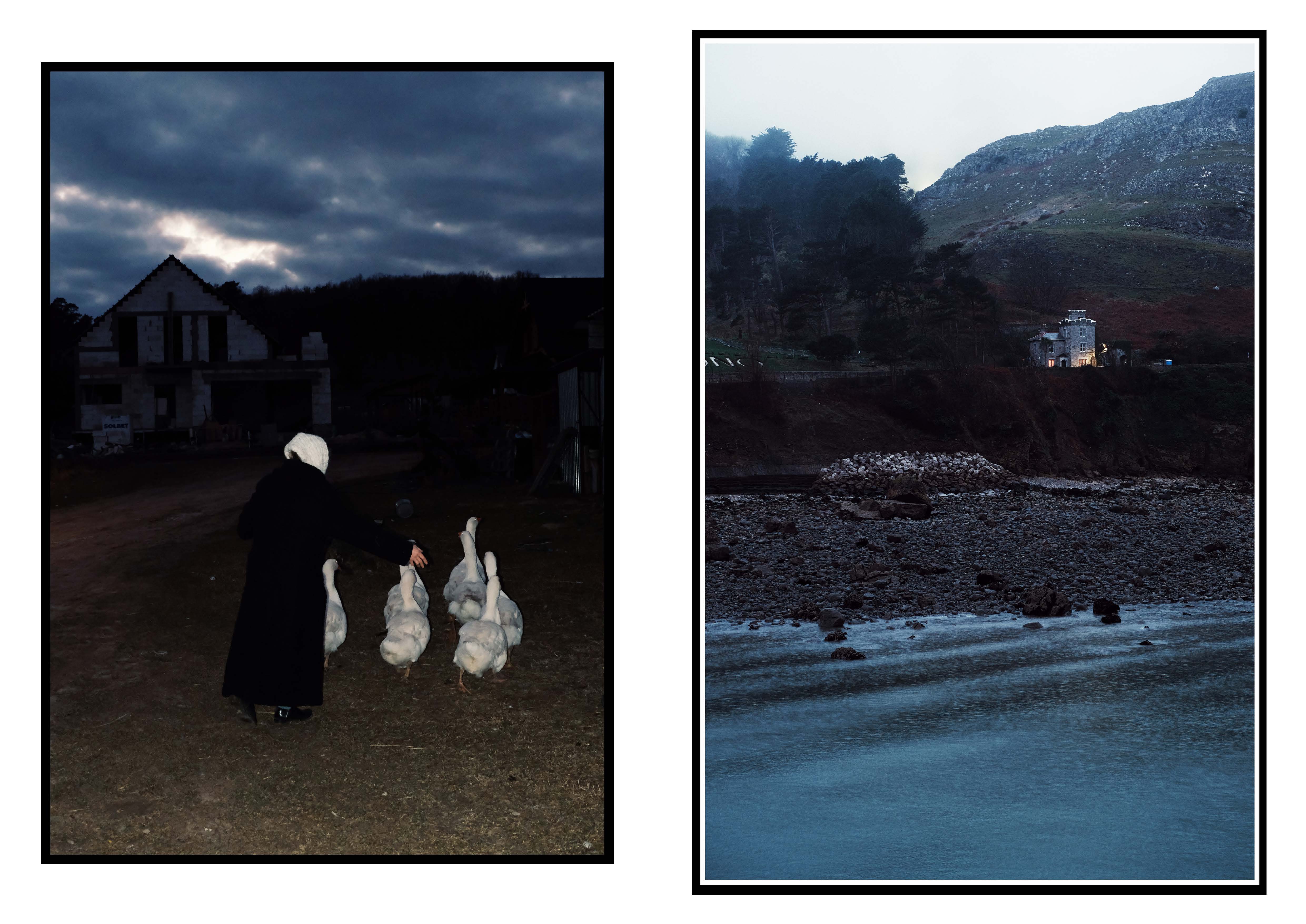
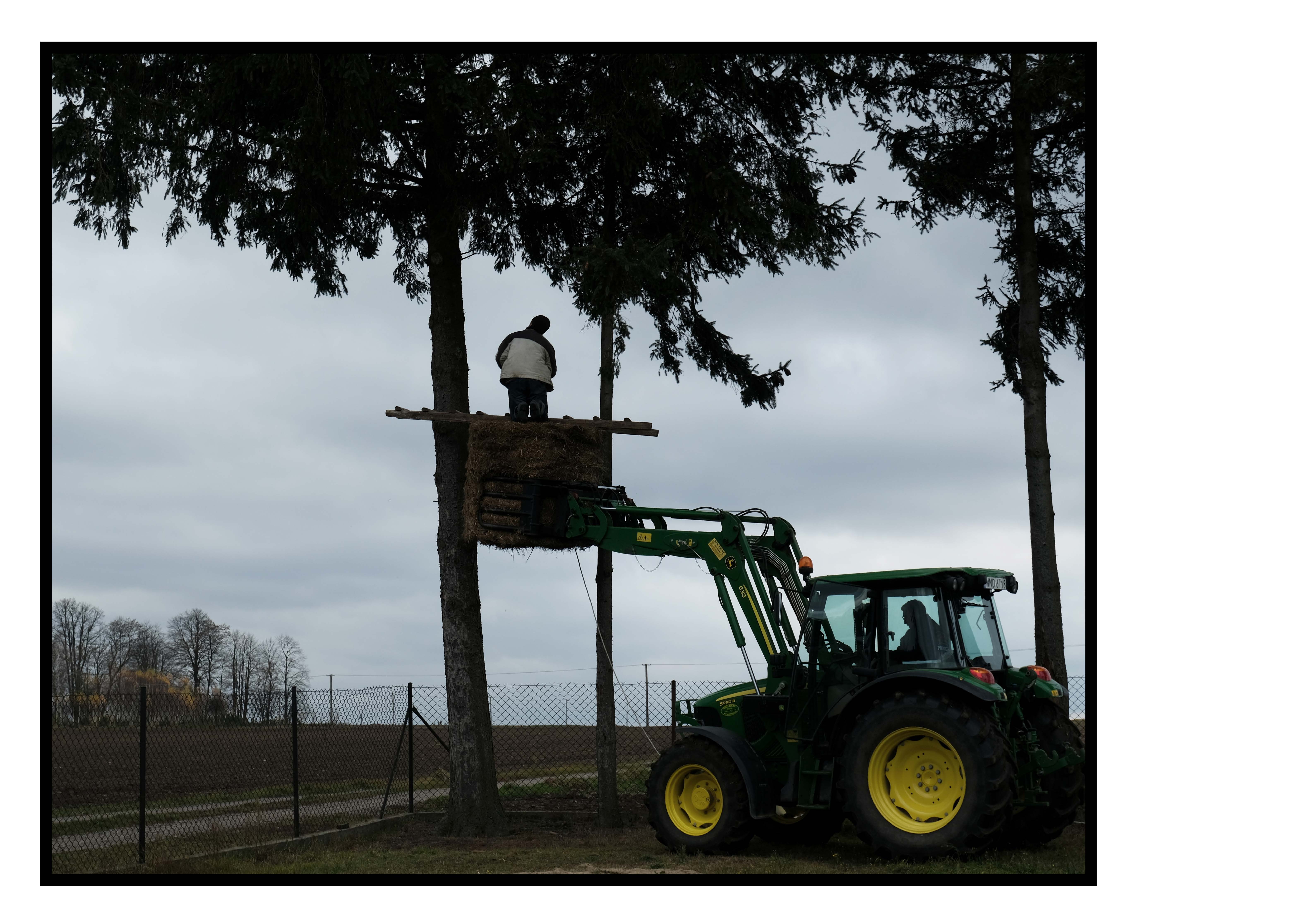
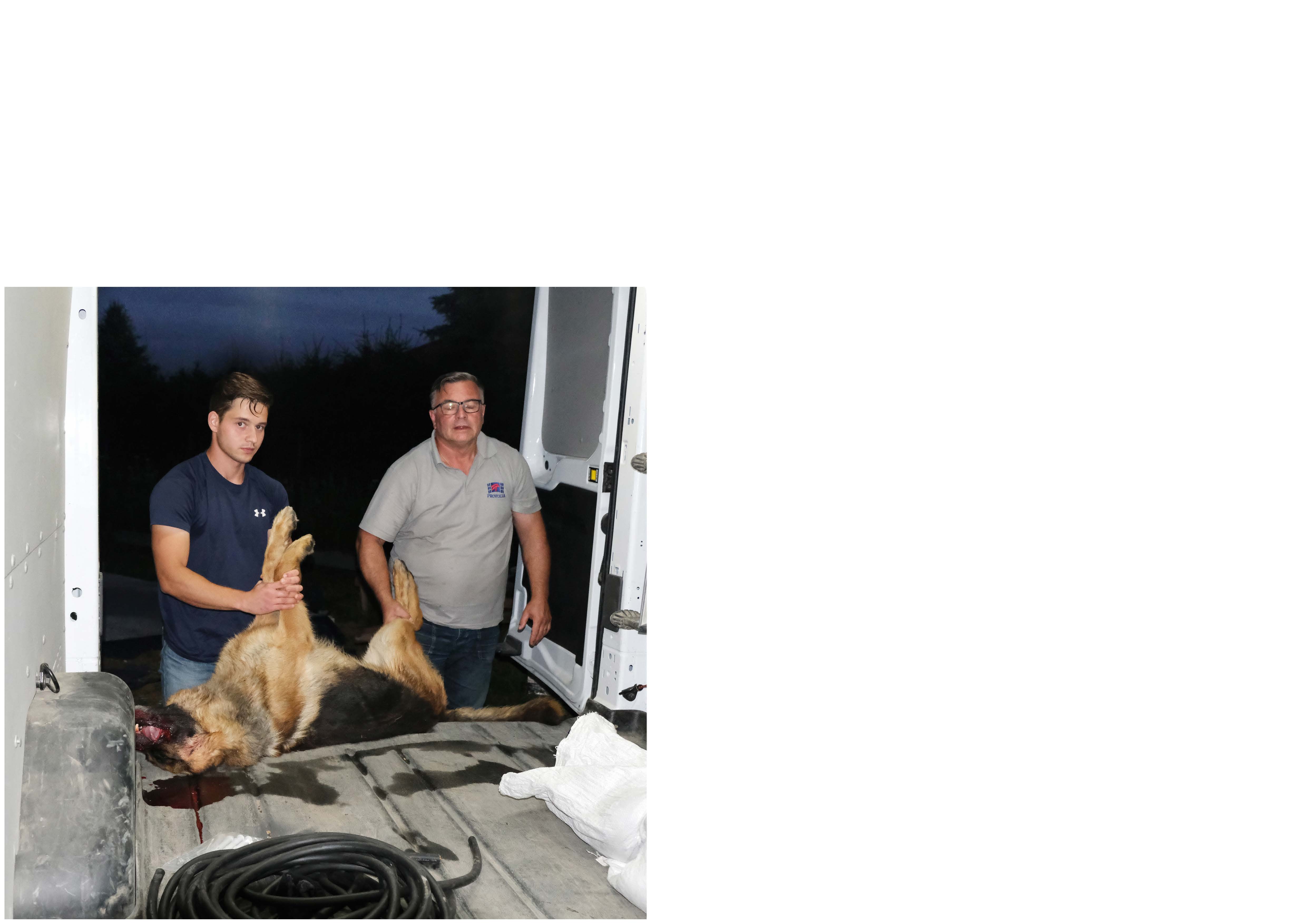
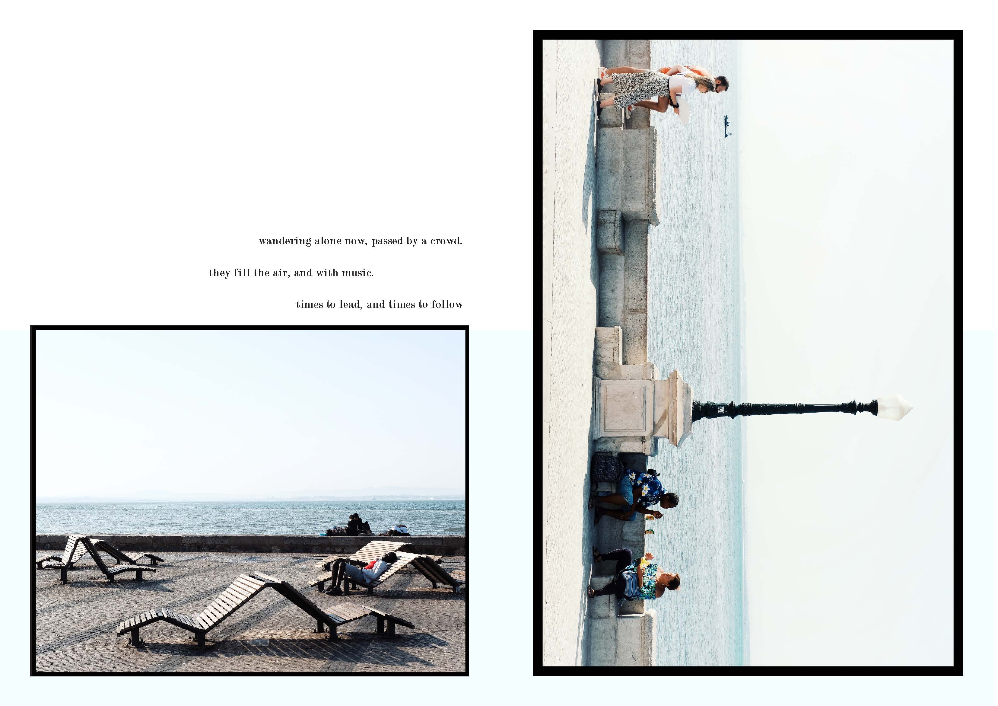
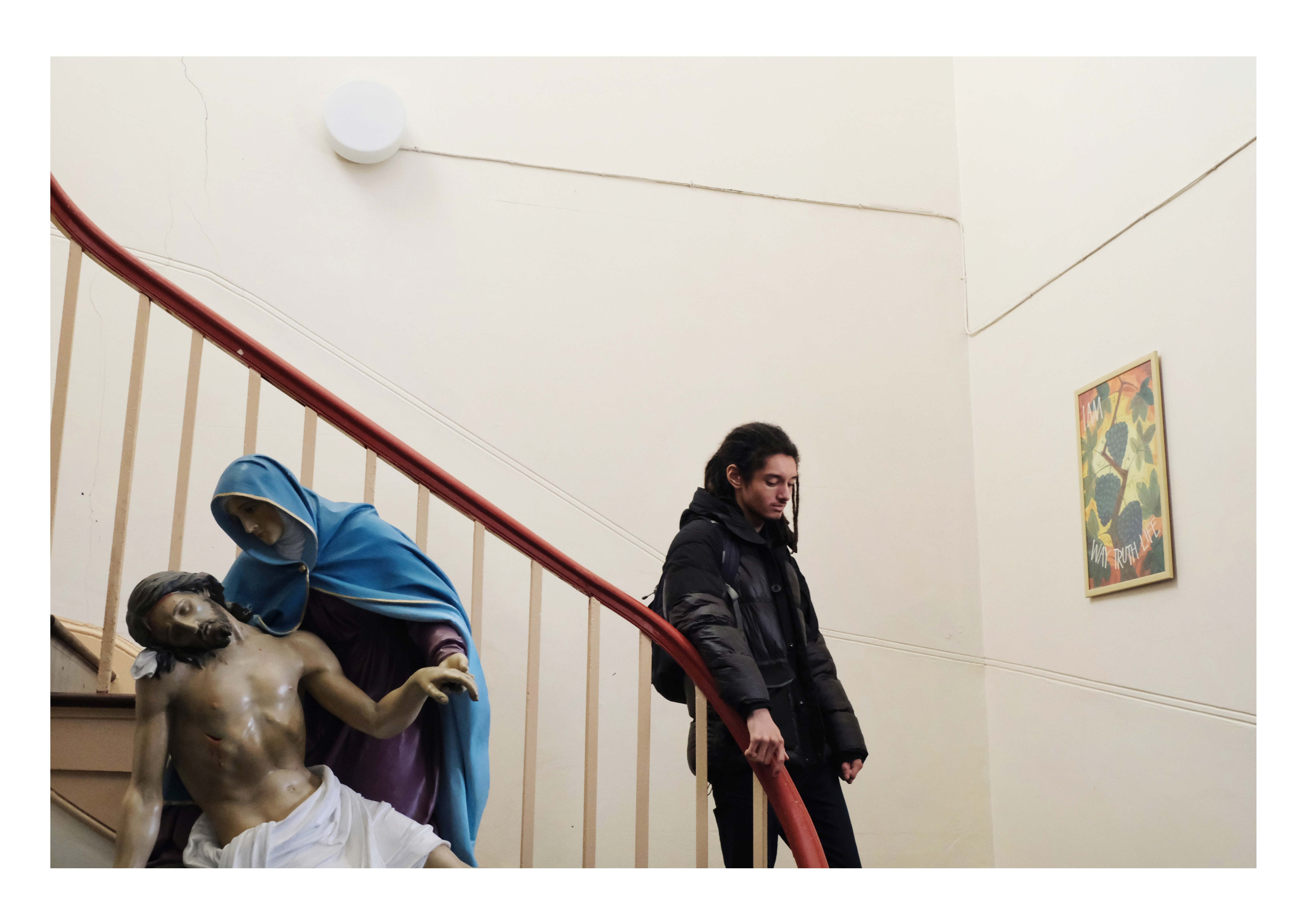
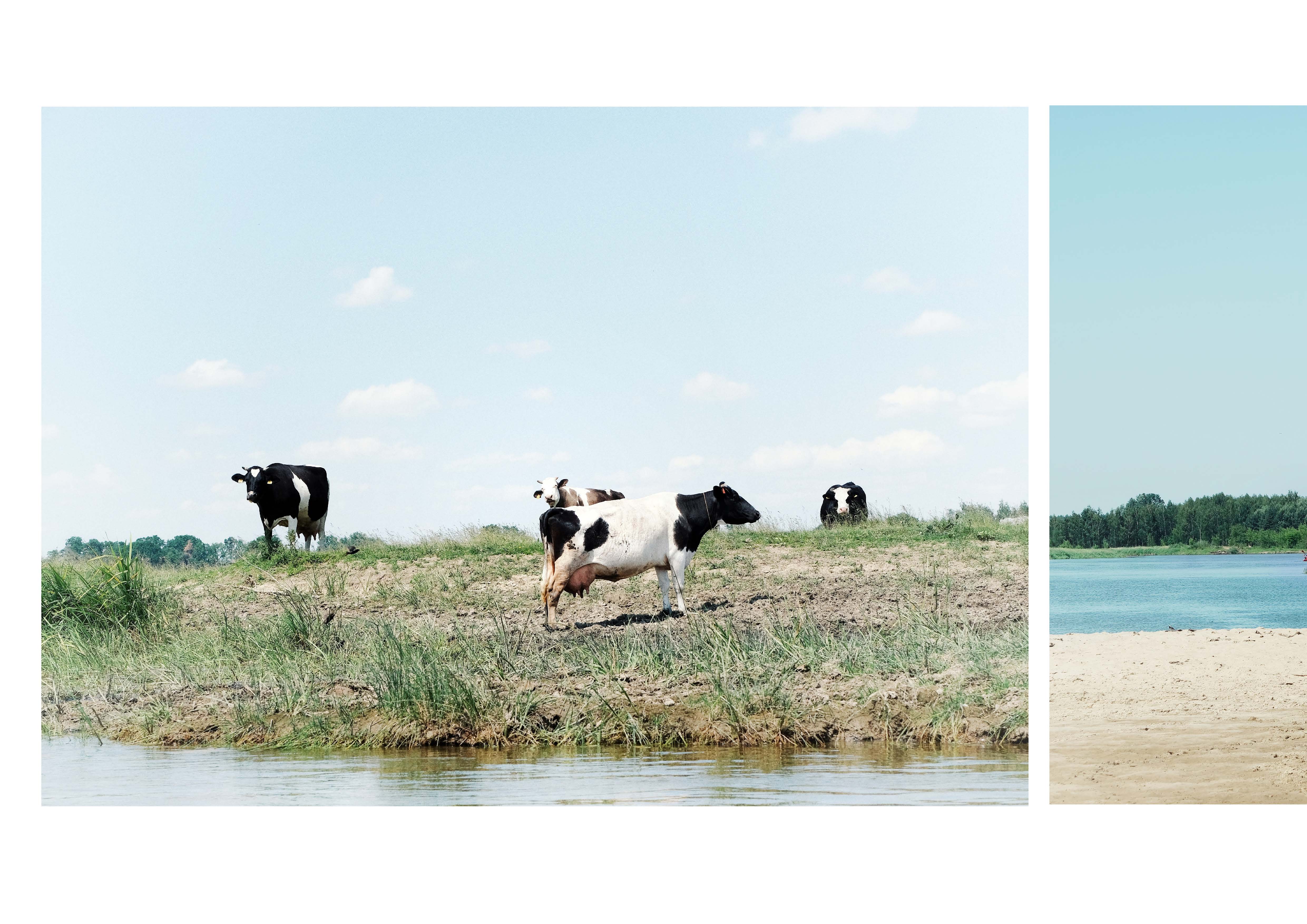
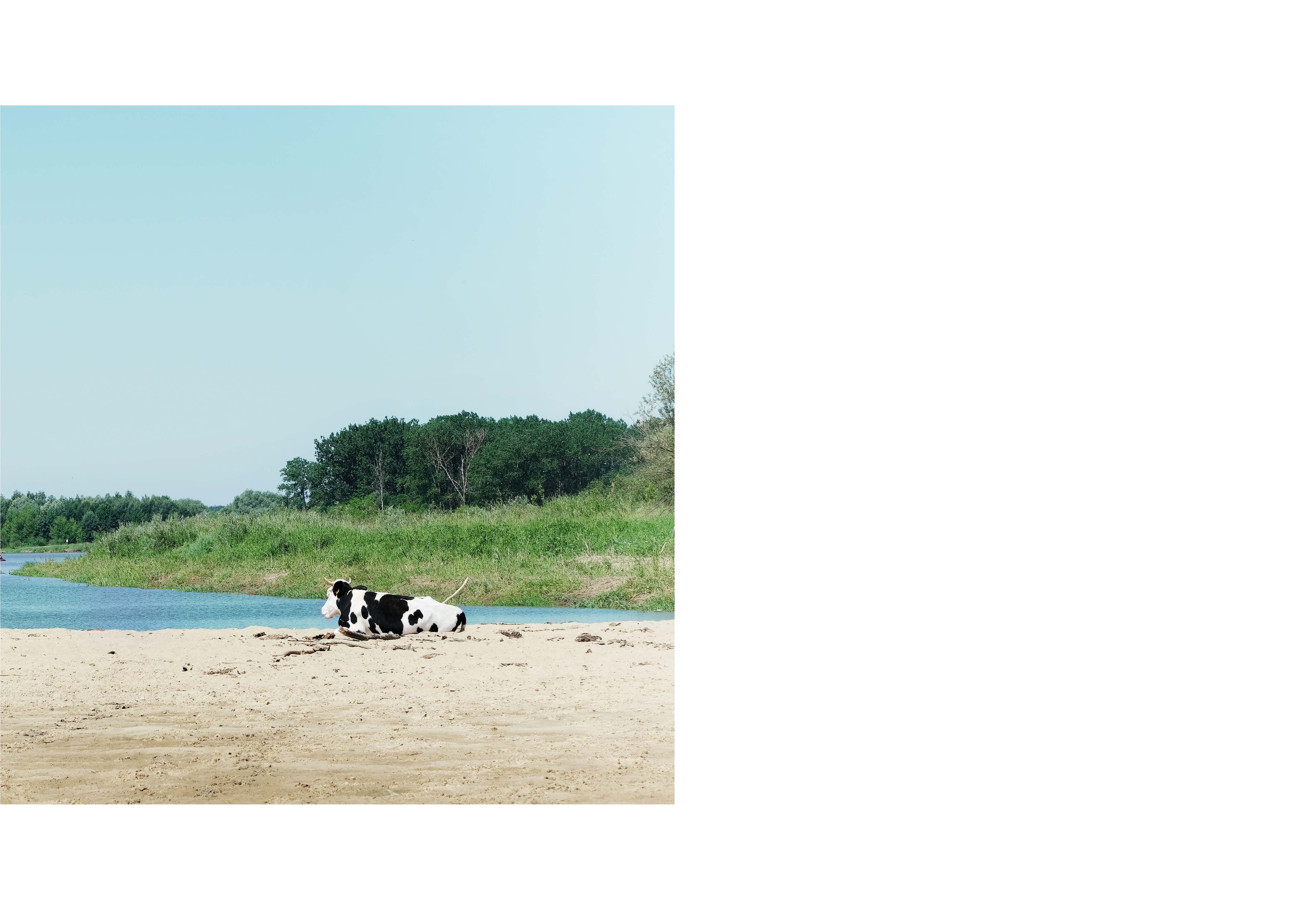
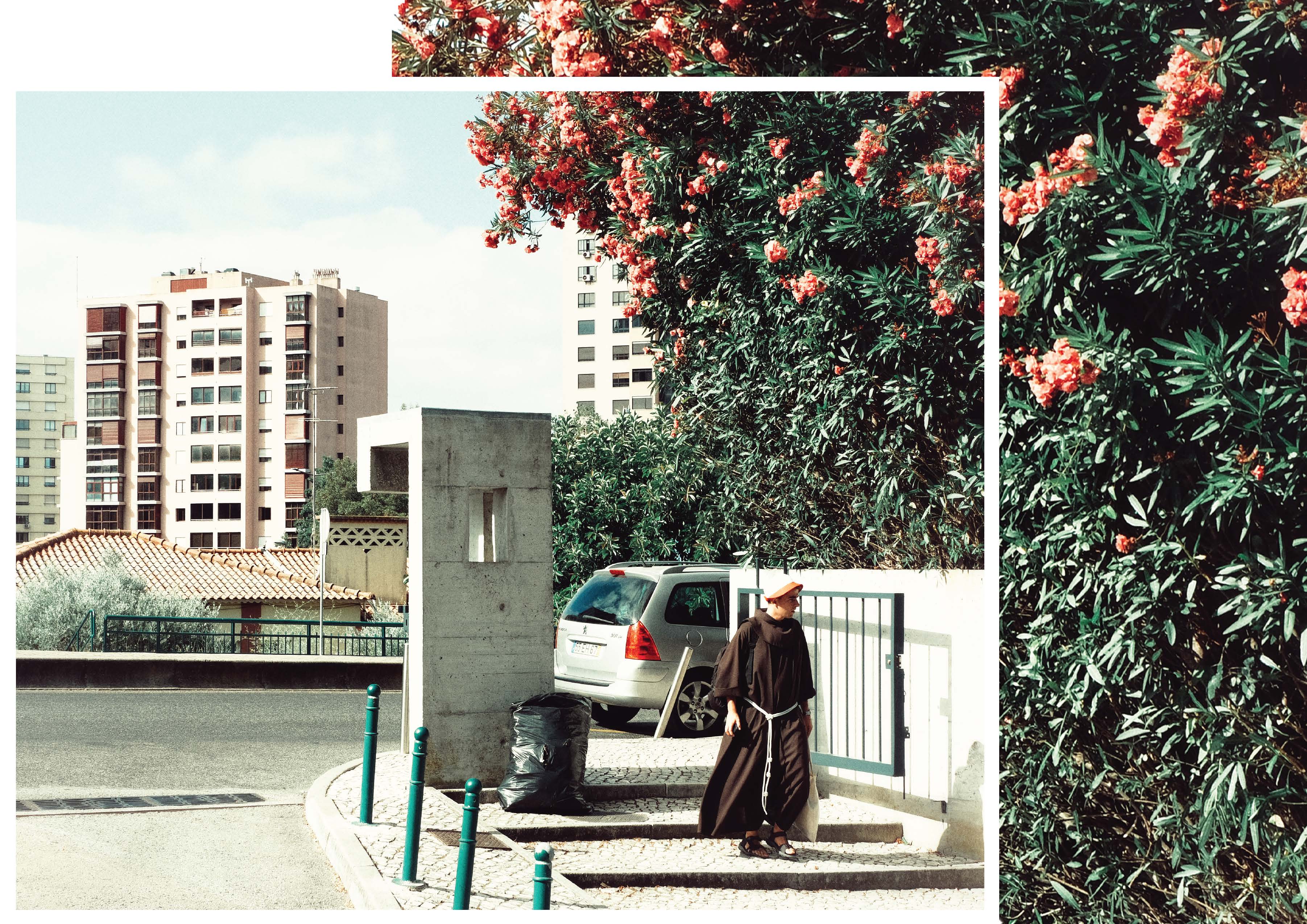
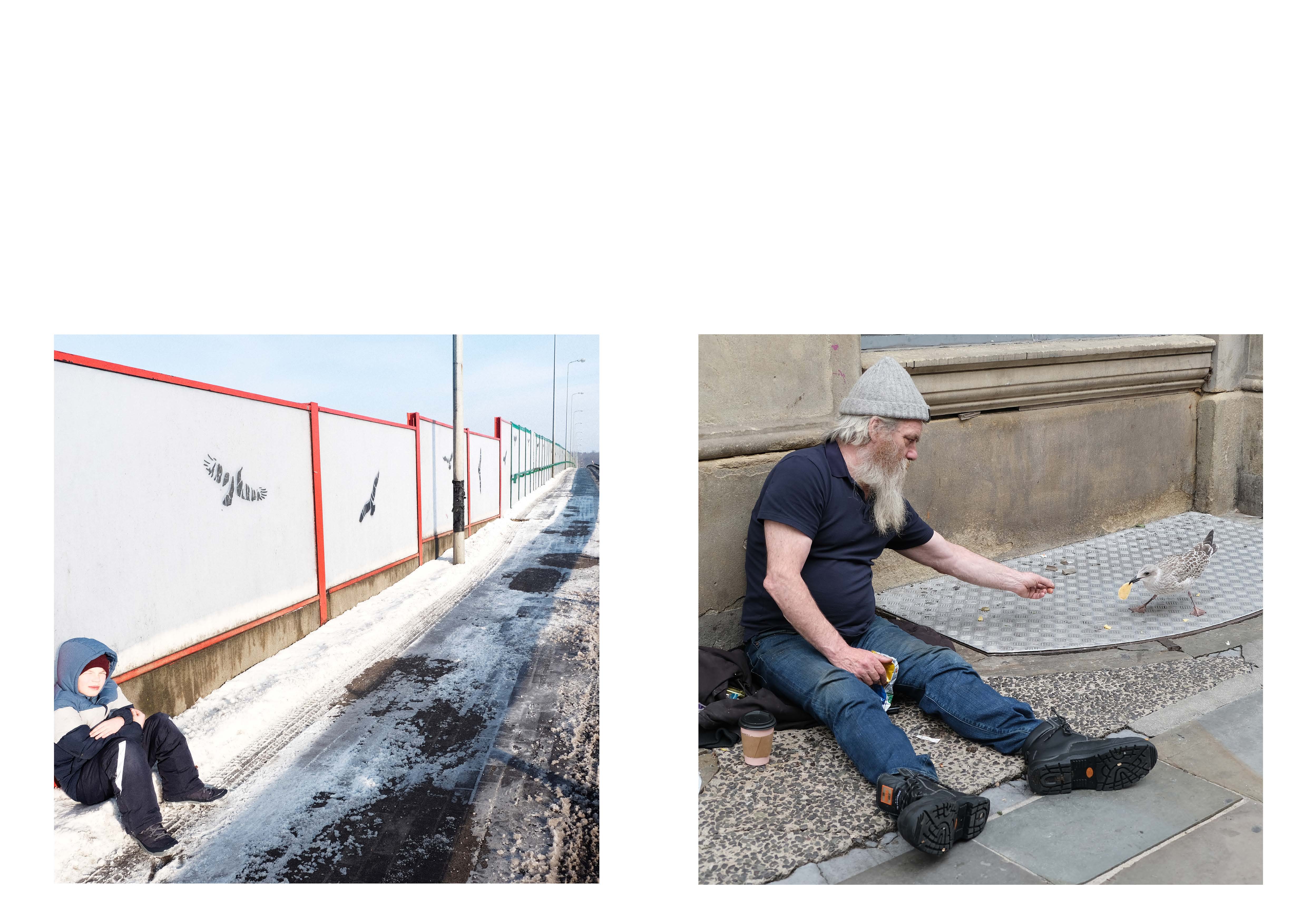
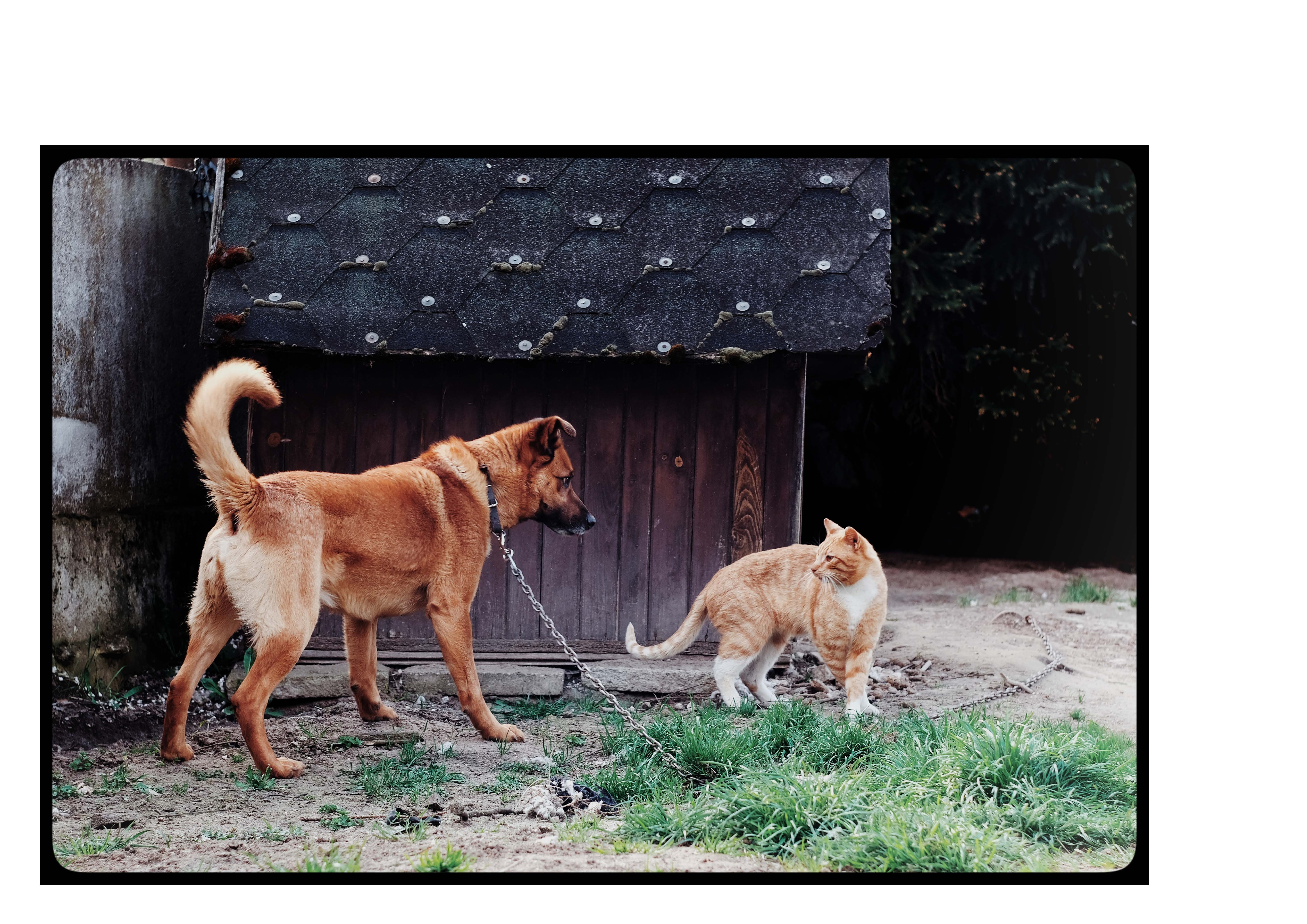
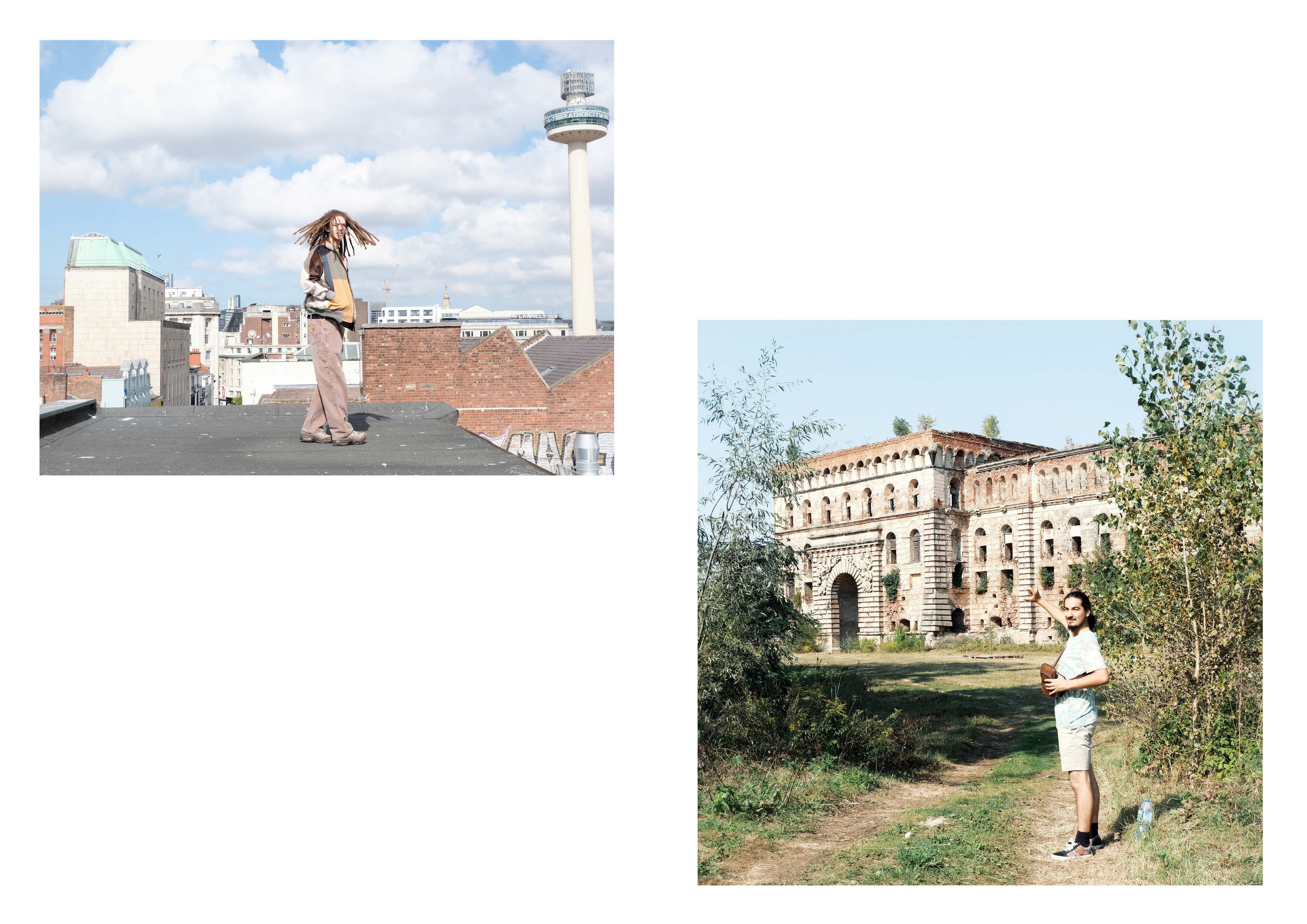
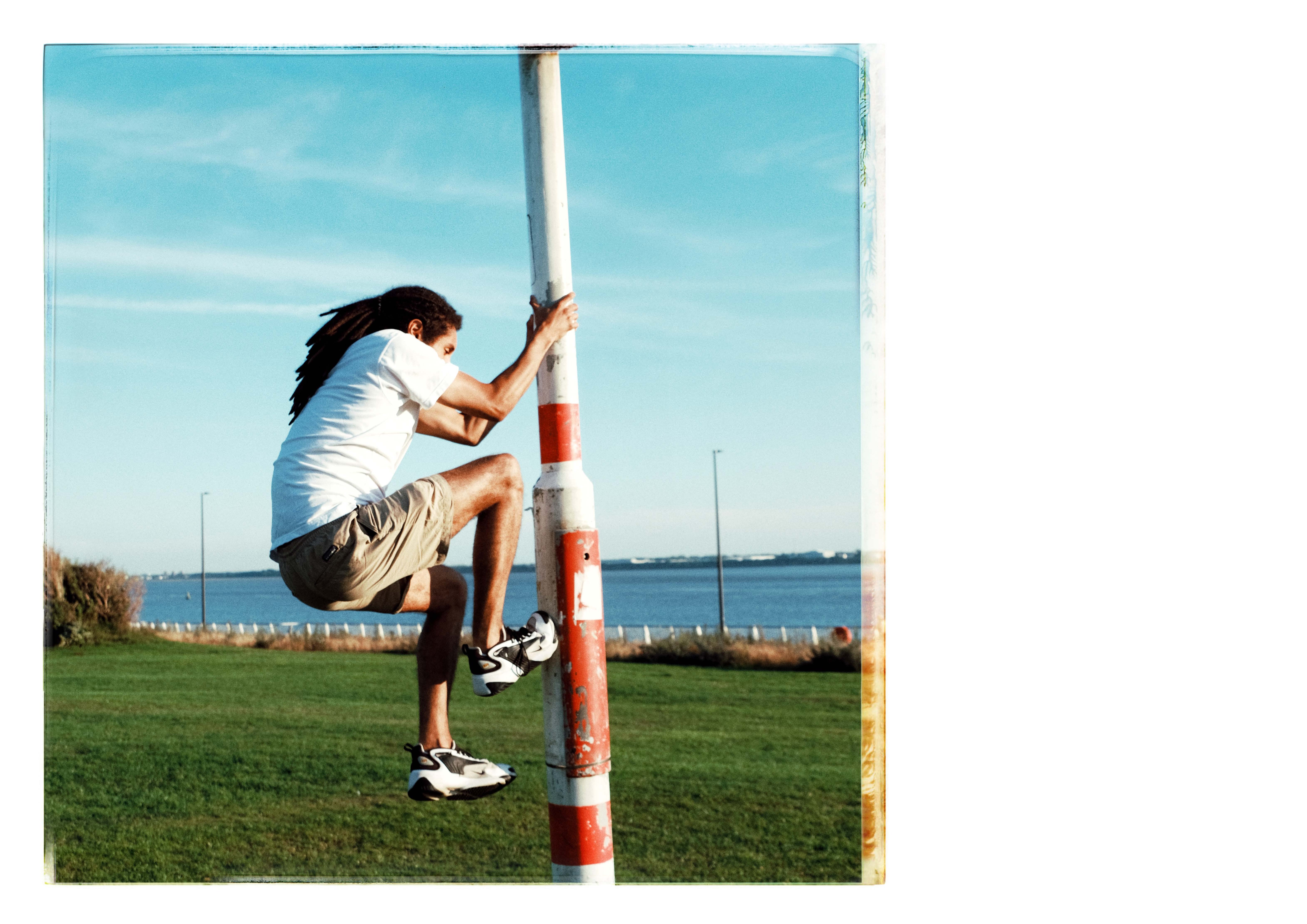
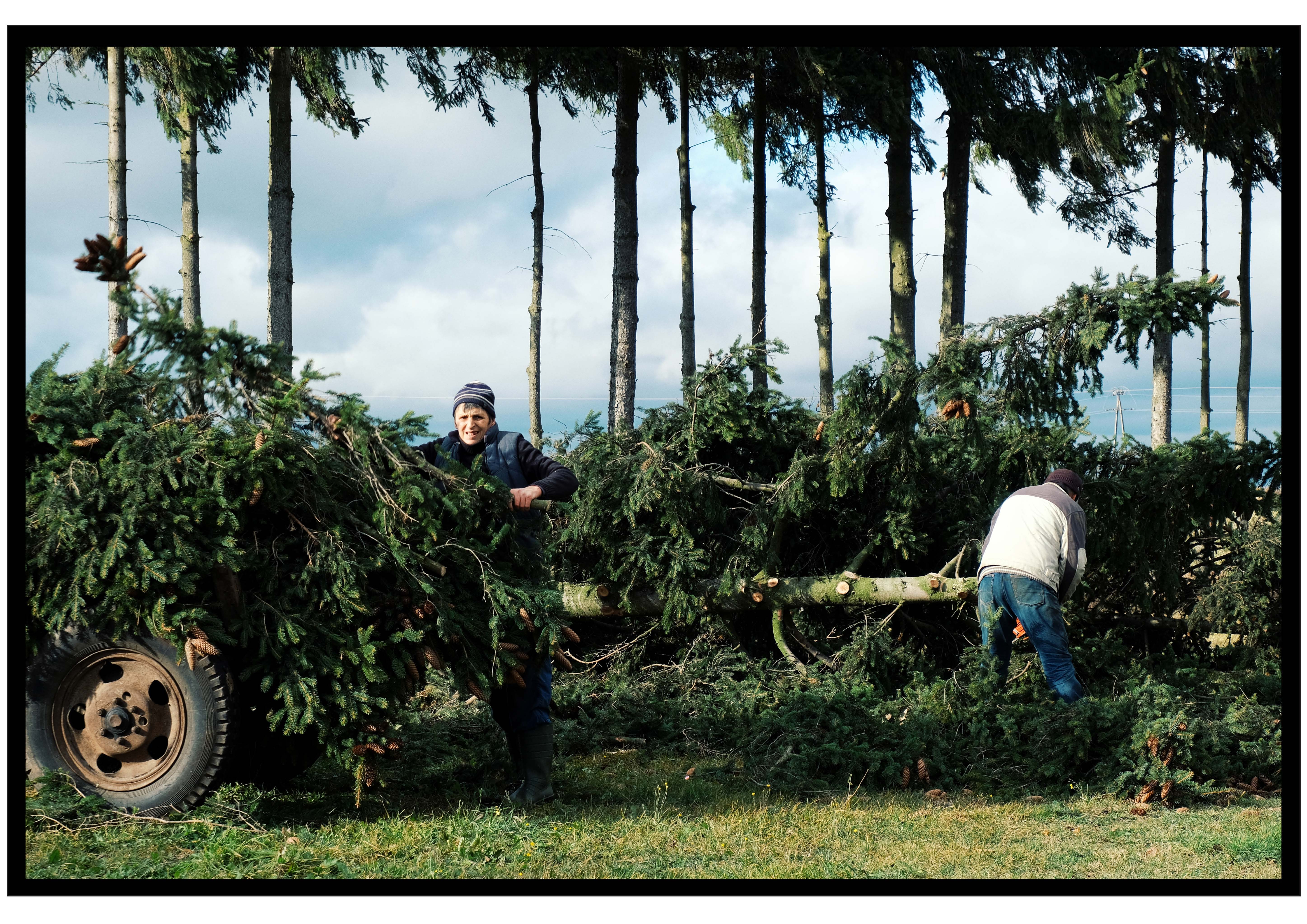
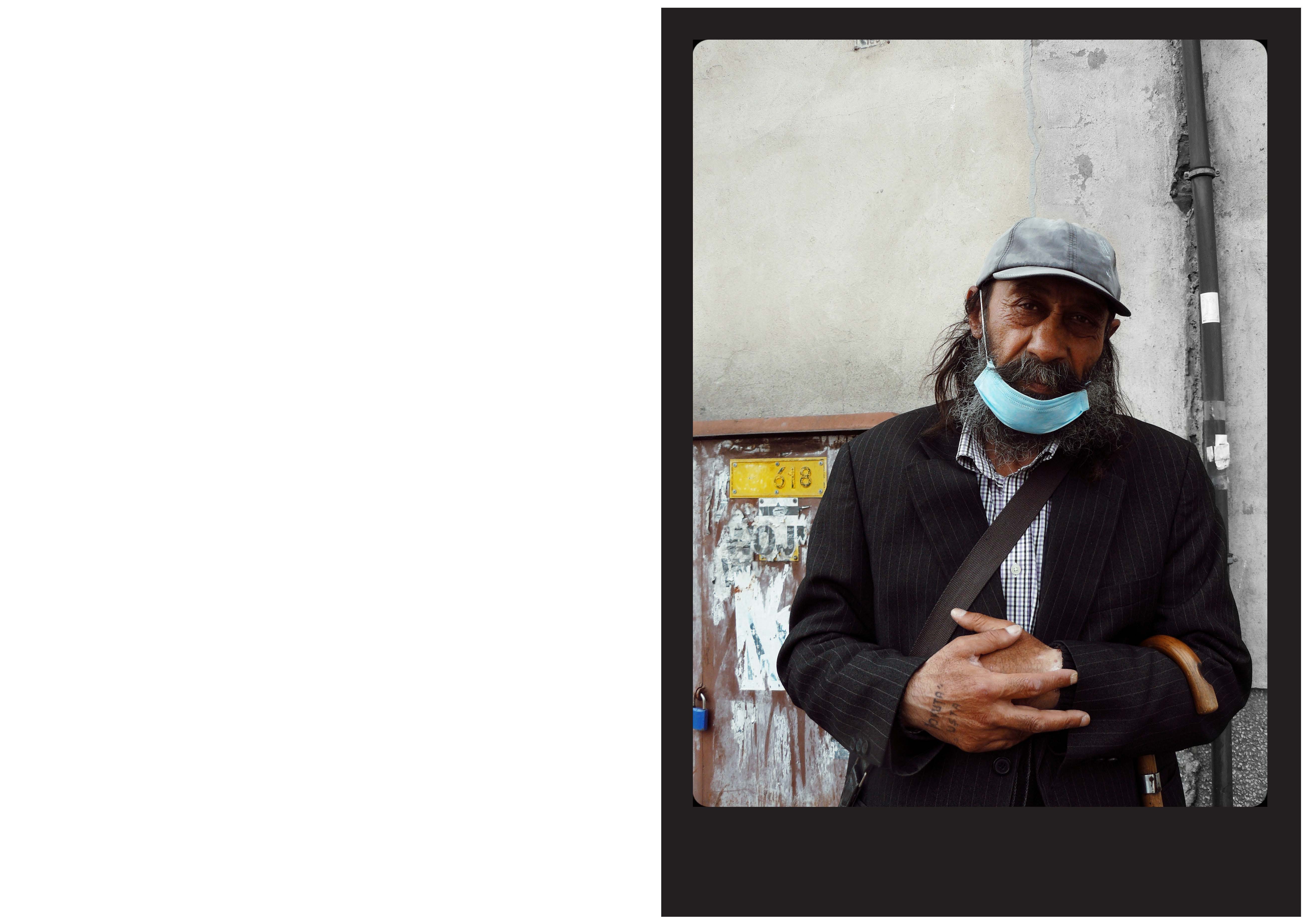
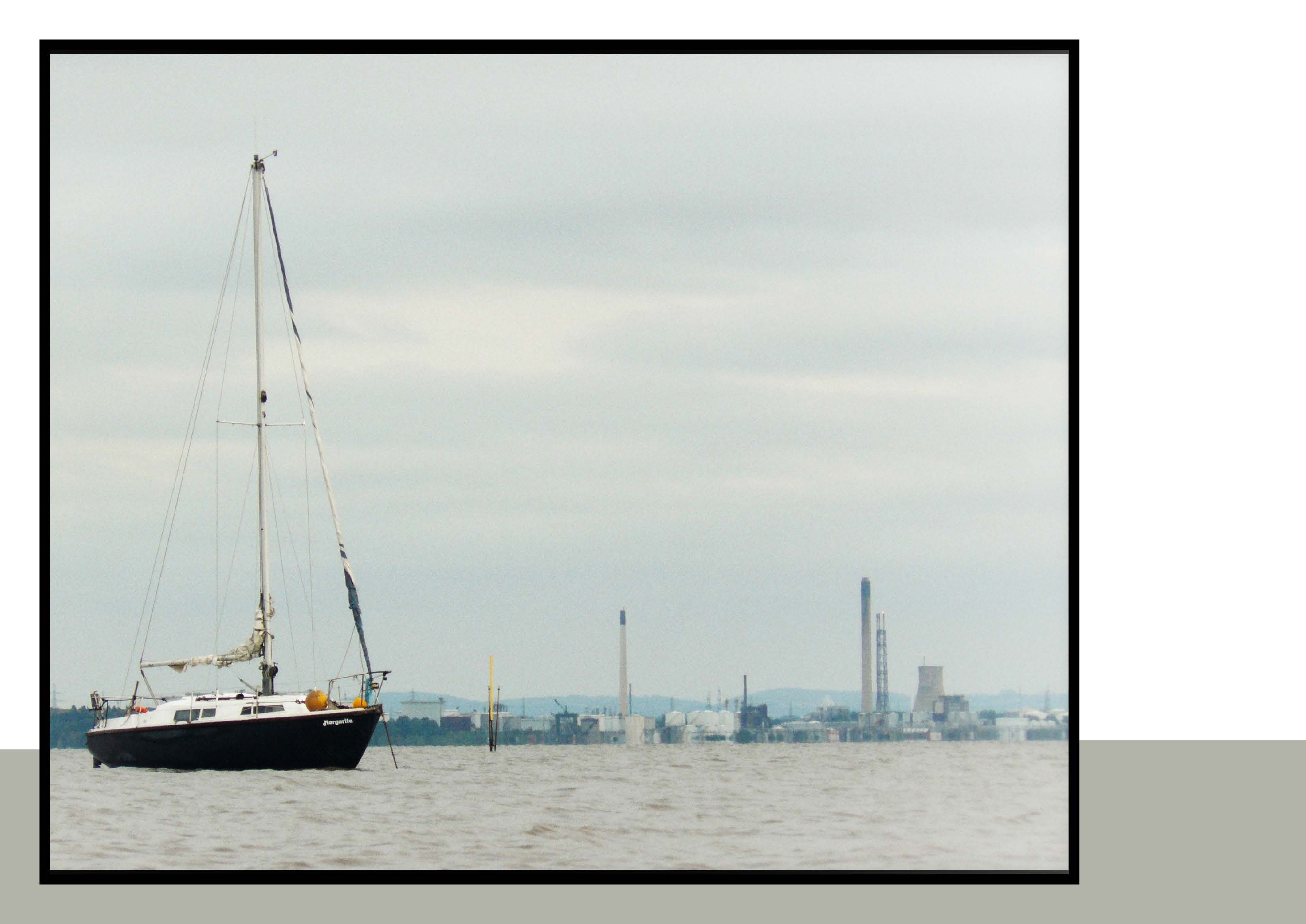
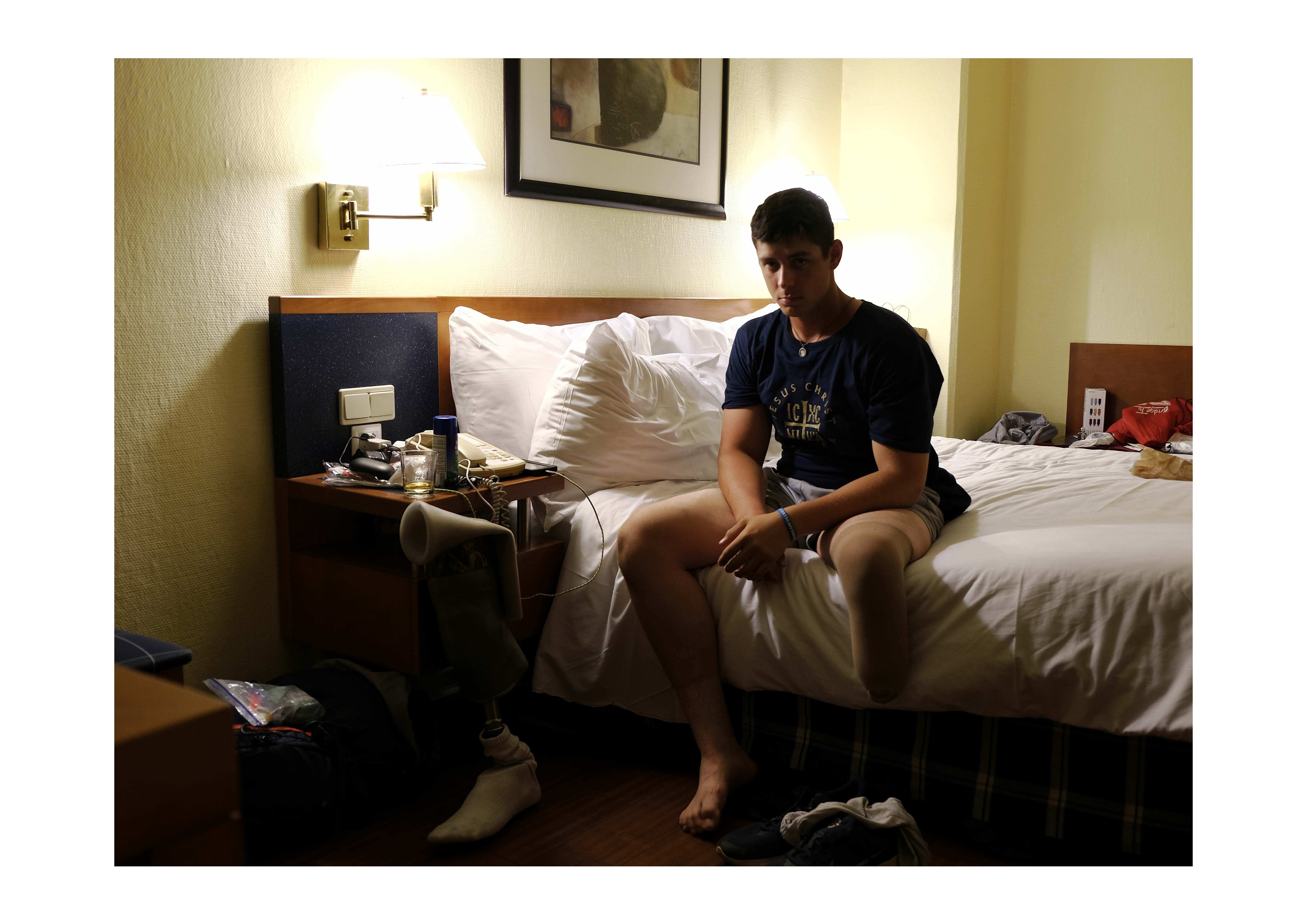
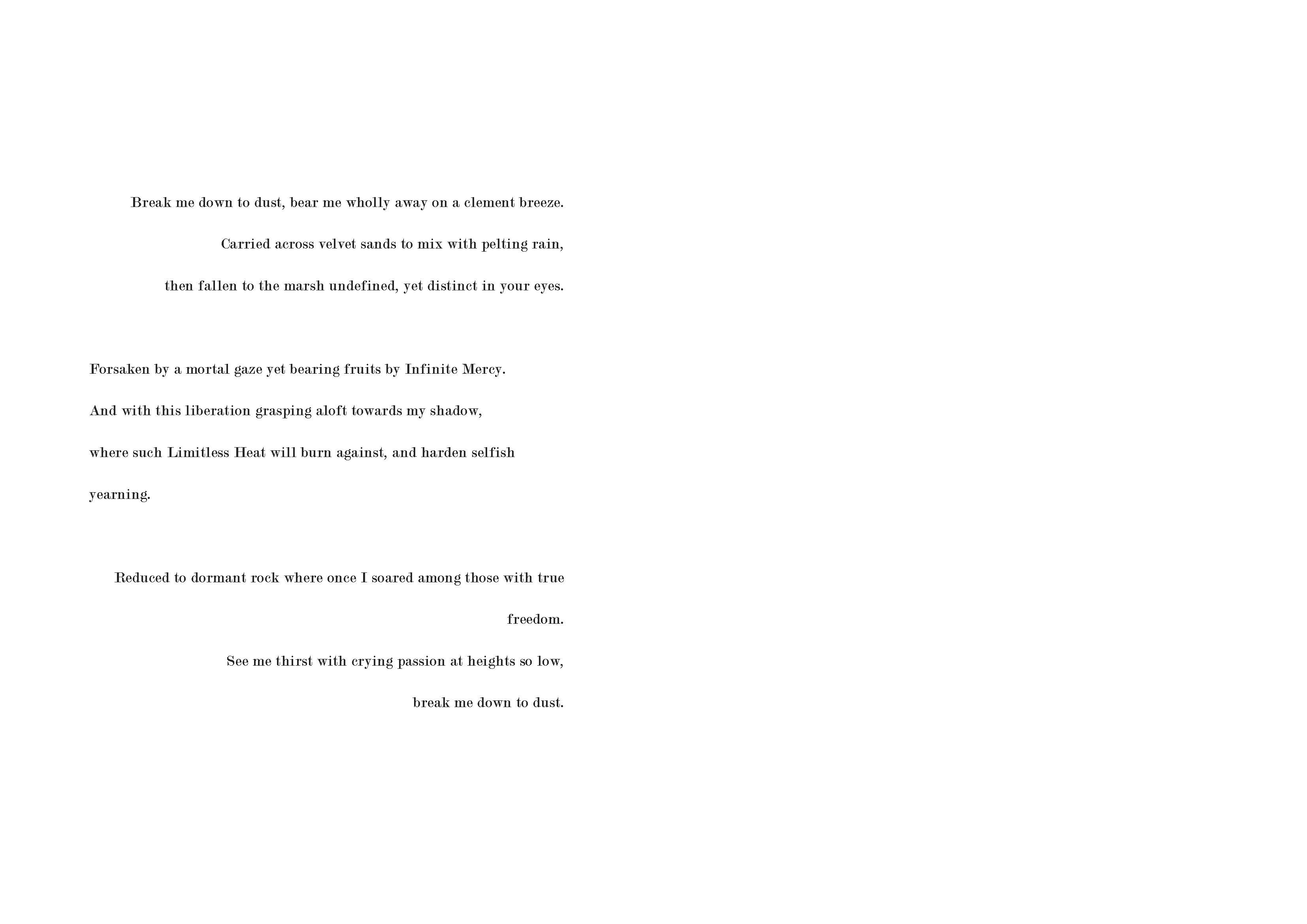
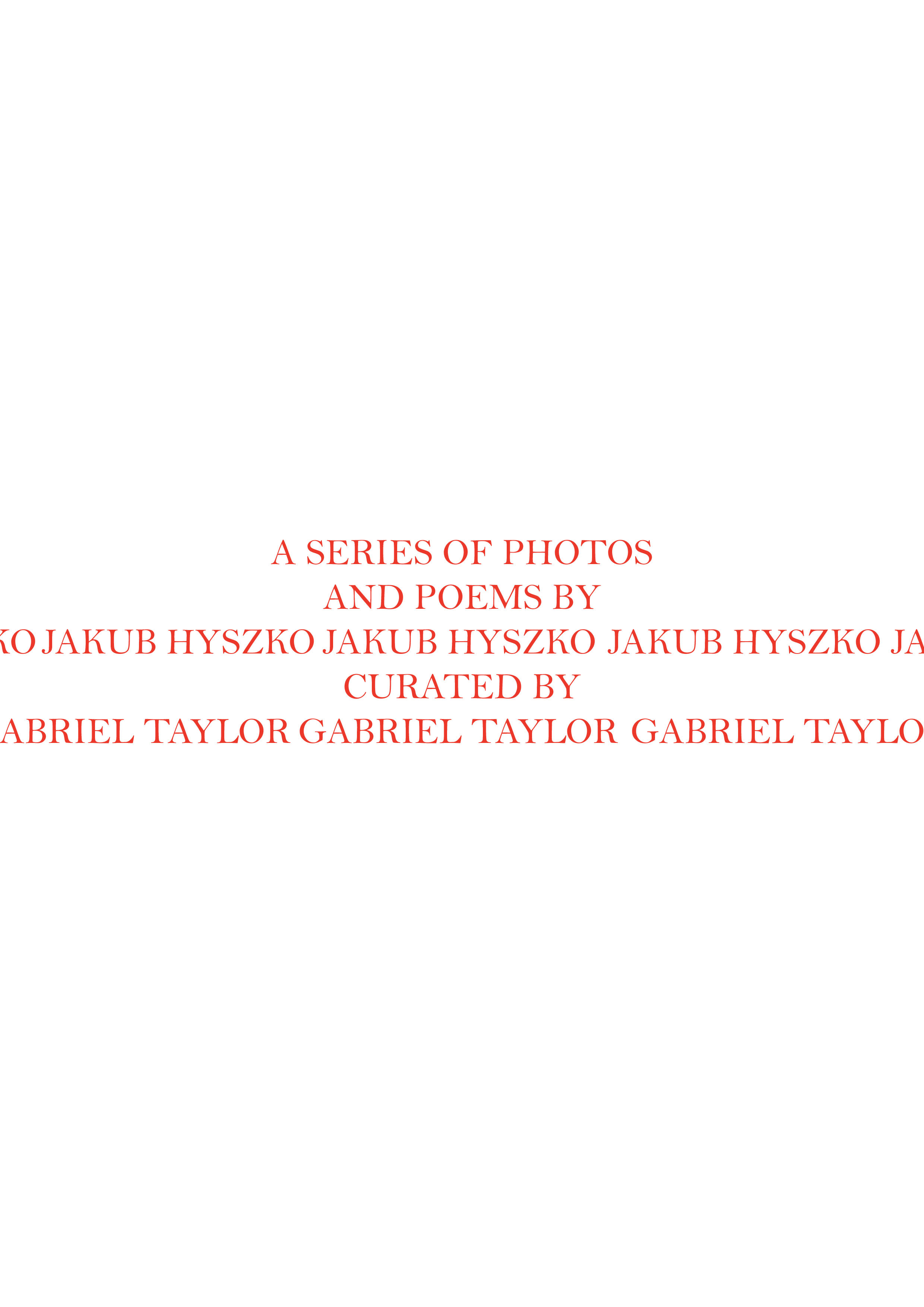
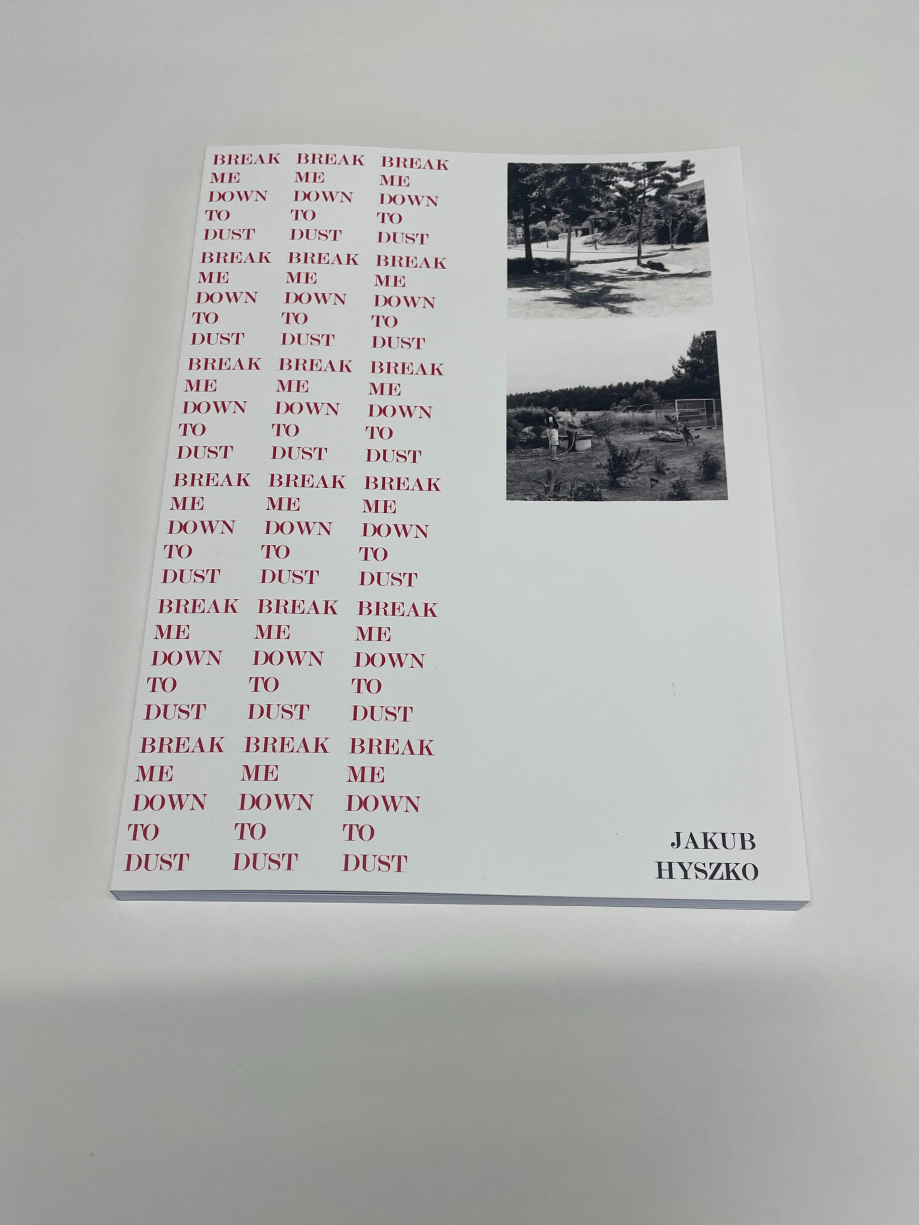
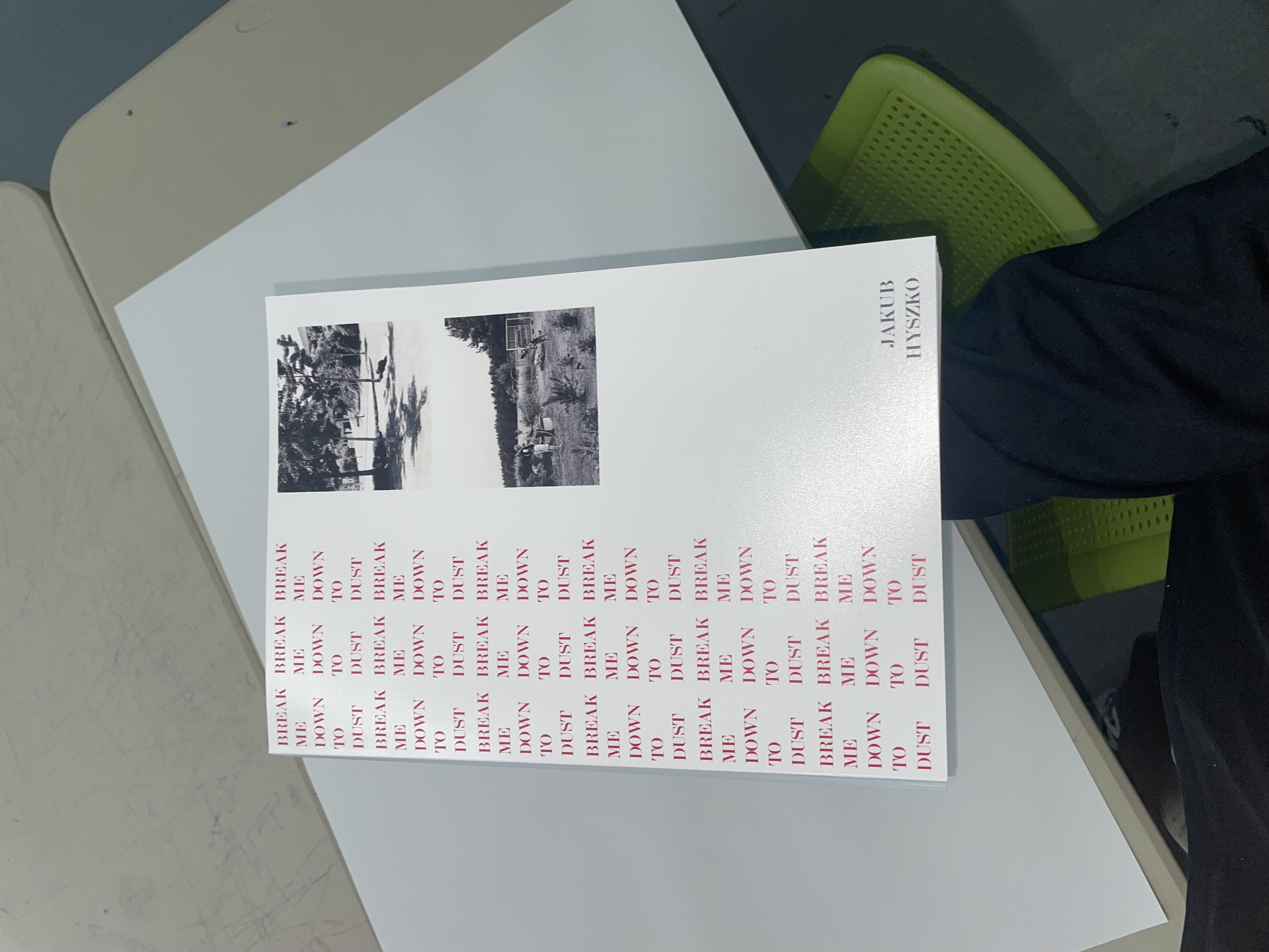
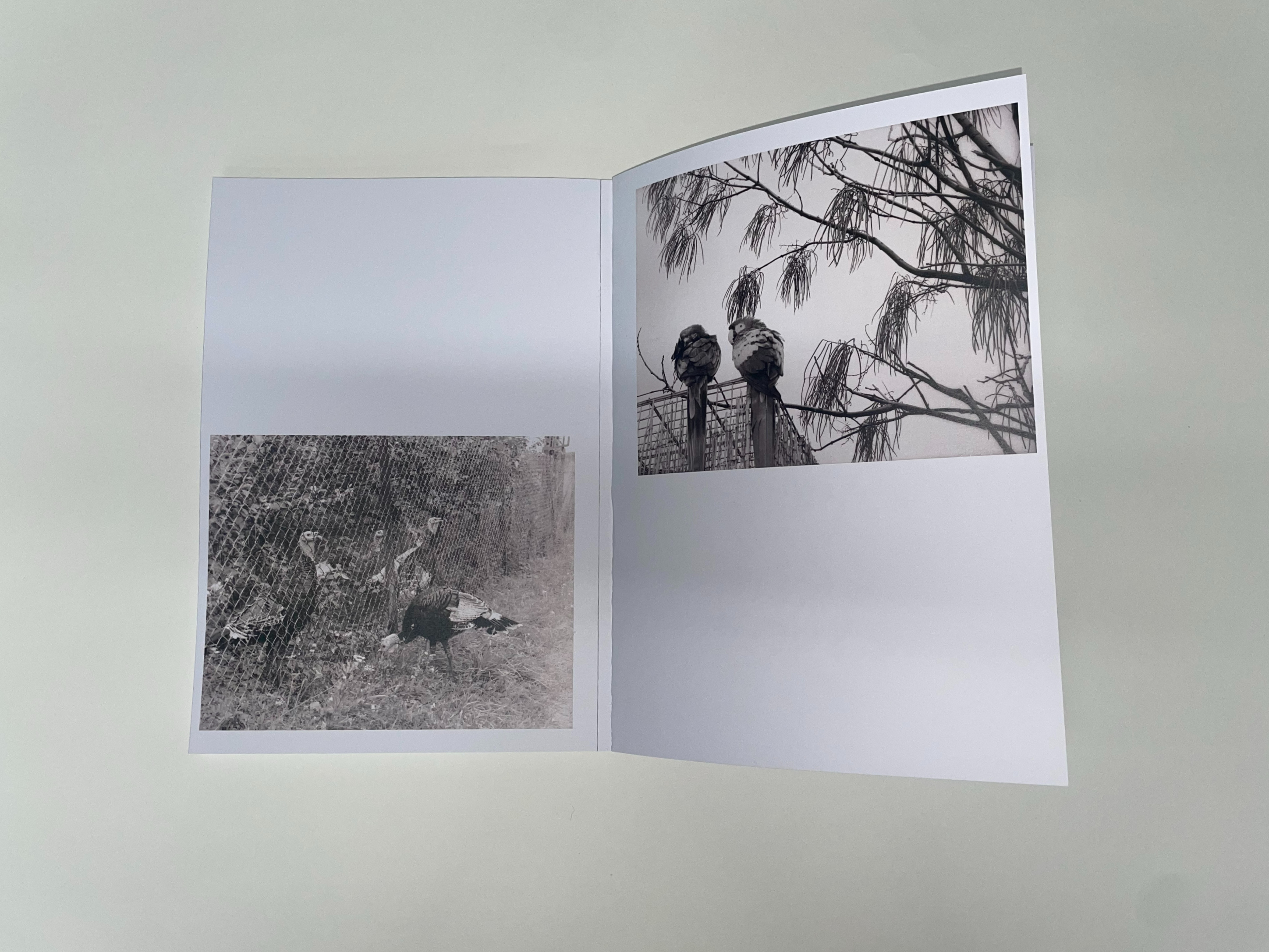
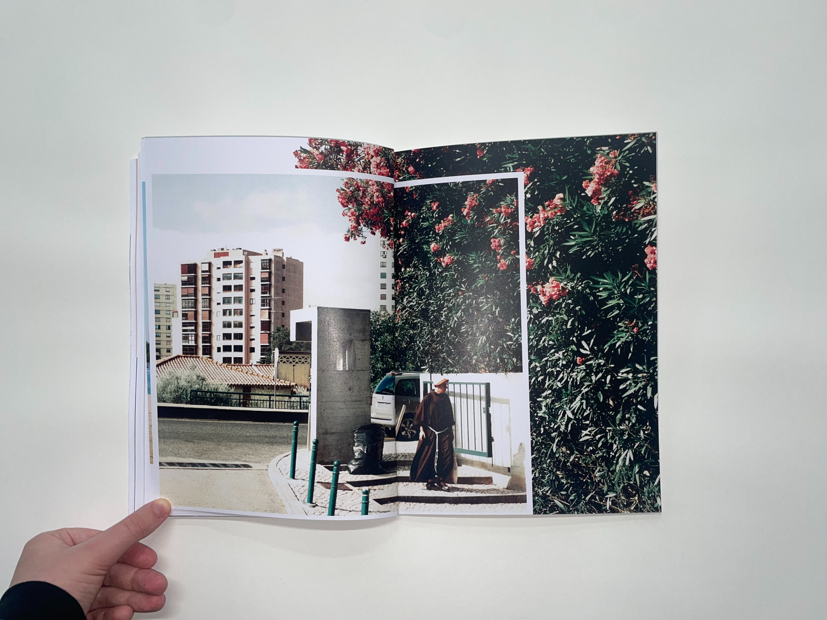
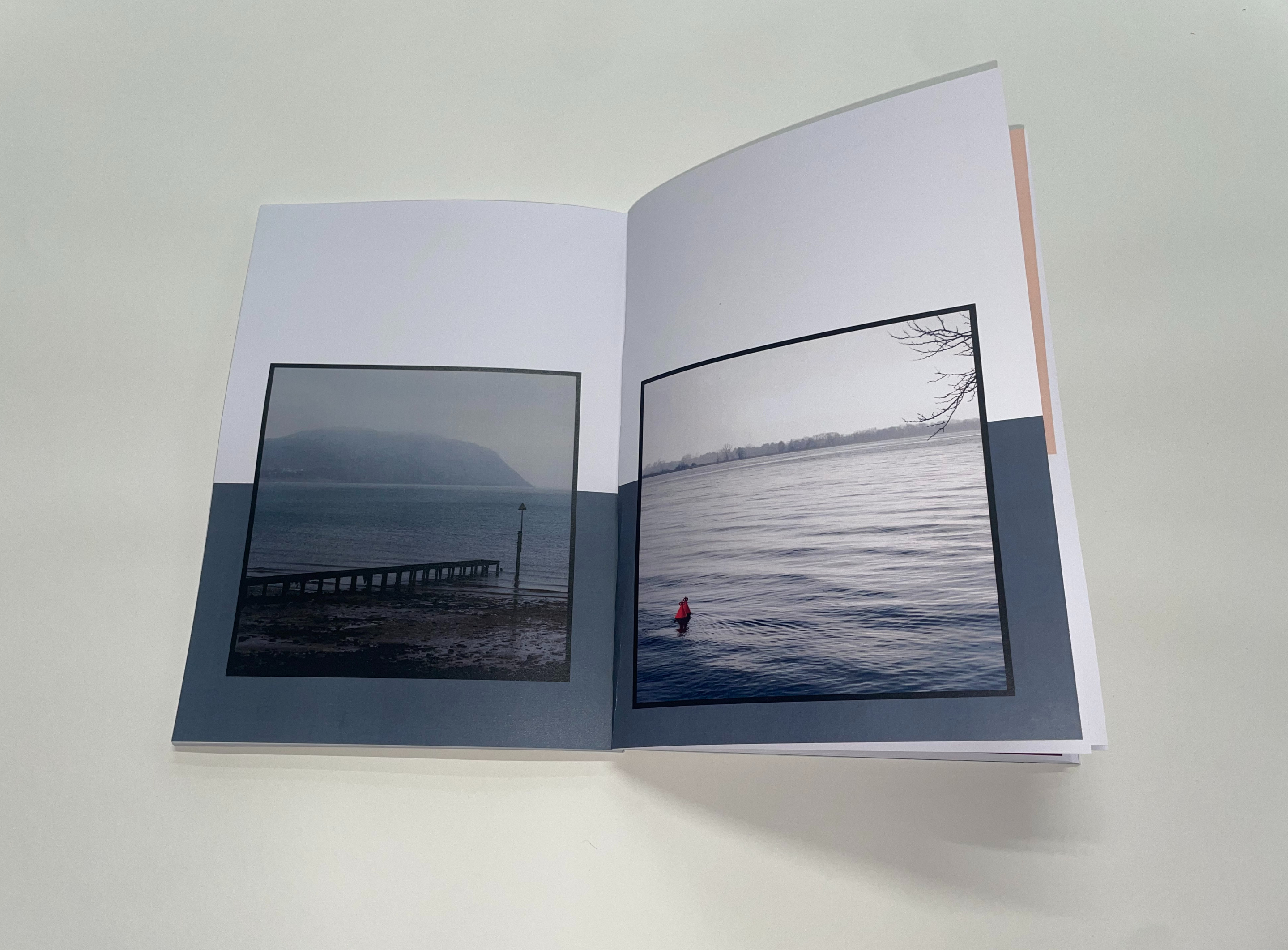
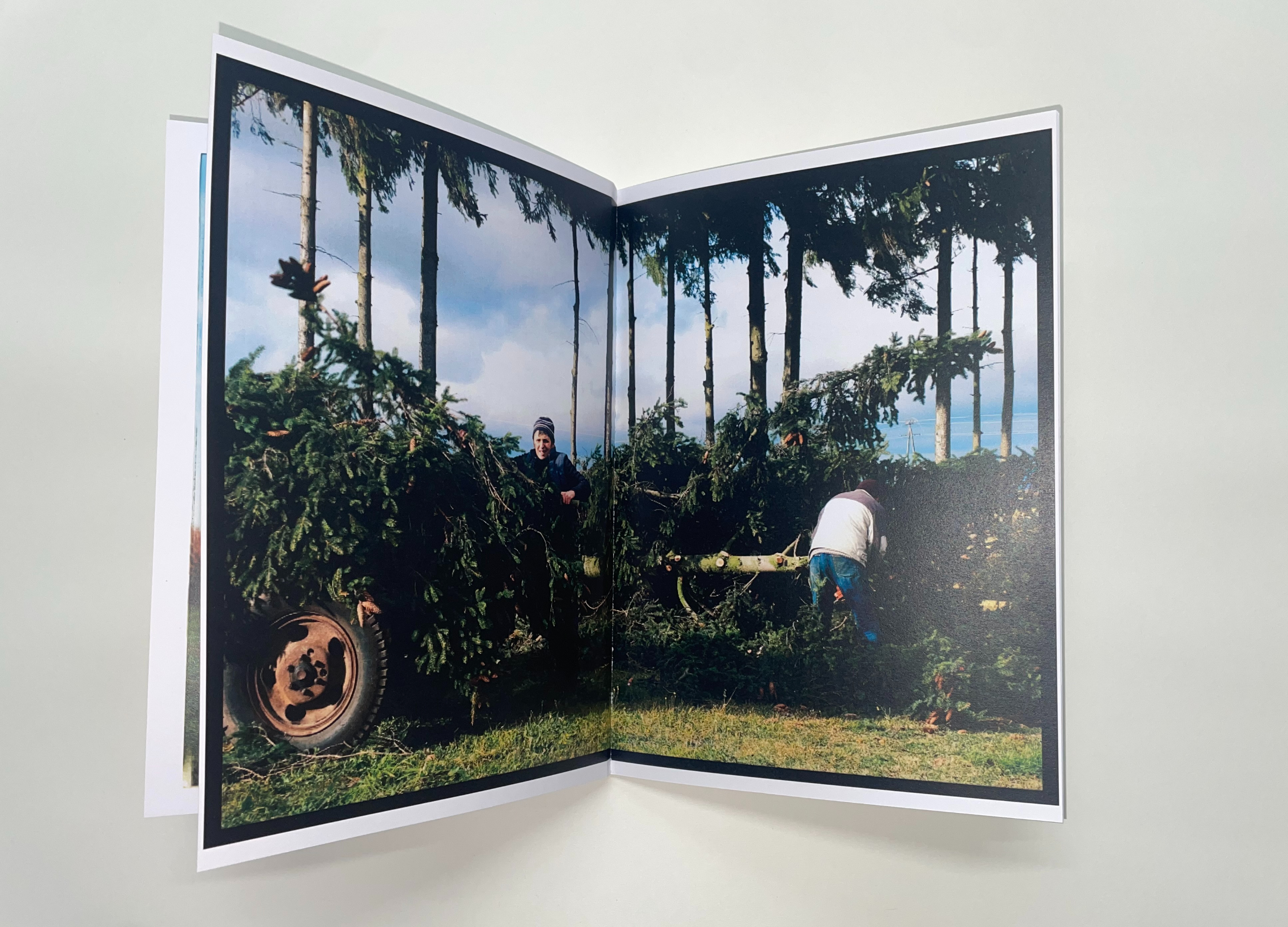
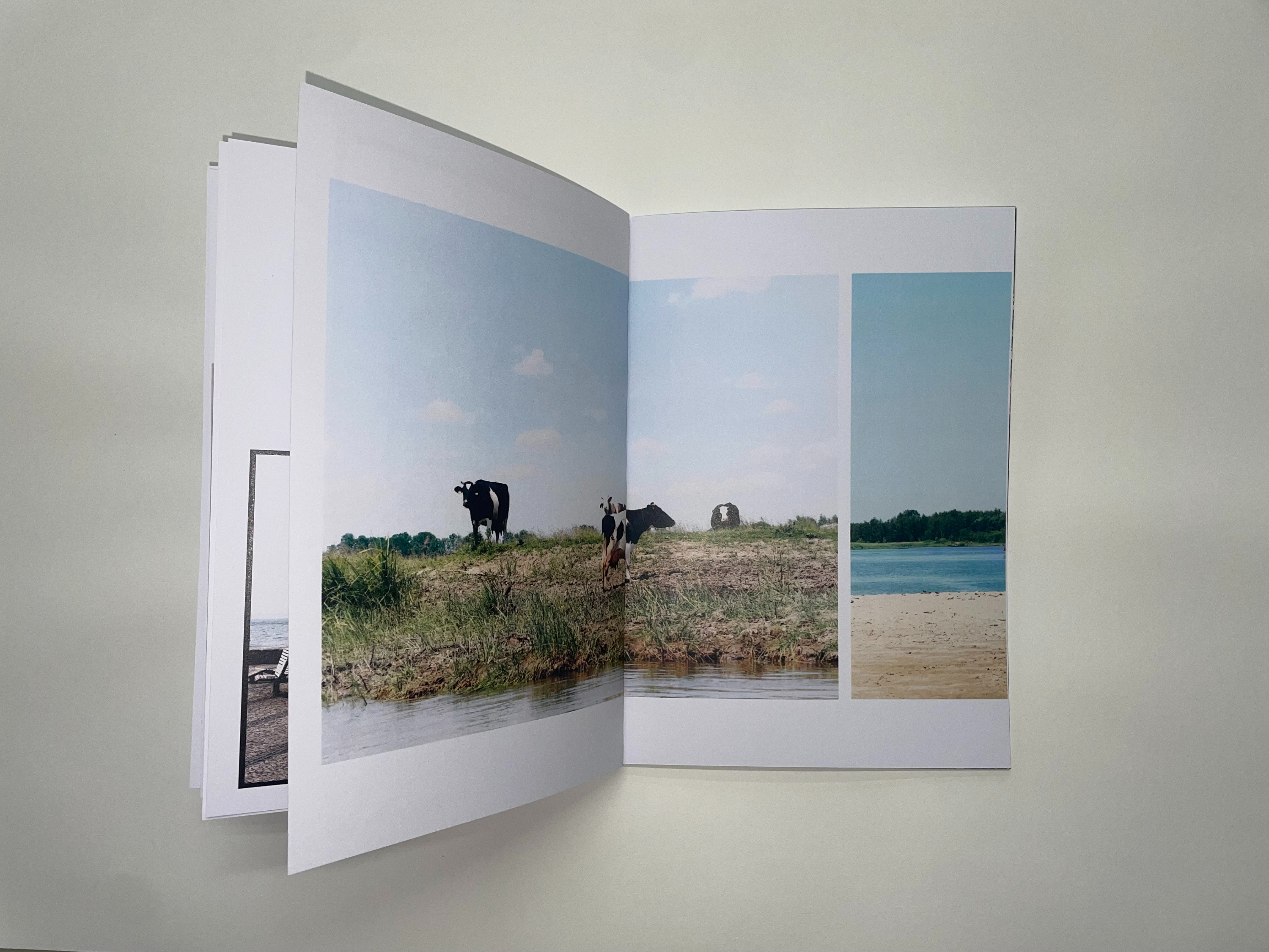
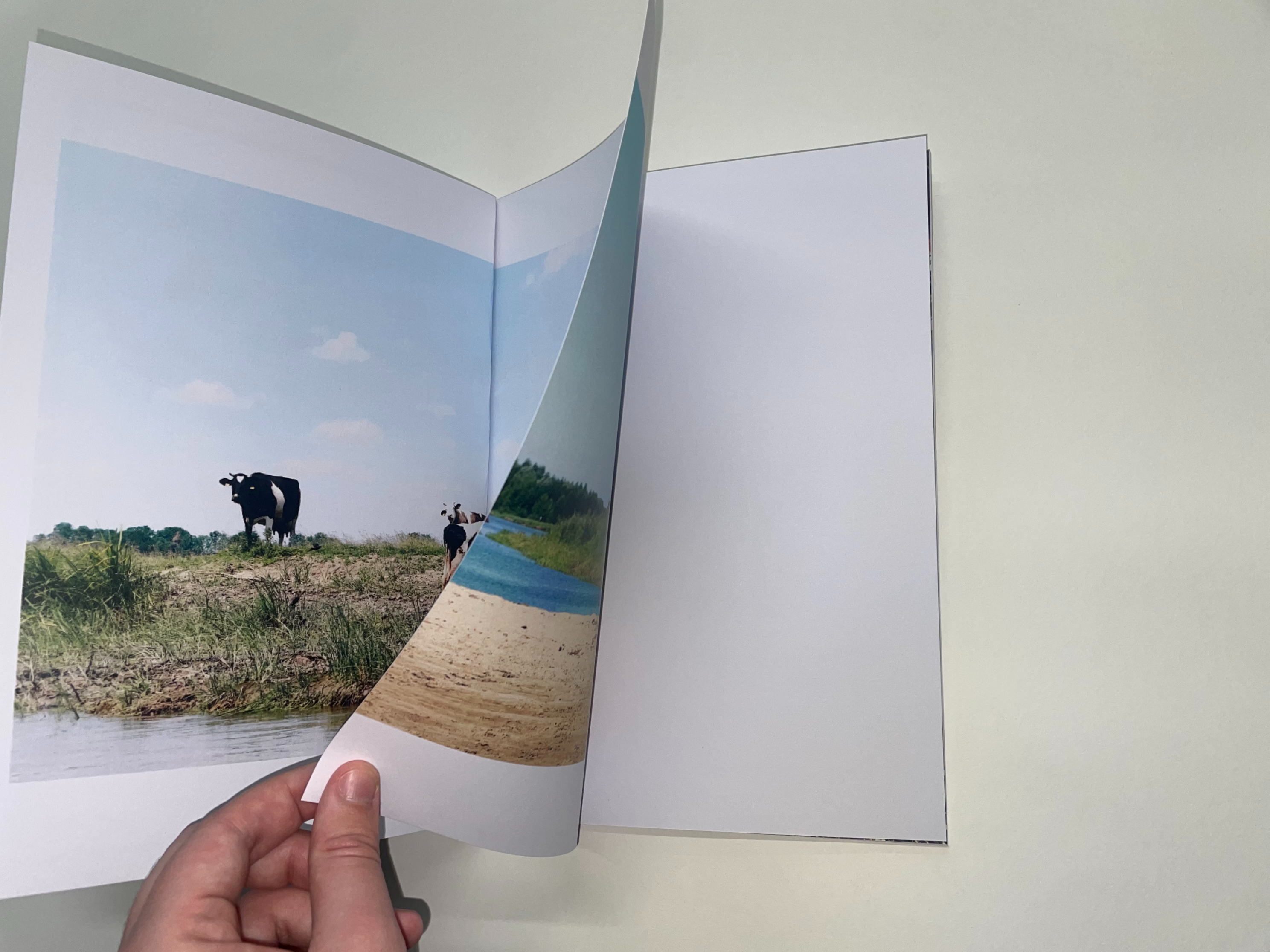
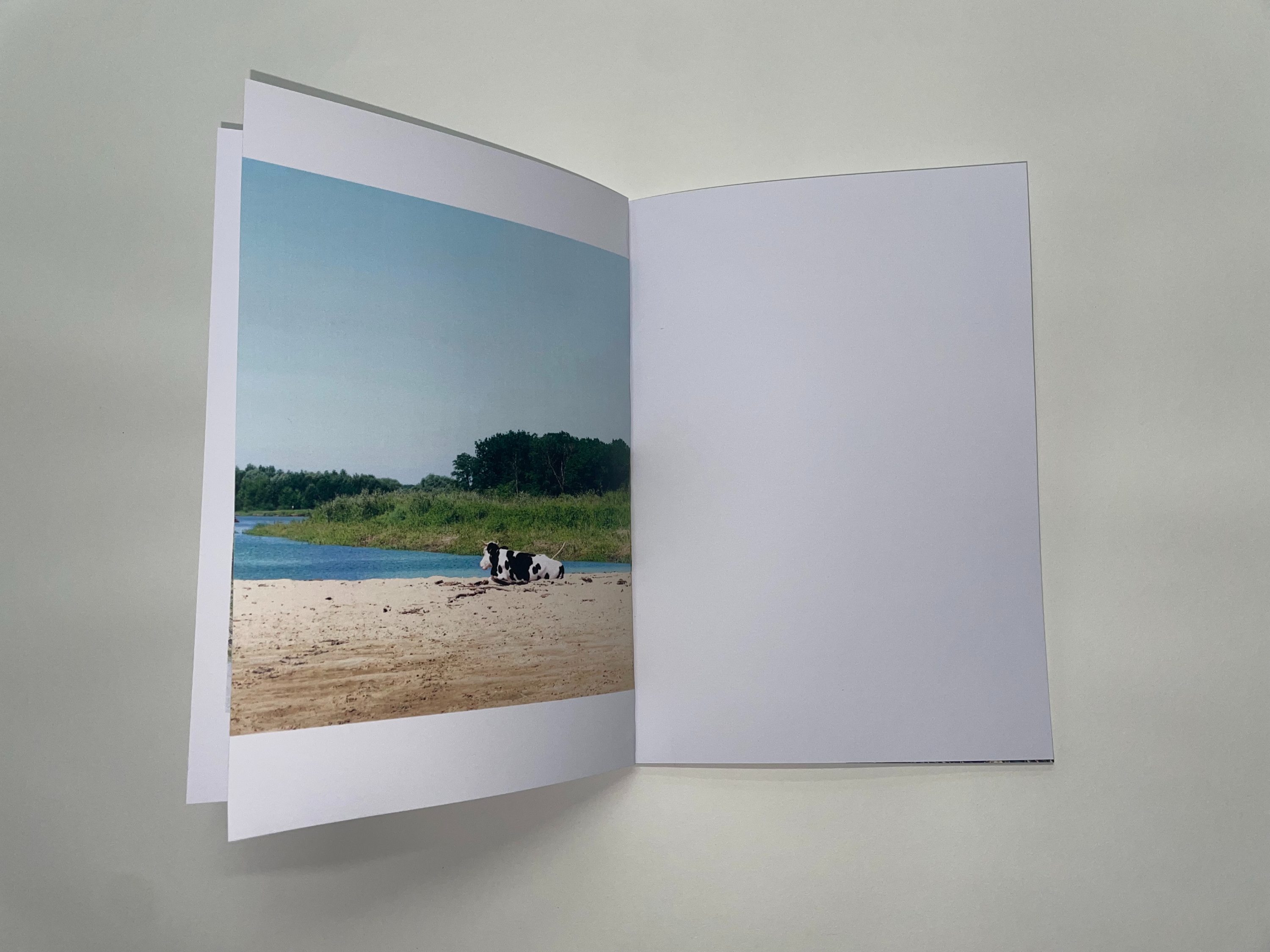
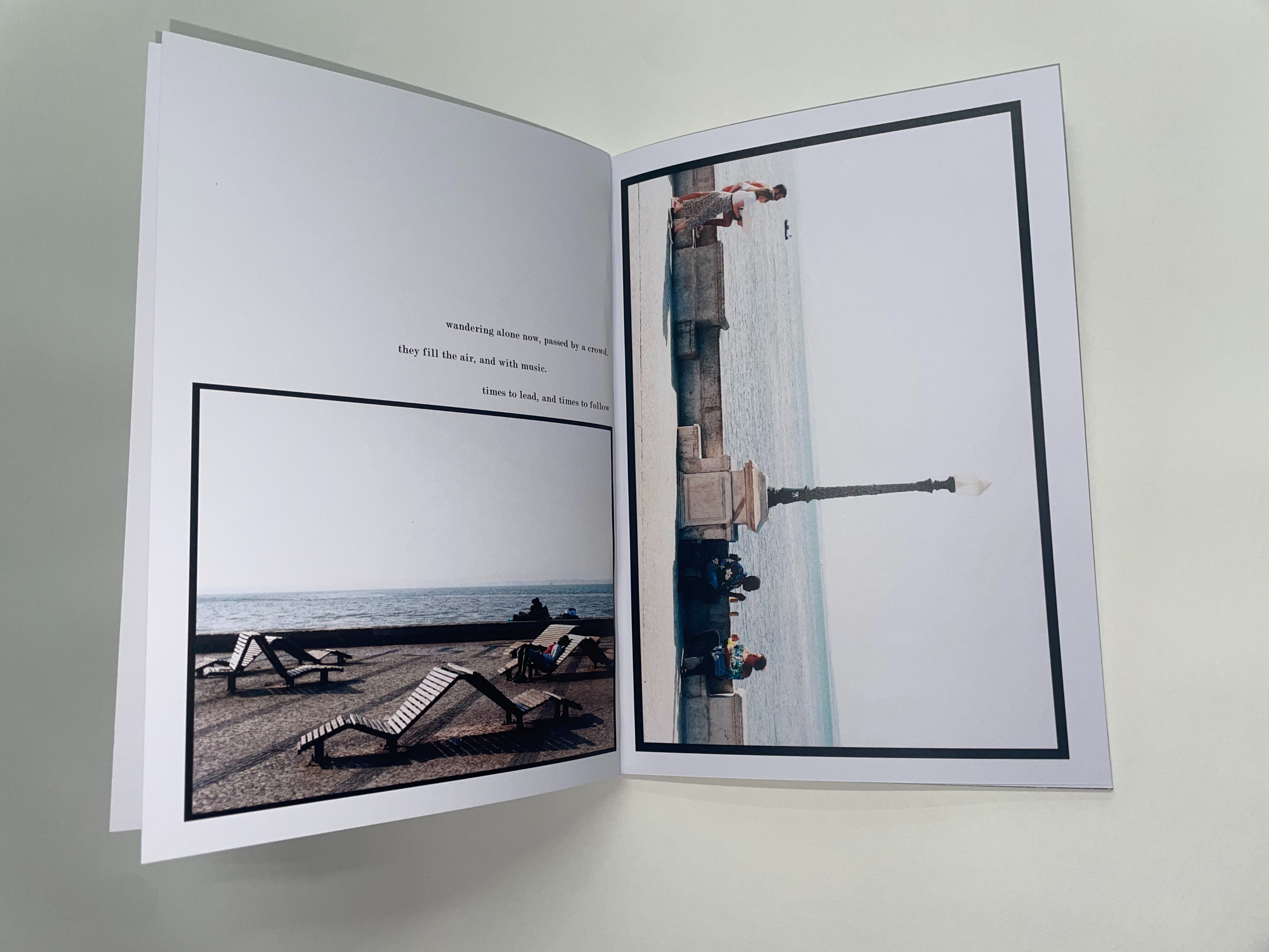
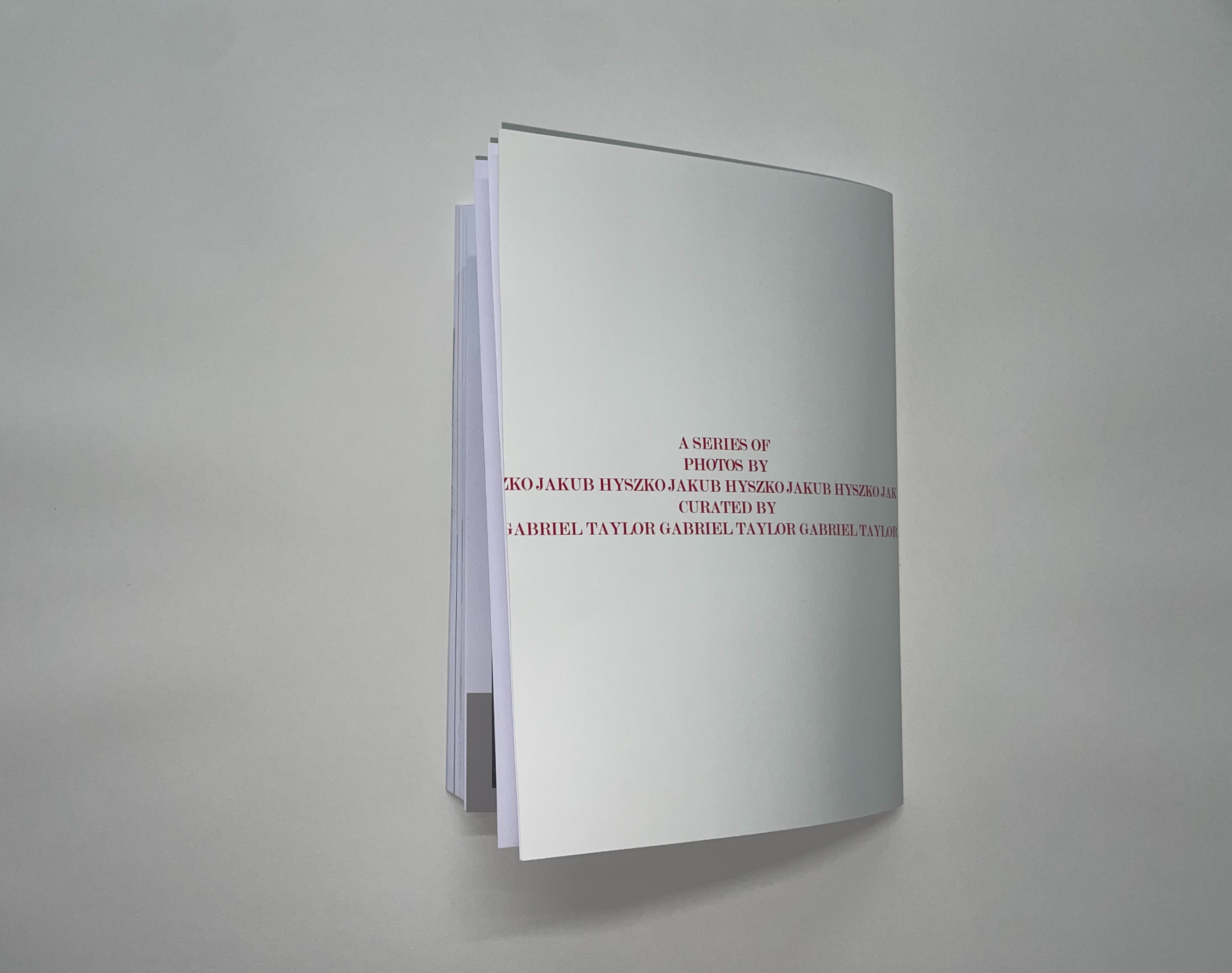
This was a photo I created in collaboration with local photographer, Jakub Hyszko, I approached Jakub on the basis of wanting to curate a photography publication, I set off by putting together a wide selection of images with him, ones that fit in together but would also contrast each other in a positive way and also make the publication flow , after doing this I created layouts for each page, using contemporary layout styles in order to make the book appear more than just a simple photography book, also while doing justice to the images, not taking anything away from them. once all of this was completed I had to print, carefully selecting paper types for the main pages and cover, ones which would reflect the style of imagery as well as the layout, I then bound this using a perfect bind, the most suitable for a publication such as this. The process of creating this publication taught me not only a lot about publication design but also a lot about composition and collaboration, especially with other creatives who don't work in the same medium as I do, doing this and being able to showcase somebody else's work as well as my own was a long and at sometimes challenging process but the whole time it was pleasurable and rewarding.






Spine - Branding and Promotional
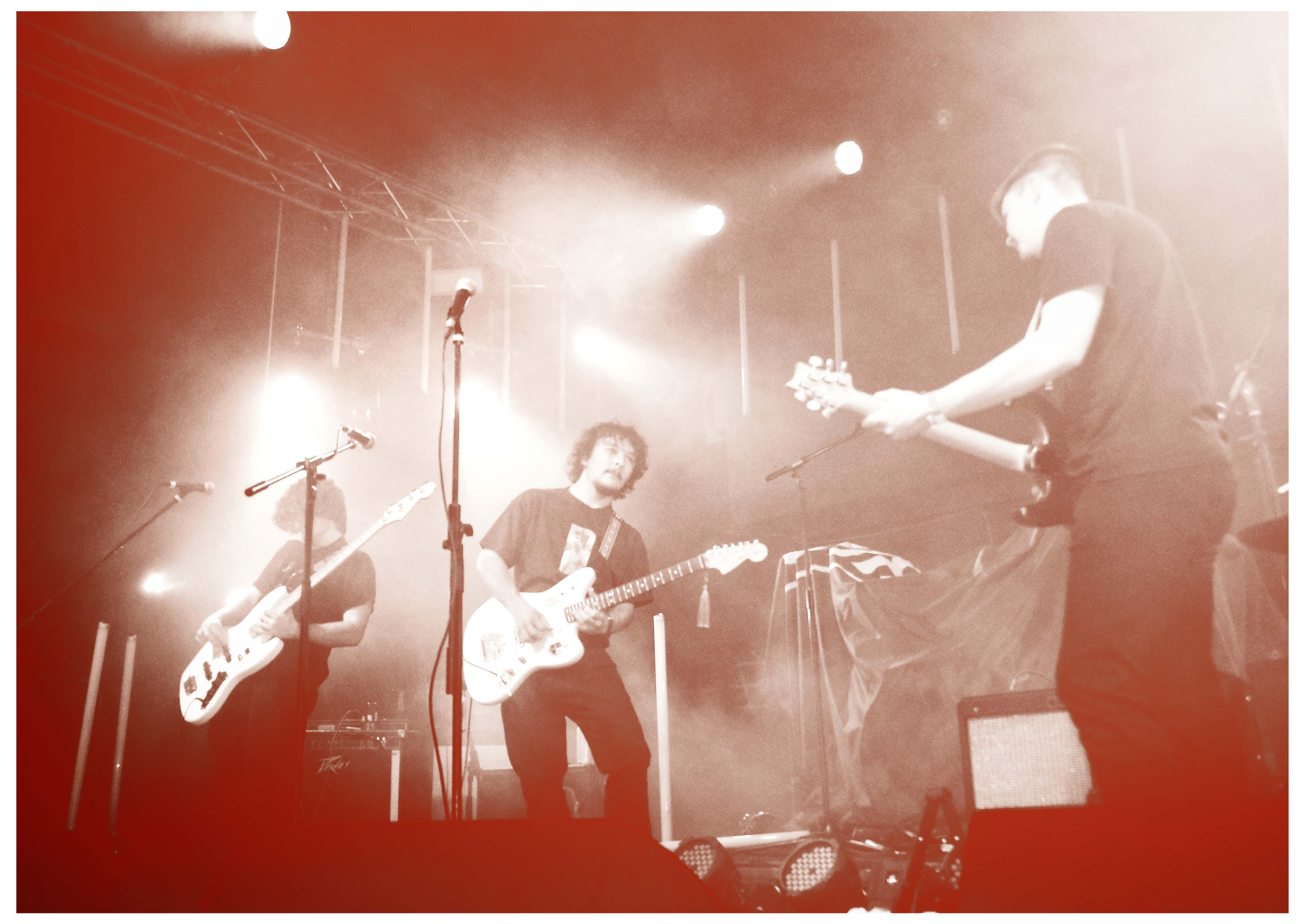
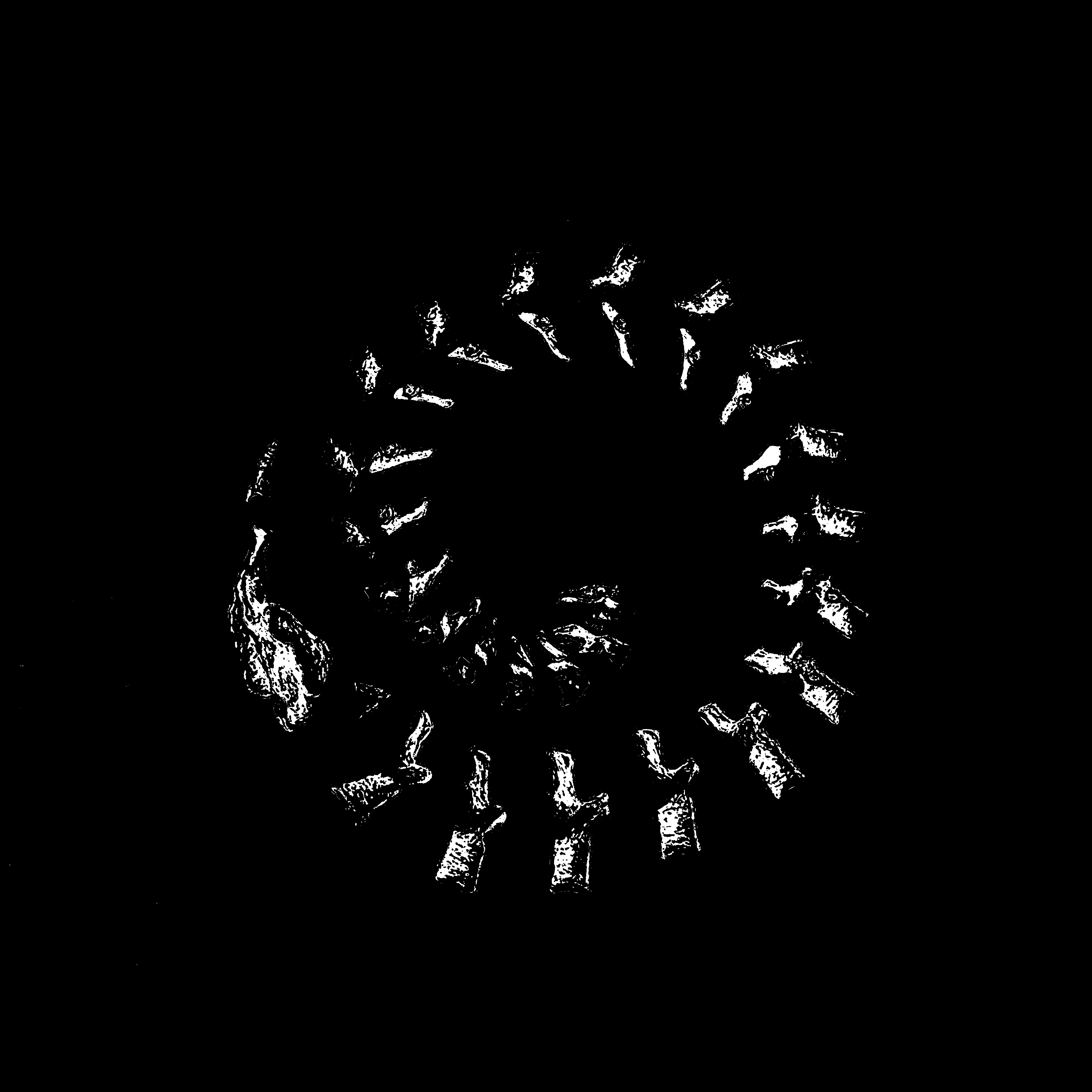
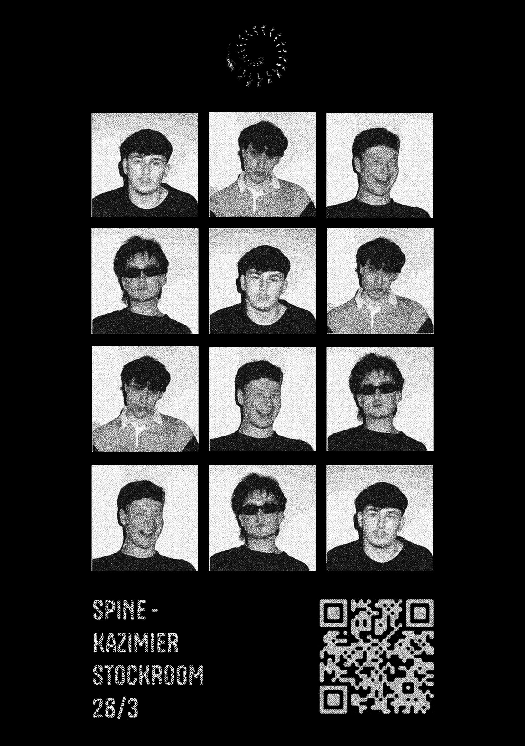
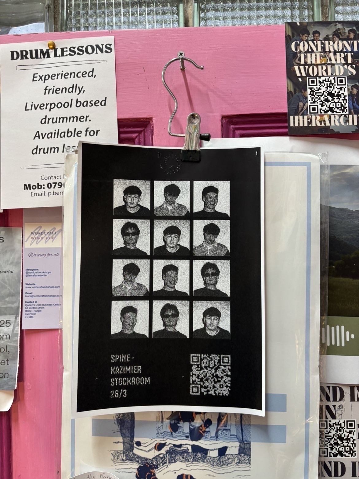
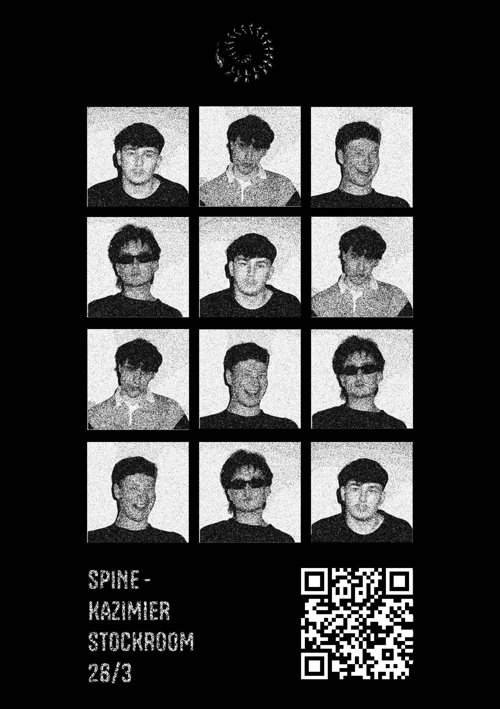
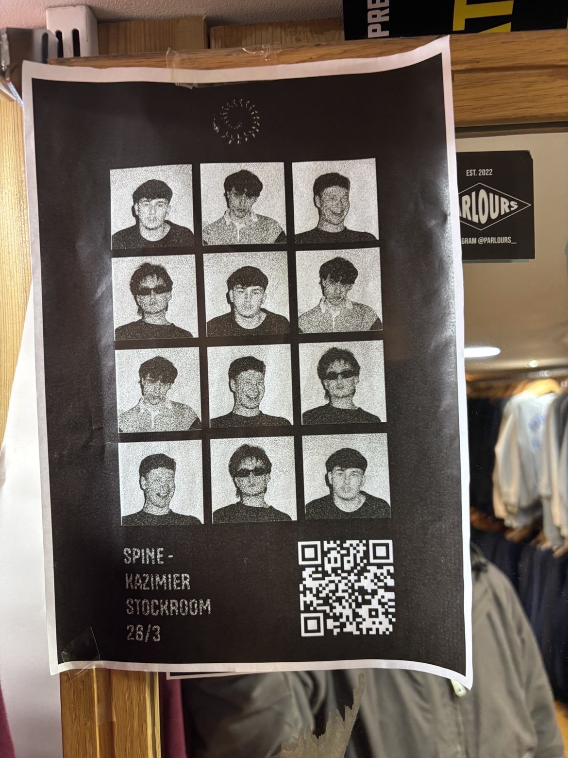
I was approached by a local and upcoming band to create a logo for them, in order to give themselves more of an identity, being unhappy with the current logo they had made for them, feeling it lacked originality, I set out on creating something more individual to the band which suited their sound and overall aesthetic, upon creating this for them they have reached out to me to create posters for an upcoming gig, this is an ongoing project I have with the band, creating more promotional content for them which reinforces their image and helps them look more professional when trying to make their way up in the industry.



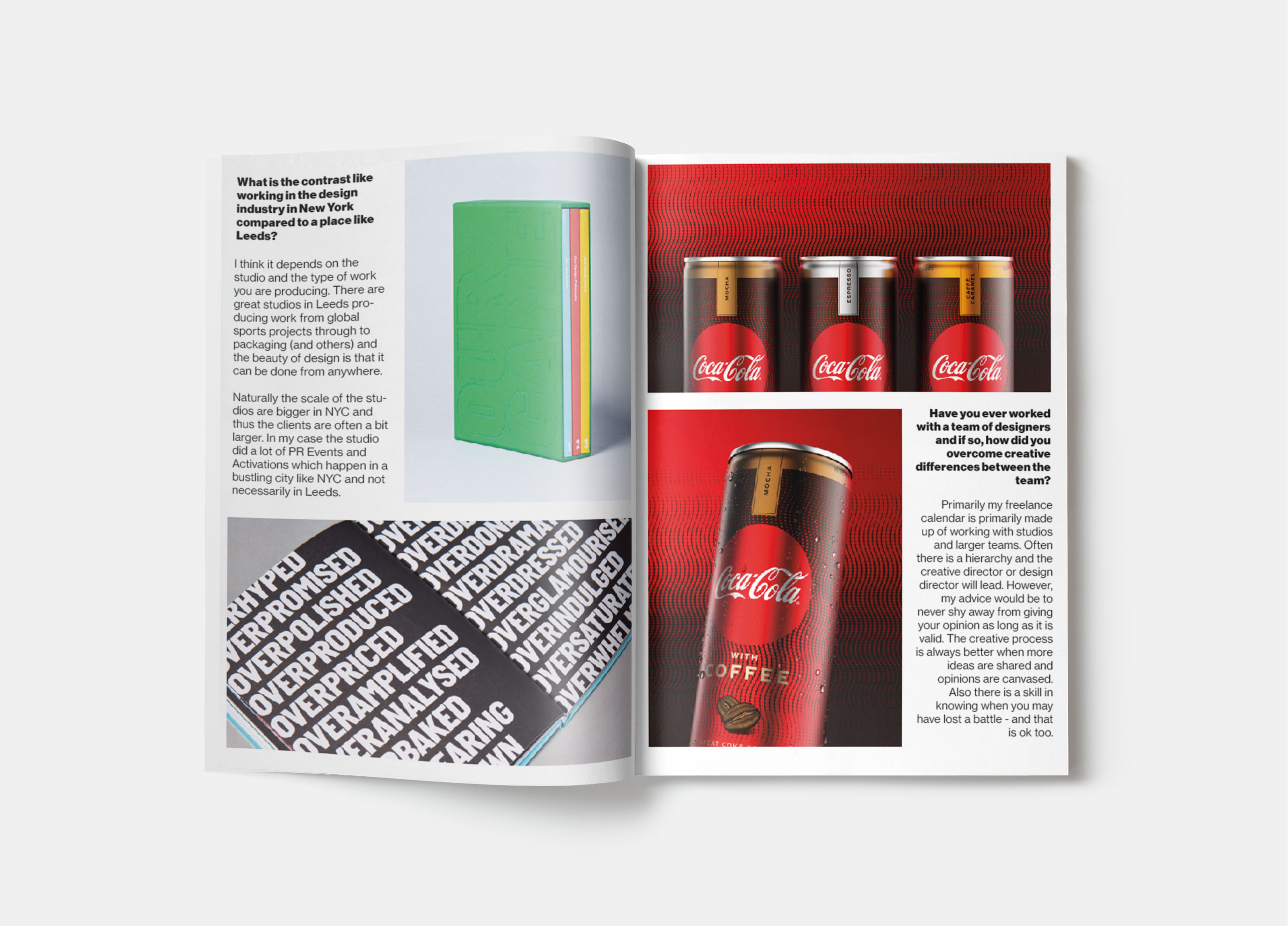
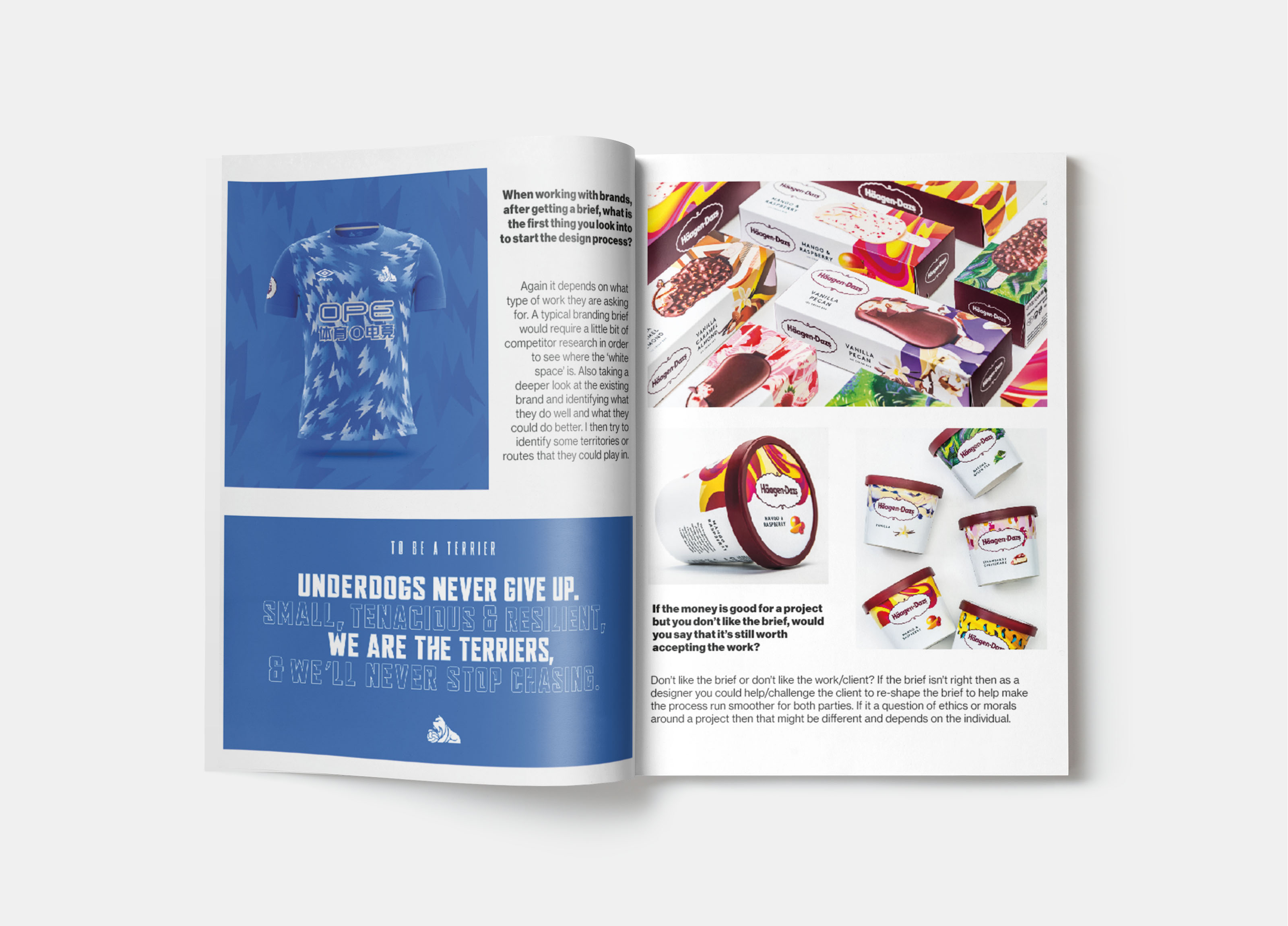
Creative Report - University Assignment
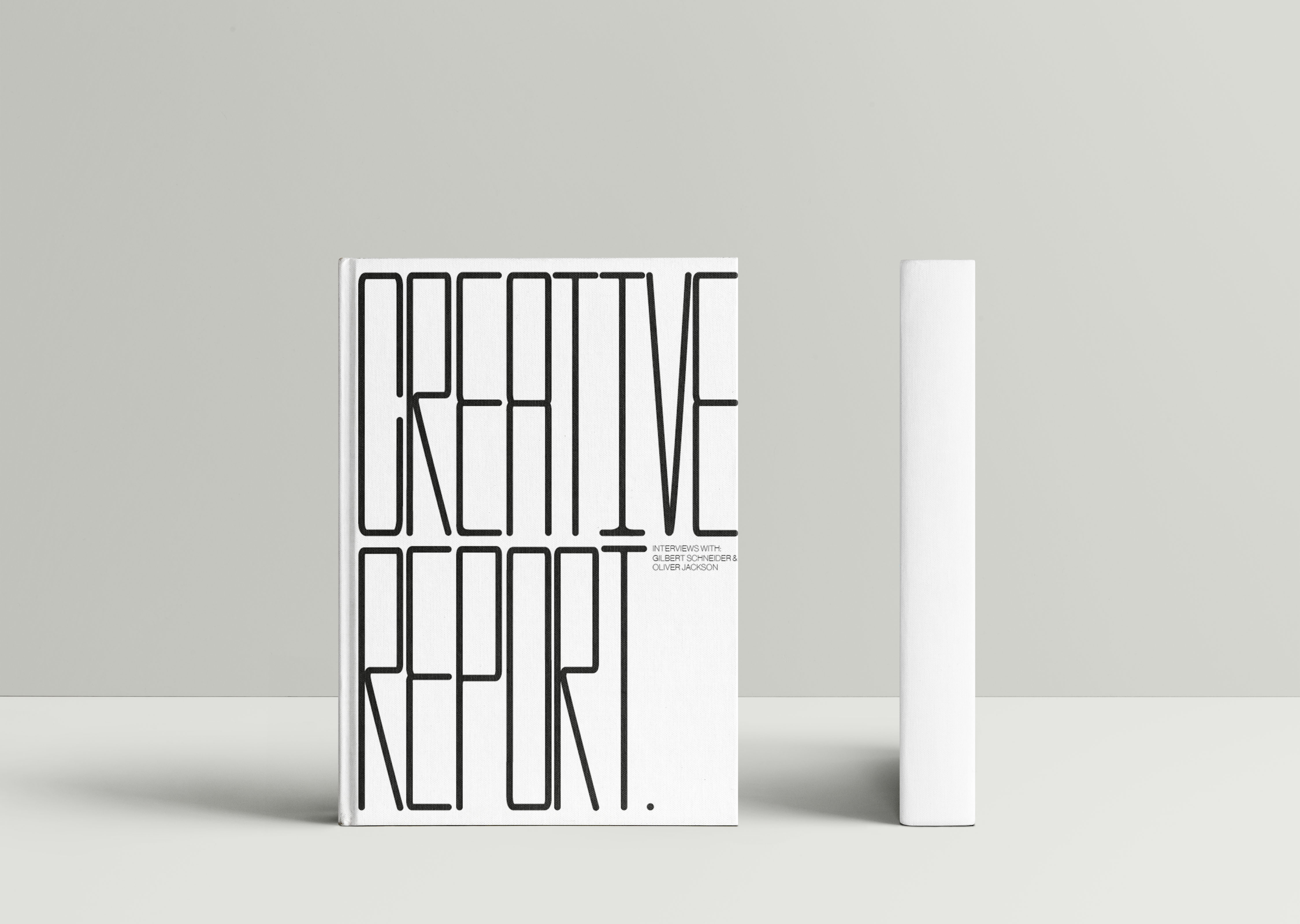
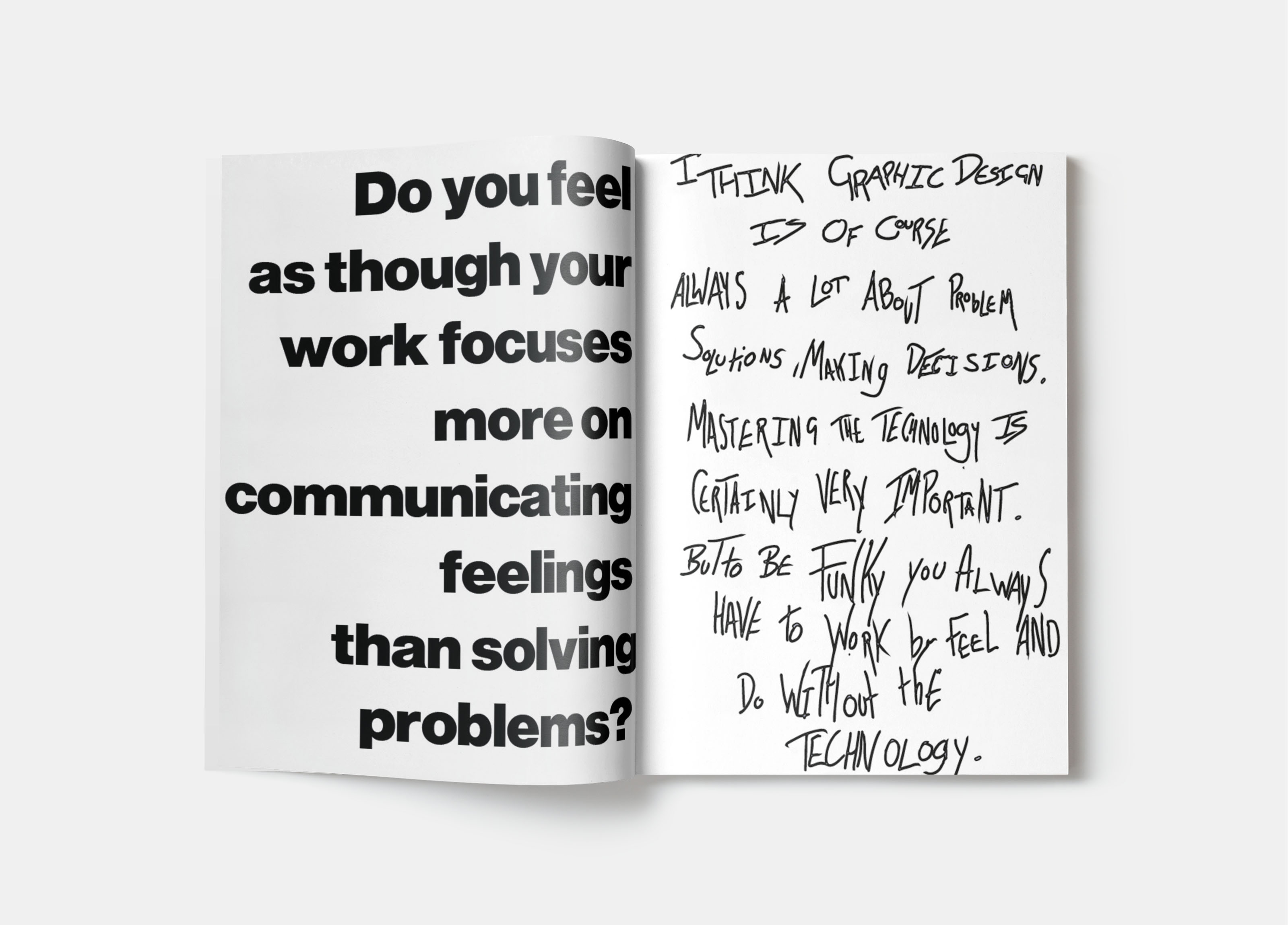
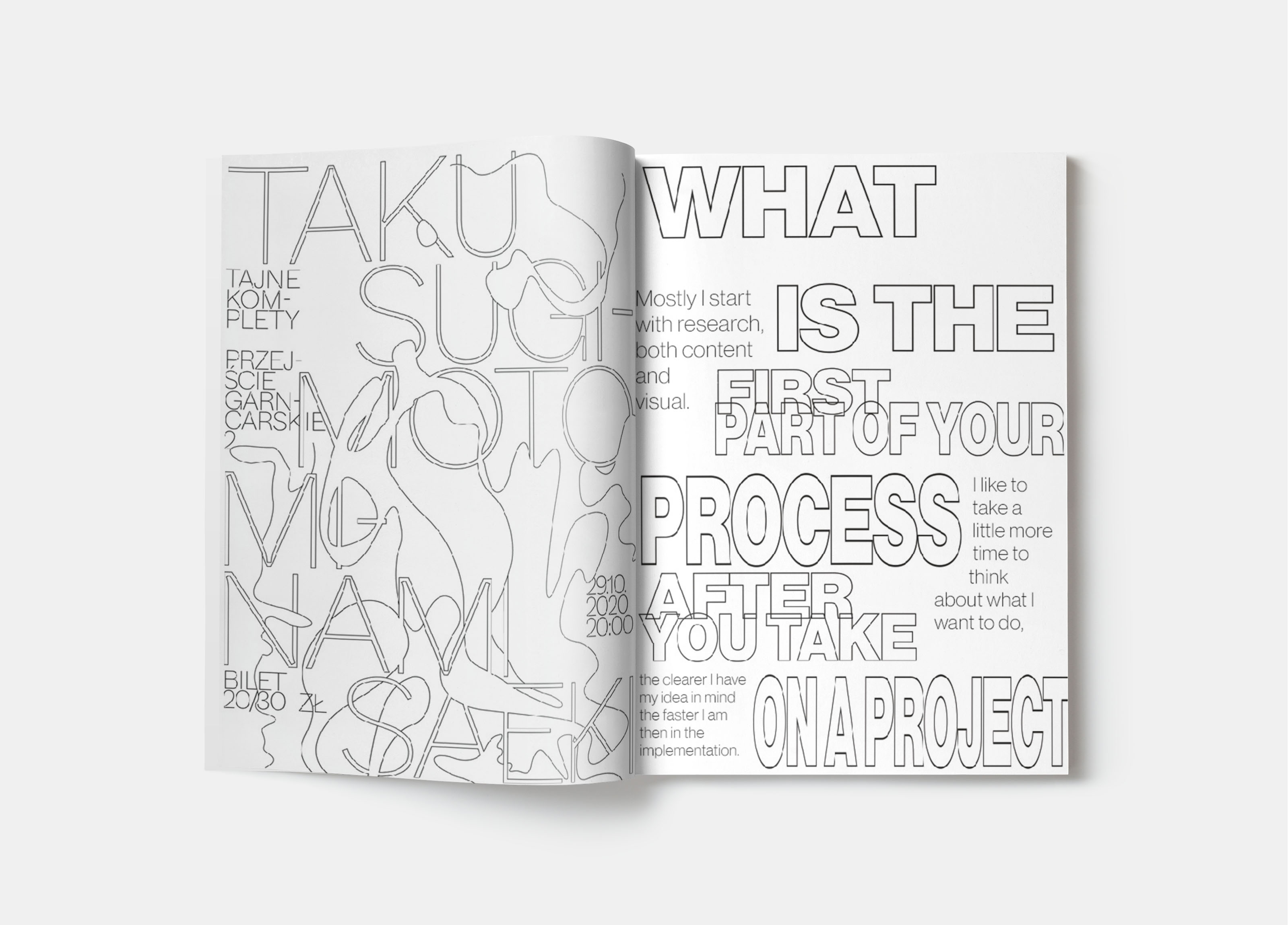
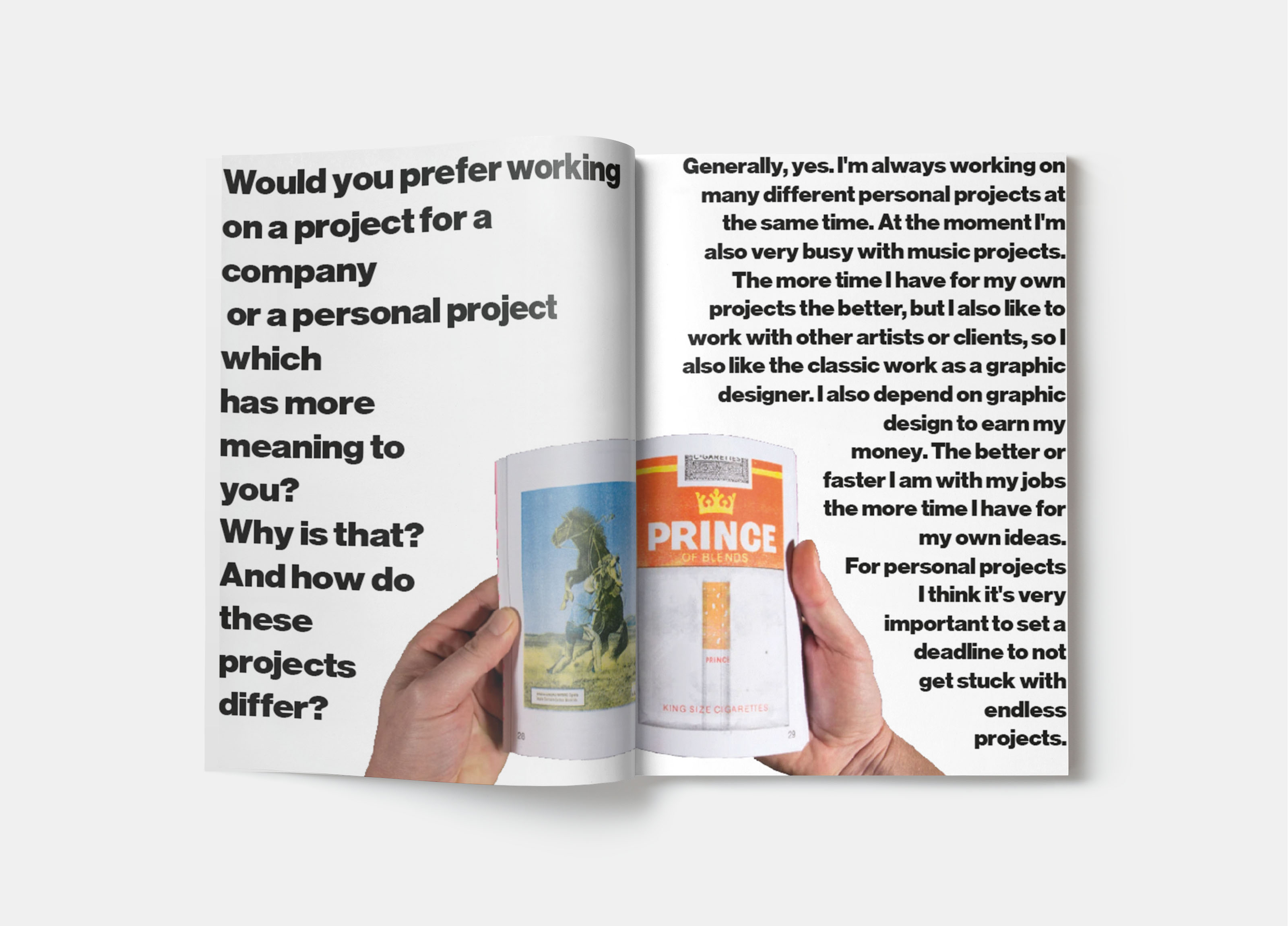
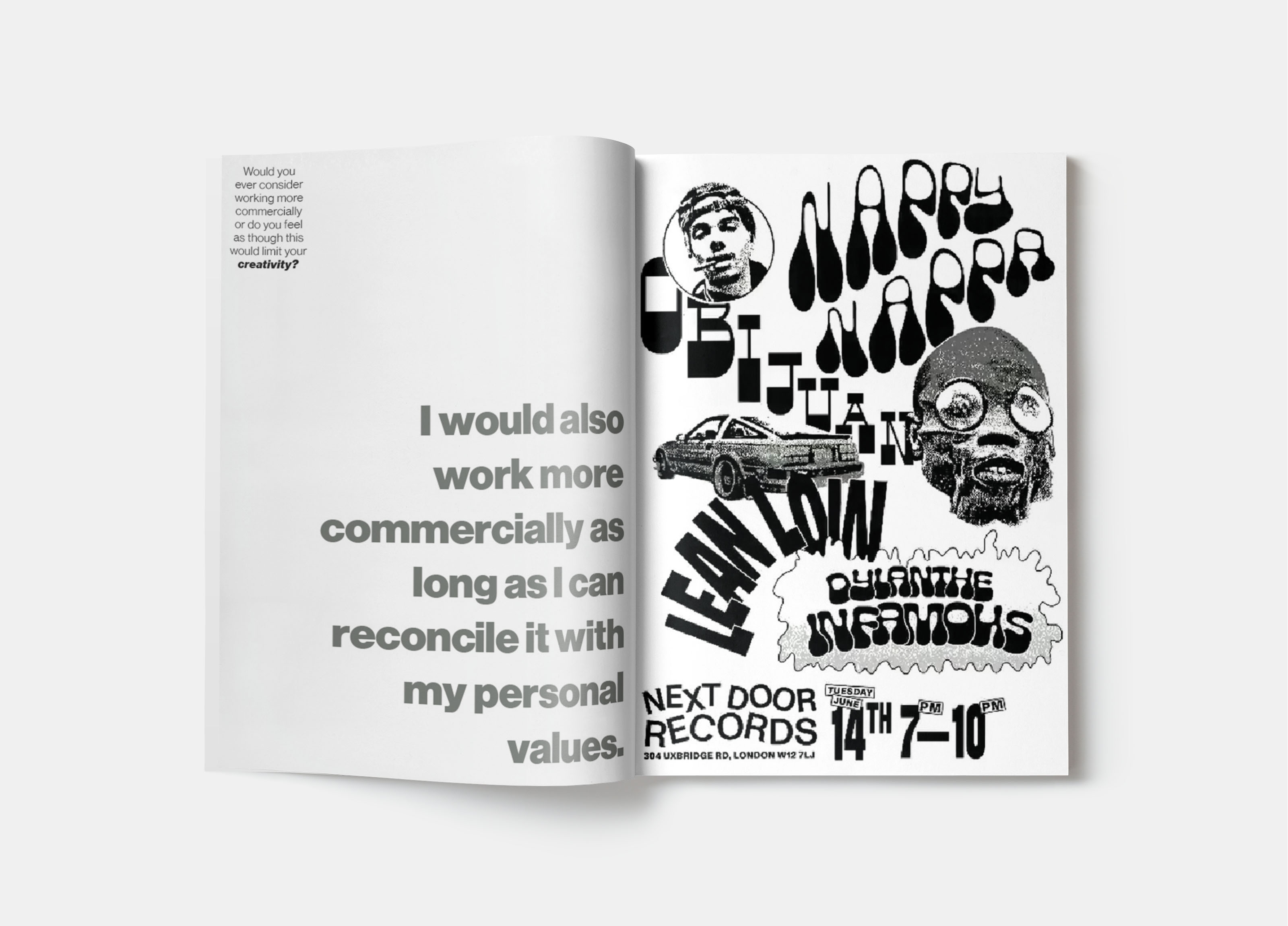
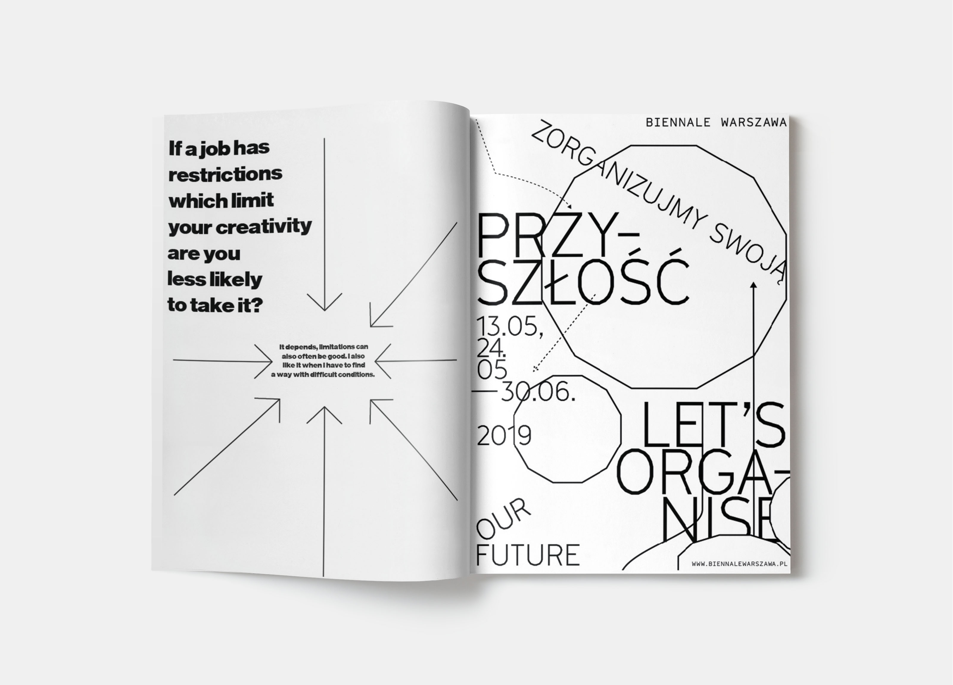
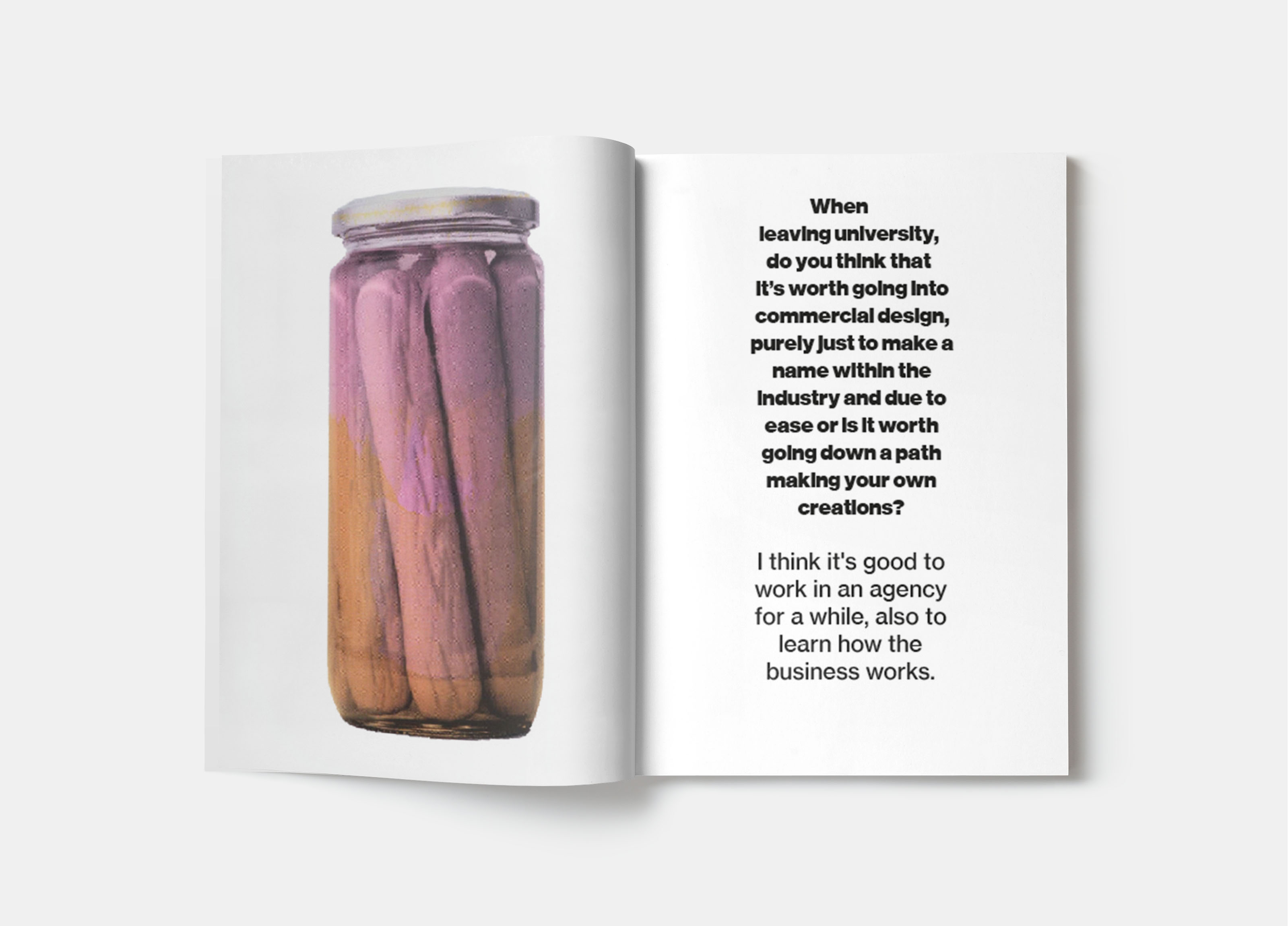
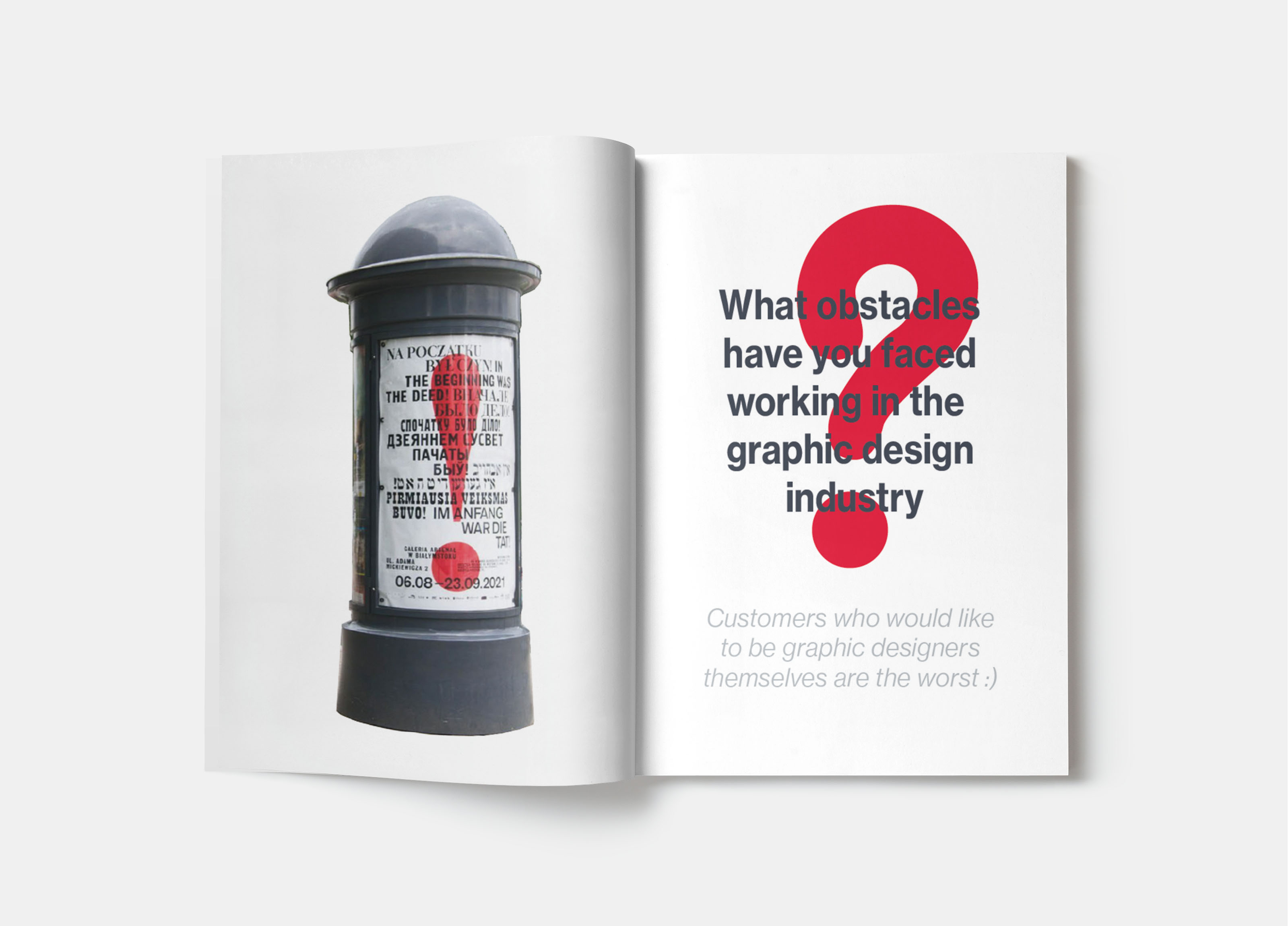
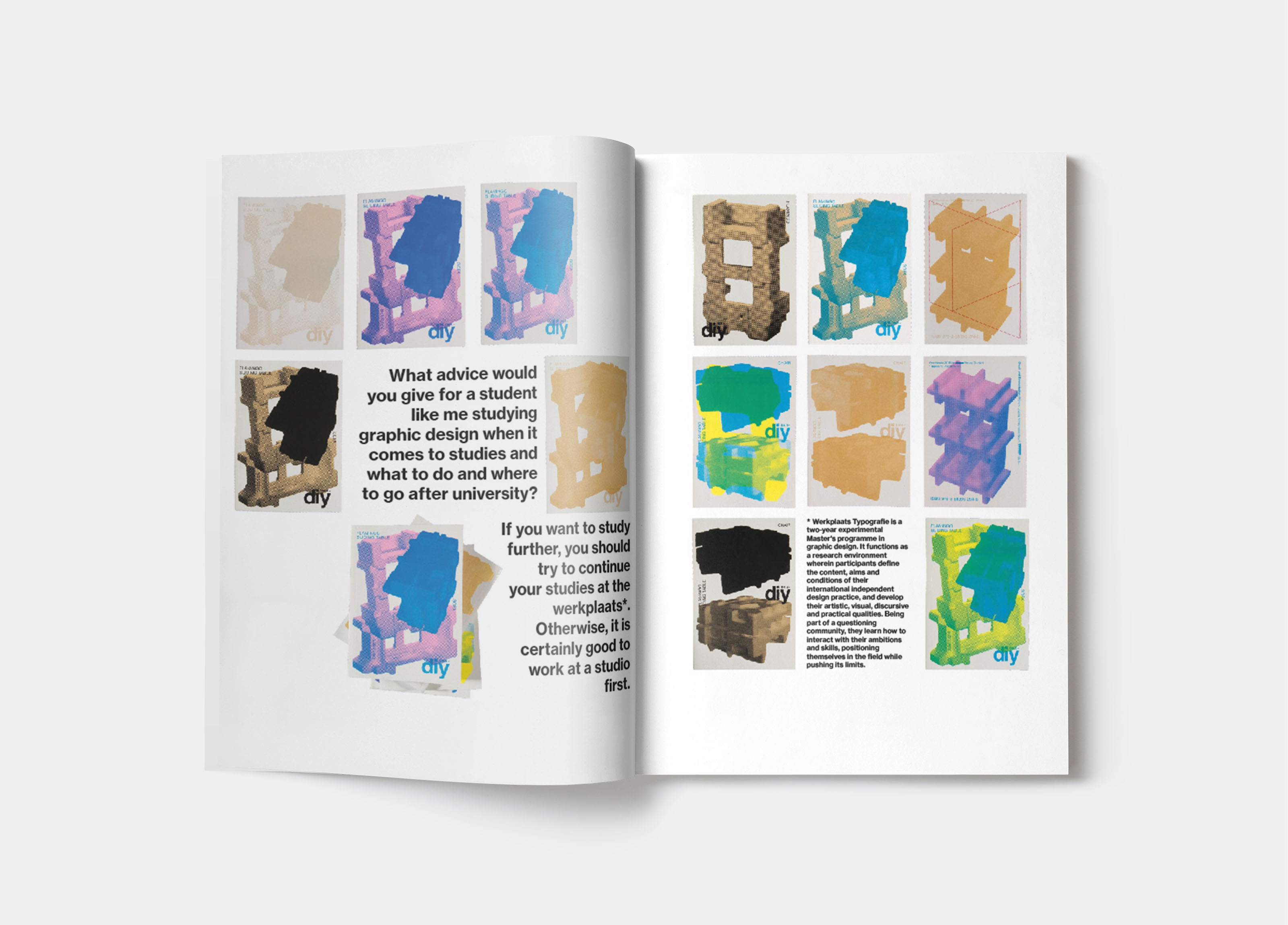
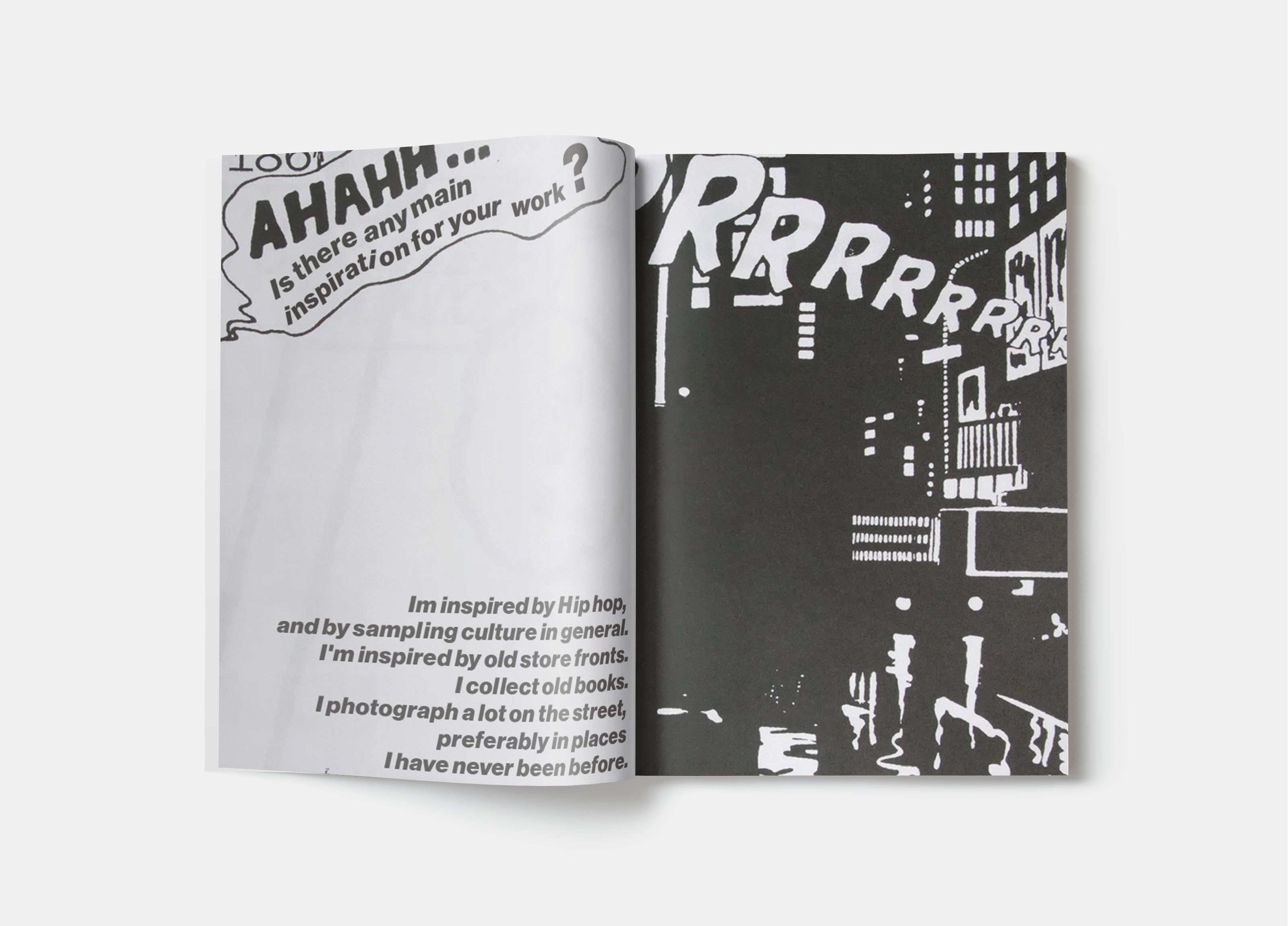
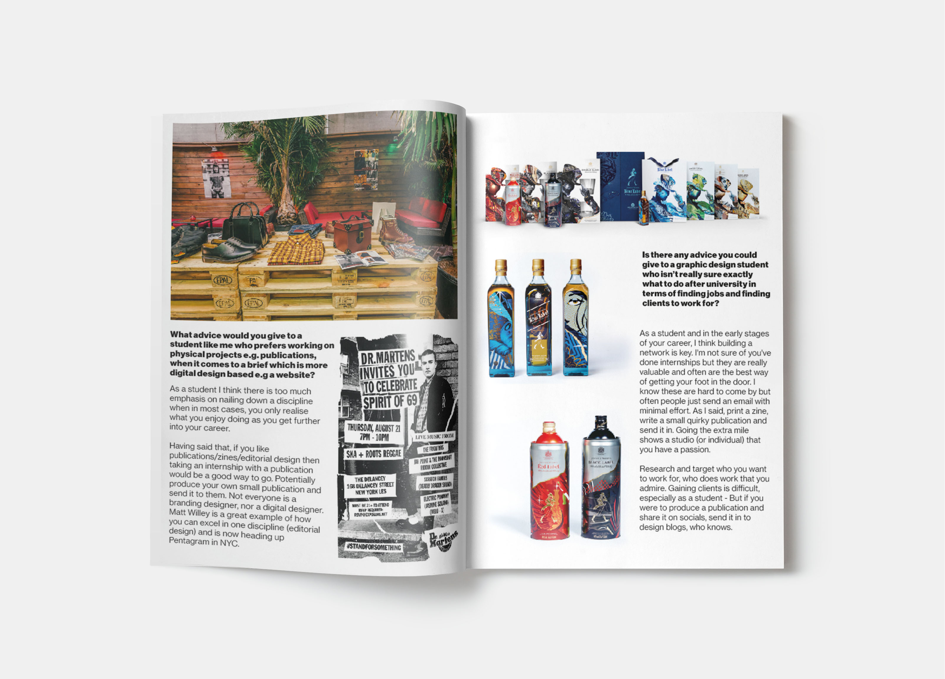
This assignment from University was to create a publication using your own interviews with two different designers who have a different design style, ask them questions based on this and use the answers to create a publication, for this I decided to go with the difference between commercial design and personal design which allows for more creative freedom, to create this, I first interviewed the designers, Oli Jackson, a Leeds based designer who stays more on the commercial side of design and Gilbert Shneider, a Swiss designer who does a wide range of design without limitations. to show the difference between the design I split the publication into two sections, one for each designer, the interviews with Oli being a lot more structured, where as the section with Gilbert was a lot more contemporary.


Fossil Fuels Non-Proliferation Treaty - Competition Brief
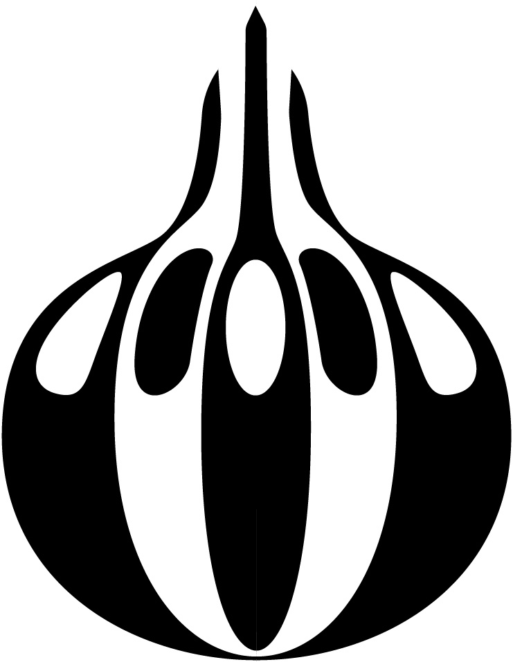
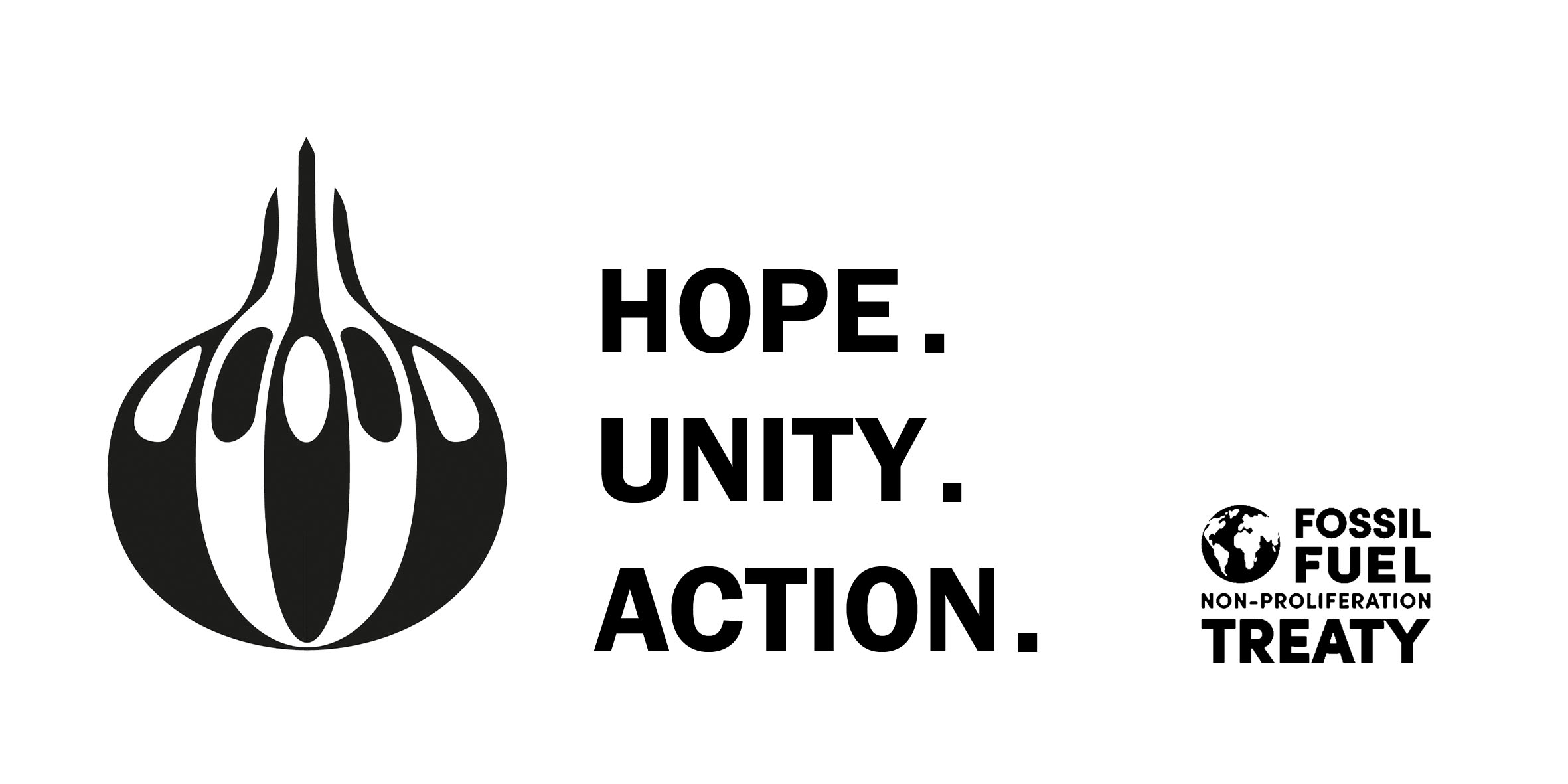
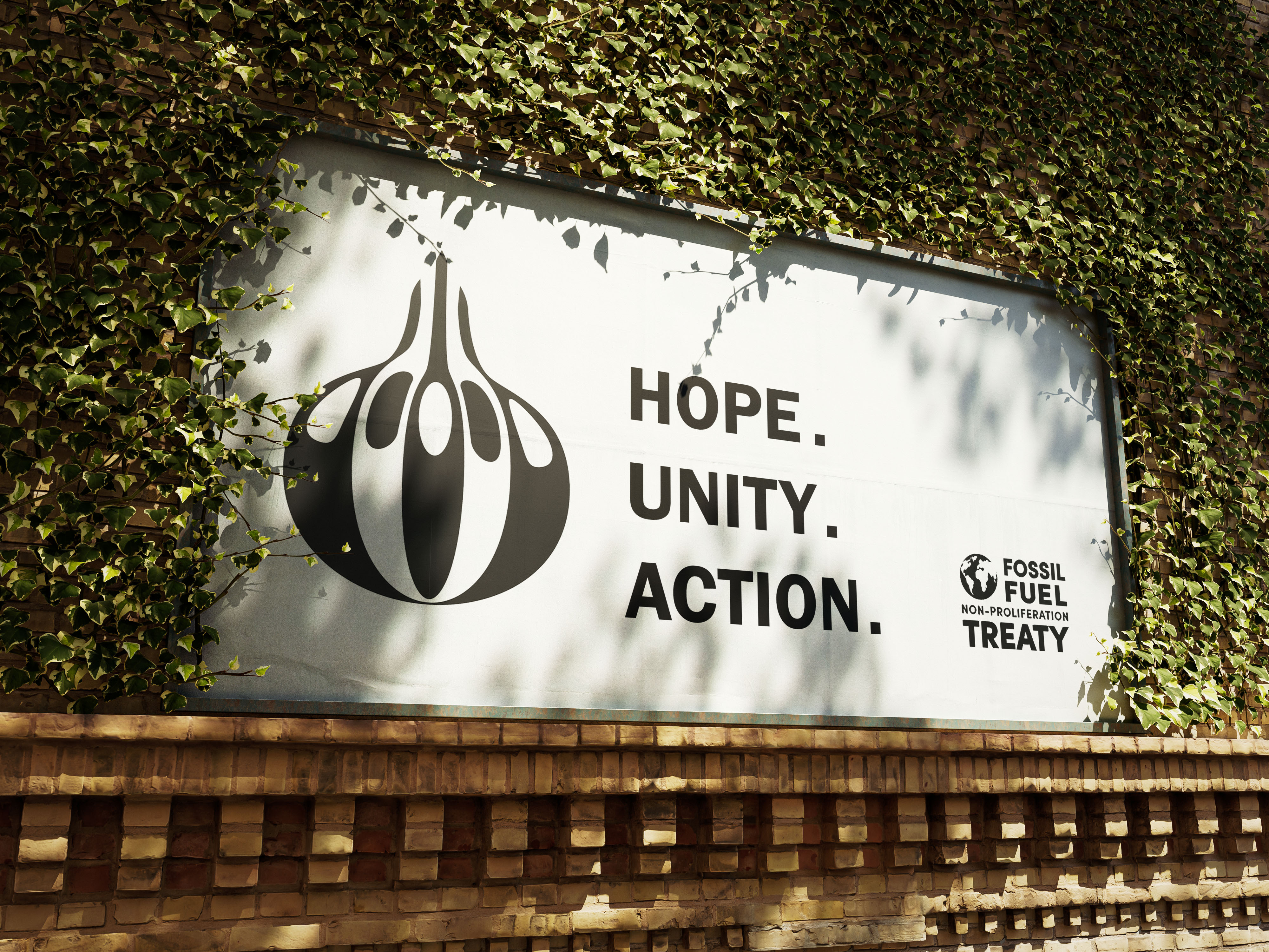
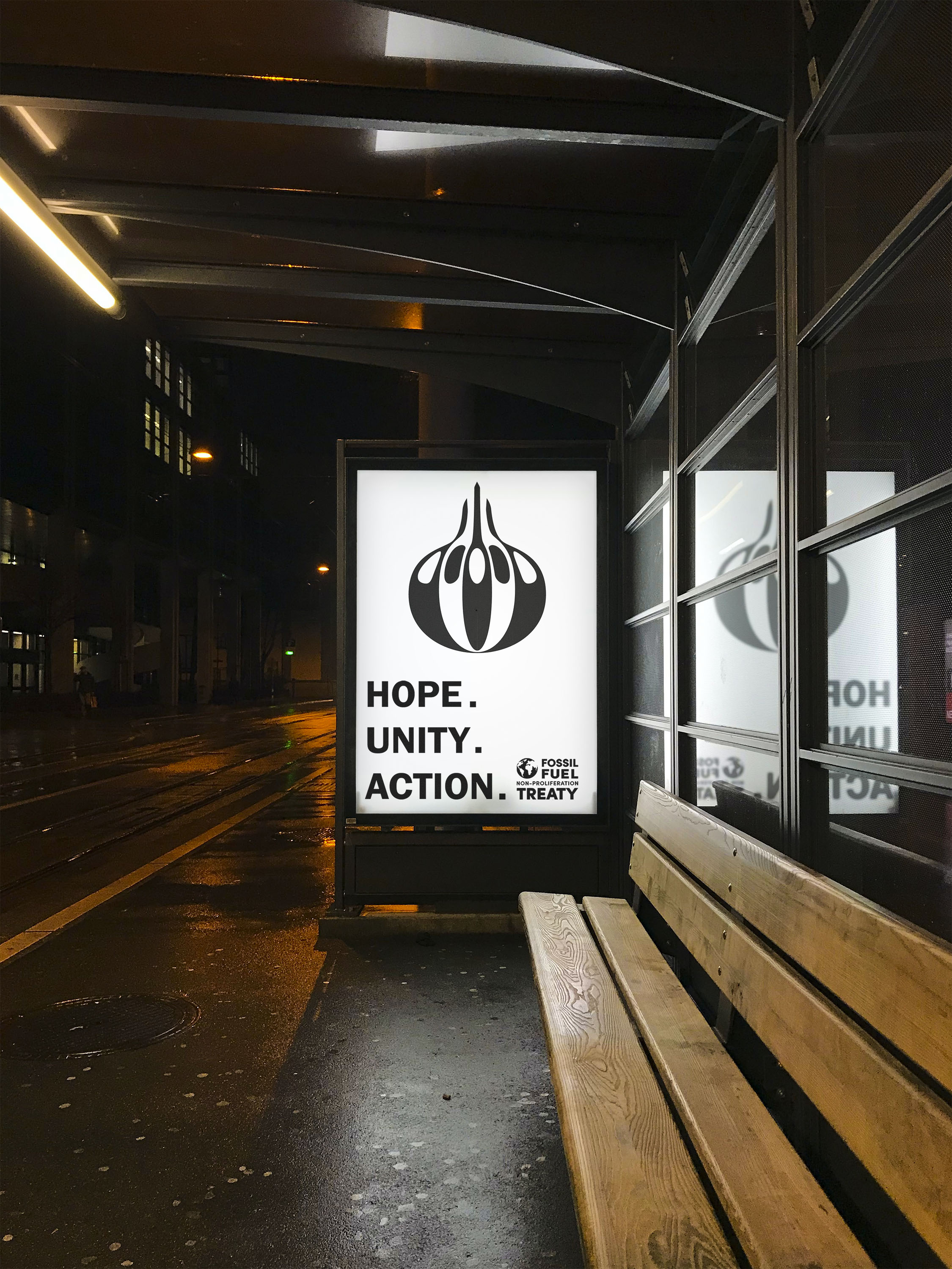
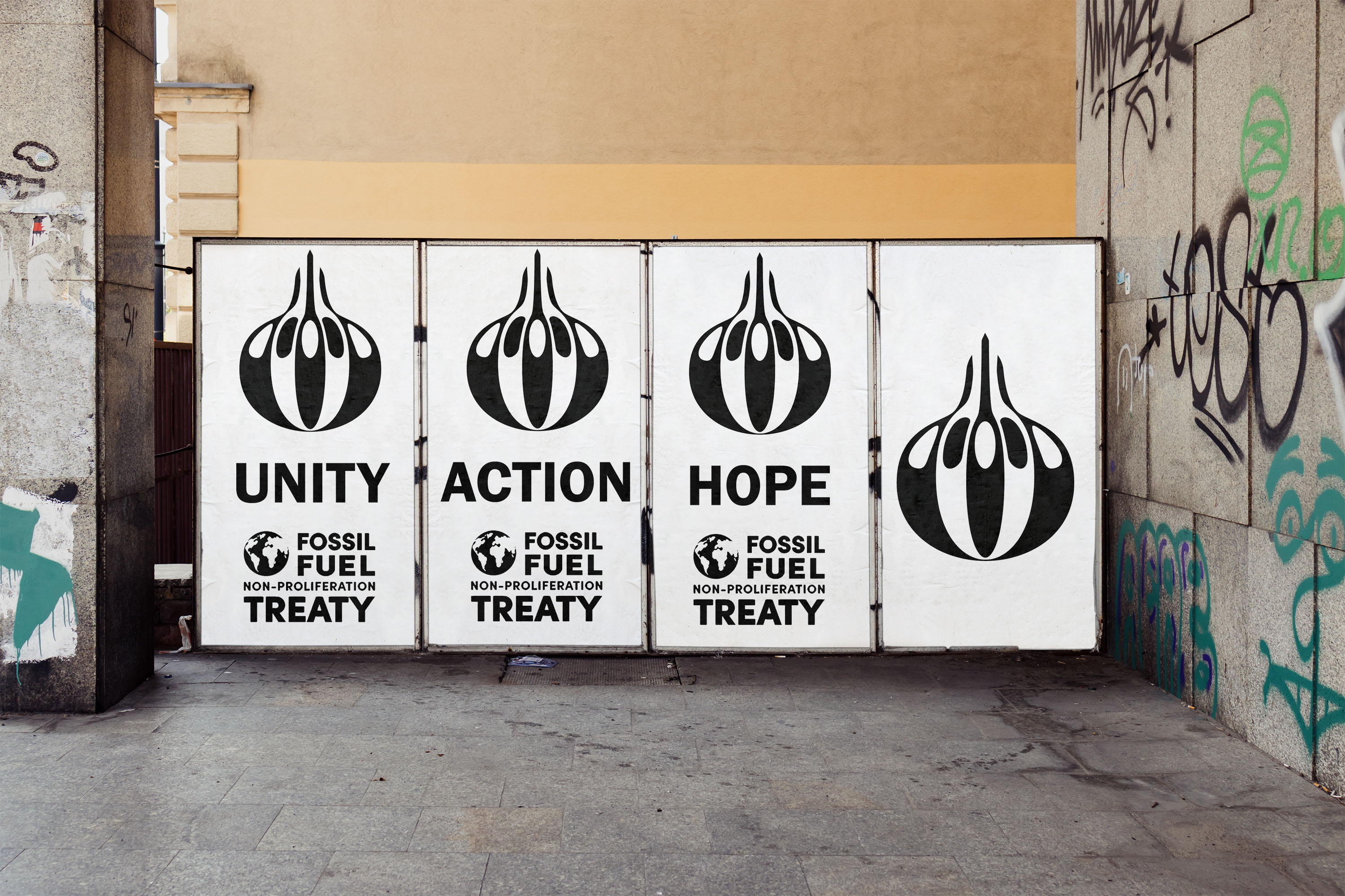
This was a competition brief I participated in for D&AD to create a symbol for The Fossil Fuel Non-Proliferation Treaty is a proposed international agreement aiming to halt new coal, oil, and gas exploration, the brief for this was to create a symbol which represented hope, unity and action, my idea for this was to create a symbol which looked like a flower bulb, which shows hope, the hope that a thing which doesn't look like much at all can sprout into something as beautiful as a flower, combining this with the representations for action, a hand on the bulb, showing the action it takes to plant the bulb in order for it to sprout into that flower, the way in which I showed unity as well as tying all of the other elements in together was to make the bulb and the hand also look like a crowd of people in a contemporary way, after making all of this whole I was left with my final symbol, which I mocked up into various scenarios which it would be used for by the treaty.


The Reader - Ongoing Work and Collaboration
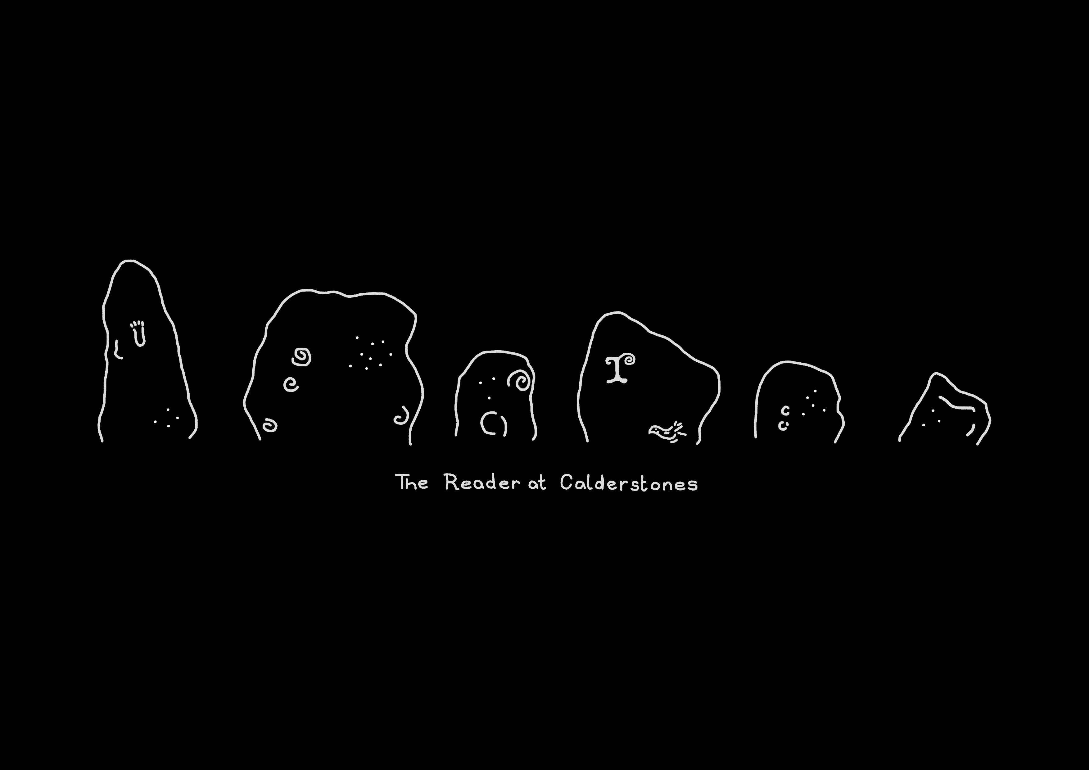
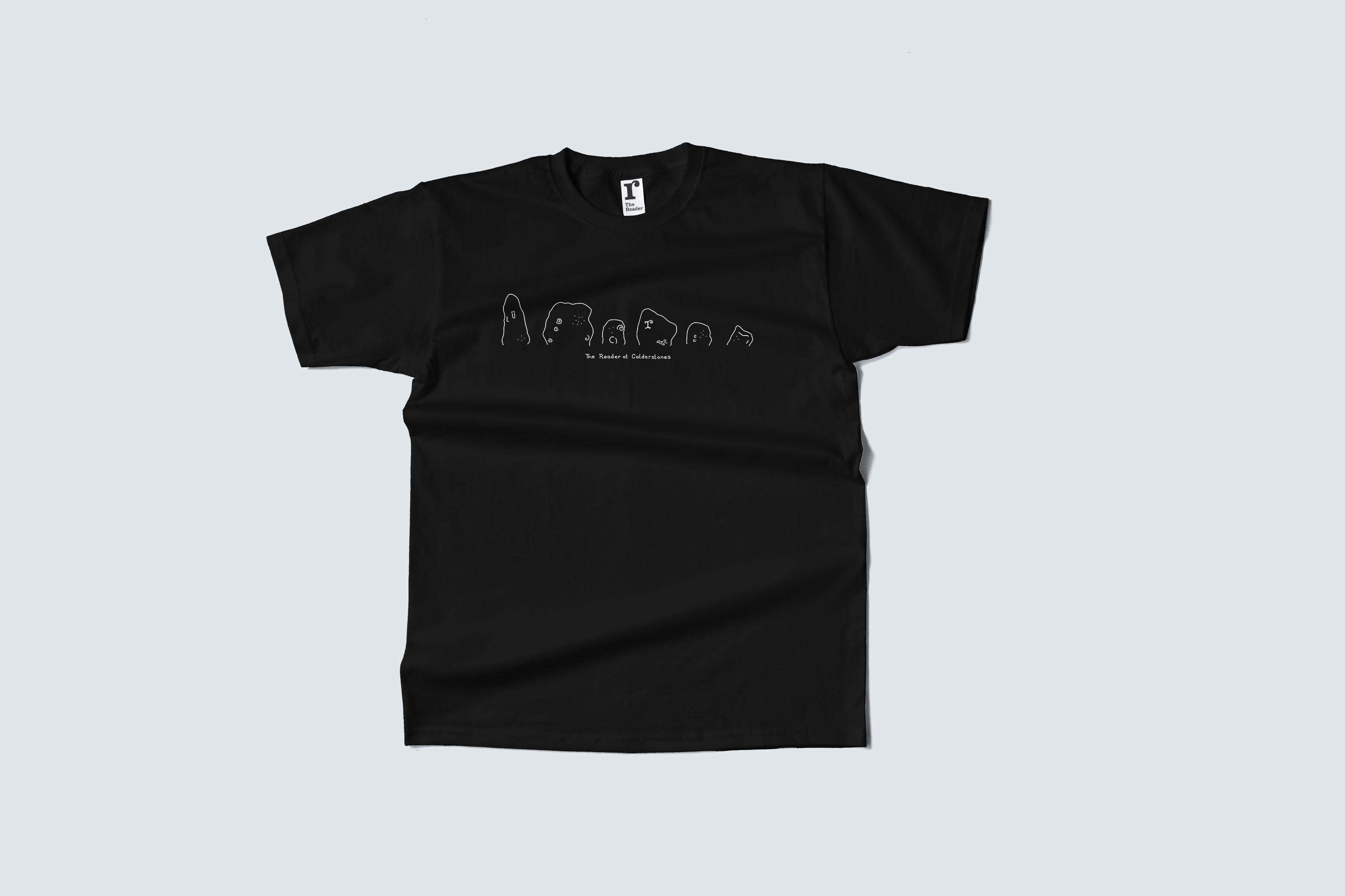
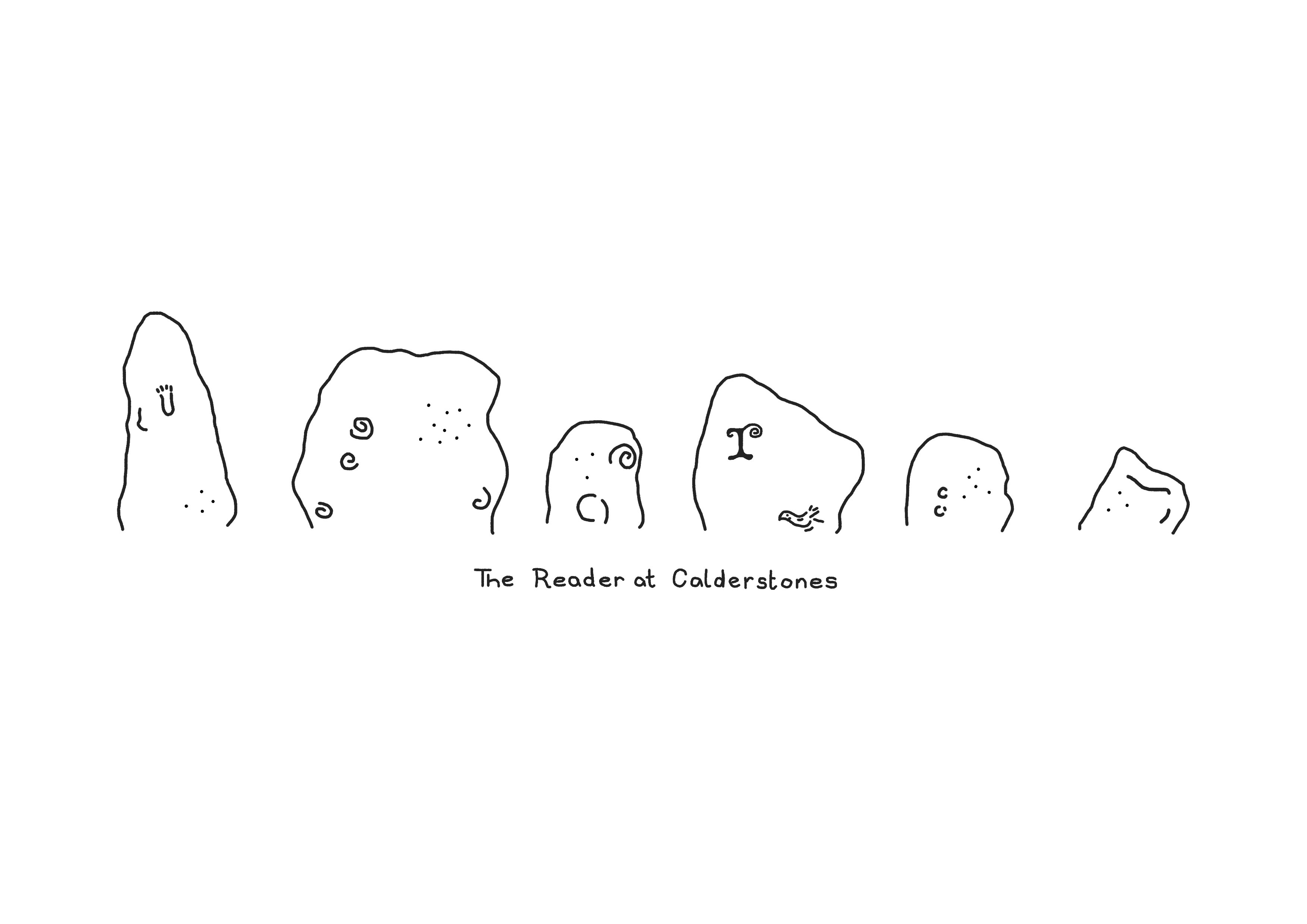
Working for the reader, I realised that a few of the aspects of design could do with a change and a refresh, I approached the managers and suggested that I do some design work for them, this resulted in a yes, allowing me to go forward and create a refresh on their brand design, not an overhaul, my first step in this partnership was to create a less basic uniform design, which not only reflects the charity but also its surroundings, something which staff members are happier to wear than he current design, this is a fresh and new collaboration so while I have the design for the uniform, it is yet to be printed out, I am also currently working on signature for around the park as well as a cohesive design identity for menus, and signs, something which brings a newer take on the older style of menus and signature.